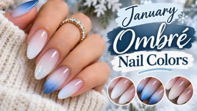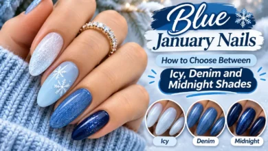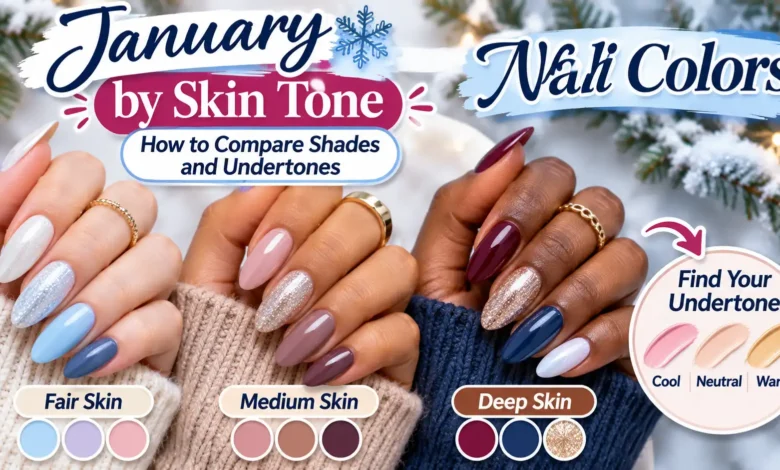
To choose January nail colors by skin tone, compare two finished swatches from the same color family beside your hand. First decide whether you want the polish to blend in or stand out. Then compare its undertone, coverage, and finish. A rosy beige and a peach beige can look quite different even when both bottles say “nude.”
For a winter starting point, consider rosy beige, cocoa, muted blue, creamy white, or berry. These are editorial starting points, not rules assigning colors to skin tones. The useful question is which version gives you the effect you want on your own hands. You can wear any of these colors at any skin depth.
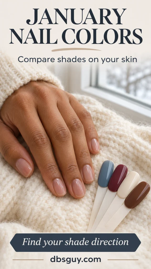
The visuals are AI-generated concepts. They illustrate color choices and comparison methods, rather than completed salon work or product tests. Screens and lighting affect color, so confirm your choice with a finished swatch.
Separate Skin Depth From Undertone
Skin depth describes how light or deep your skin looks. Undertone describes its underlying color cast: commonly warm, cool, or neutral. These answer different questions. Light skin can have warm undertones, and deep skin can have cool undertones.
Warm usually means a golden, yellow, or peach cast; cool can mean a rosy, reddish, or bluish cast. Neutral sits between the two. Olive describes a greenish cast that can lean warm, cool, or neutral; it does not automatically mean medium skin or warm skin.
For a manicure, look at the hand that will wear the color. If your hands are temporarily flushed from being outside or washing up, let their appearance settle before comparing. A moment of surface redness is a poor basis for deciding your undertone.
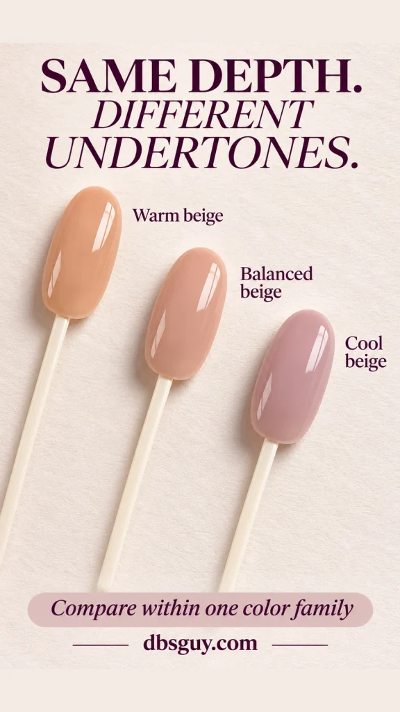
Use Undertone as a Comparison Tool
Choose one family you already like, such as beige, and compare versions at a similar depth. Peach-beige gives you a warmer reference; mauve-beige gives you a cooler one. A balanced rosy beige offers a middle option. Keeping the depth and finish similar makes the color cast easier to notice.
You might prefer a warm beige that echoes golden tones in your skin, or a cool mauve that creates a visible contrast. Both are valid outcomes. OPI’s guide to nude polish across skin tones also considers undertone and makes room for personal color preferences.
You do not need to settle your undertone before choosing polish. If beauty quizzes or jewelry comparisons leave you unsure, compare the actual swatches and describe the result you like: “less peach,” “more rosy,” or “a little deeper.”
Compare January Colors at Your Skin Depth
A shade close to your skin’s depth can create a quieter boundary between nail and finger. A much lighter or darker shade makes that boundary more visible. This is why deciding on contrast helps before you start searching for the “best” nail color for your skin tone.
For example, the same muted blue can create a different amount of contrast beside light, medium, and deep skin. Use that difference to decide whether you want the color to blend or stand out; there is no preferred result for a particular skin depth.
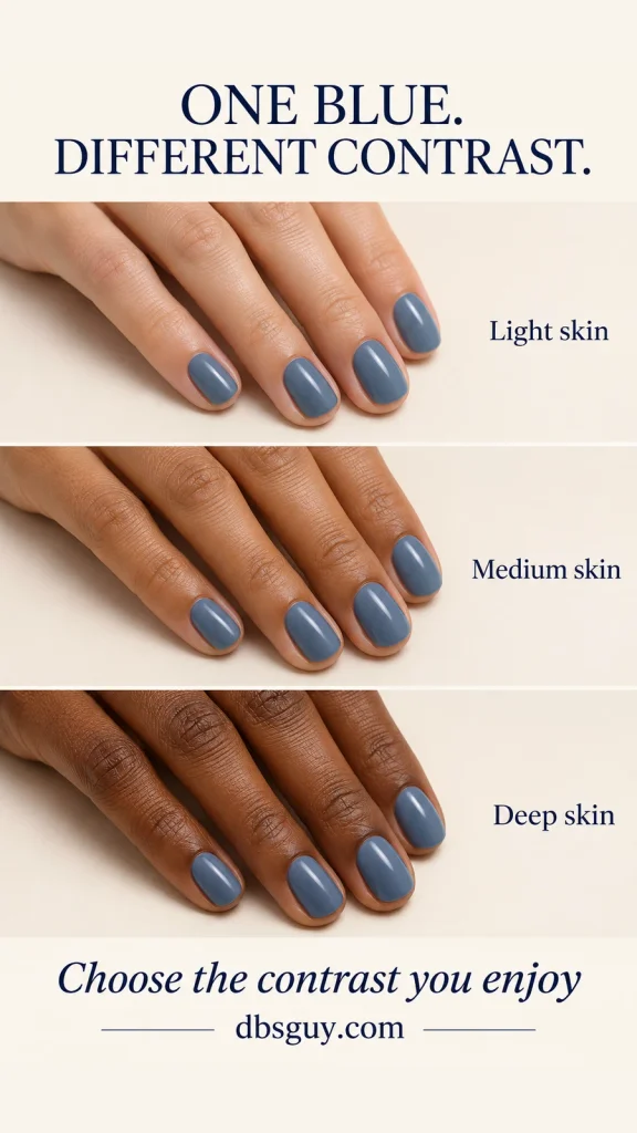
Fair and Light Skin: Compare a Soft Neutral With a Clear Color
For a subtle January manicure, start with sheer rose or a light pink-beige. Compare peach-beige if you want a warmer version, or mauve-beige if you want something cooler. If a light beige disappears more than you like, move slightly deeper instead of abandoning neutrals altogether.
For stronger definition, compare dusty blue with berry wine. Keep the rest of the manicure plain while you decide. If you like the icy effect of blue but a very pale sample feels too stark, try a midtone denim blue; that changes the depth without giving up the blue family.
Medium and Tan Skin: Decide Whether Beige Should Blend or Show
For an understated neutral, compare caramel beige with rosy taupe at a depth near your fingers. The first offers a warmer direction; the second lets you check whether you prefer less yellow or orange. Neither is automatically your match because your skin is medium or tan.
For visible winter color, hold slate blue, cream, or berry beside your hand. A pale cream may create more contrast than you want from an everyday nude, even though it is a neutral color. That is useful information: choose it for a light manicure, or try a deeper beige if you want the color to blend.
Deep Skin: Compare a Close Neutral With a Deliberately Light Shade
For a neutral close to your skin’s depth, start with cocoa, espresso, or a rich rosy brown. Compare similar-depth browns side by side: one may lean golden, another red, and another cool and muted. “Brown” alone does not describe the whole effect.
For a lighter winter manicure, compare milky ivory with muted powder blue. Their visible contrast can be exactly the point. If a pale beige looks chalkier than you intended, try a sheerer version or a deeper neutral. You can also keep that pale color because you enjoy the crisp contrast; light polish is not off limits.
Olive undertones can occur at different depths. If they describe your skin, use the depth guidance above, then compare two undertone directions. For example, set rosy taupe beside caramel beige and judge which you prefer instead of assuming the warmer option must win.
For more color references once you have chosen your contrast, see January dip nail colors in soft neutrals and rich jewel tones. Confirm the finished color in the polish system you plan to use.
Run a Fair Swatch Comparison Before You Commit
A bottle on a shelf and a finished nail are different things to judge. Use completed swatch sticks to narrow the choice, then ask about a sample on one nail if the coverage is still uncertain.
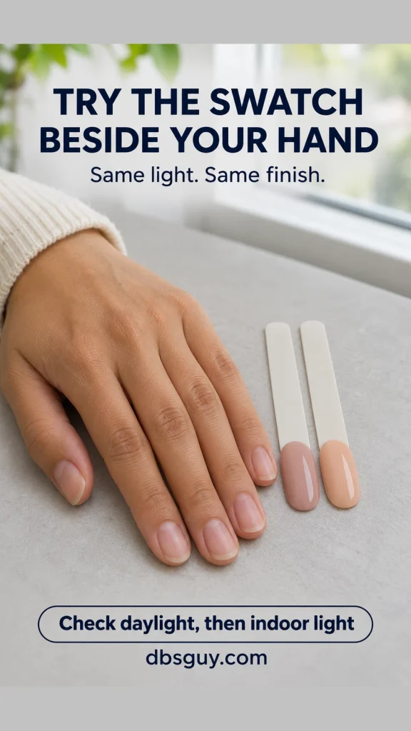
- Choose two candidates with one meaningful difference. For example, compare warm beige with cool beige at a similar depth and finish. Comparing sheer blush with opaque navy tells you which overall look you prefer, but it will not isolate undertone.
- Check what the swatch represents. Ask which product system, base, number of color coats, and top coat were used. A display tip may have a different background from your natural nail, which matters especially for sheer colors.
- Hold both tips beside the same finger. Keep them at about nail level, in the same light, against a plain background. Swap their positions and look again. Do you still prefer the same one?
- Look in two ordinary settings. Compare near a window in indirect daylight, then under indoor lighting similar to where you spend your day. For dark berry or navy, check whether you can still see the red-purple or blue you wanted.
- Add your usual sleeve. A gray coat, camel knit, or black cuff supplies a real wardrobe reference. Decide whether you want the polish to sit quietly beside it or provide the color contrast.
- Confirm the finalist. For a sheer shade, ask whether one nail can be finished to the intended coverage before the whole set. Follow the chosen product’s directions; extra coats are not a universal solution for opacity.
At home, you can compare regular-polish samples on clear swatch tips, allowing them to dry as directed. Label the color and coat count so the comparison is useful next time. Use those tips to shortlist a color; your natural nail can still affect a translucent result.
If you save a reference photo, keep both swatches and your hand in the same frame without a beauty filter. Use the photo to remember your preference, and keep the shade name separately. A screen image cannot guarantee an exact match.
Check Coverage and Finish Before Changing the Color
Coverage is how much of the nail shows through. Finish is how the surface reflects light. A polish can be sheer and glossy, opaque and glossy, or opaque and matte. A pale color is not necessarily sheer, and a shiny nail does not identify which product system was used.
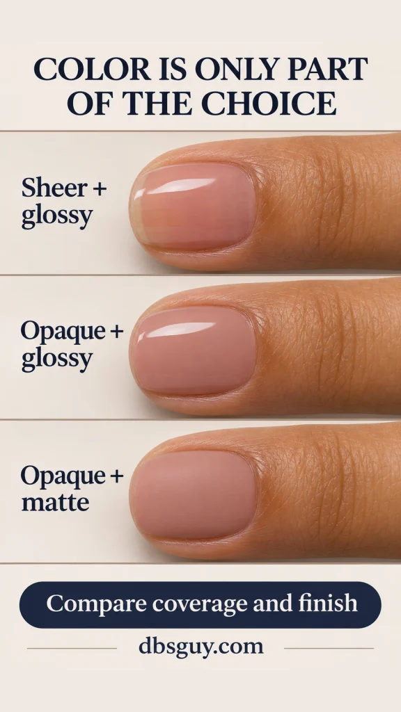
Compare three versions of rosy beige to see why the distinction matters: sheer and glossy, opaque and glossy, and opaque and matte. The sheer version can leave a faint natural edge visible. The opaque versions cover it, while the matte surface removes the glossy reflection. Ask to see the version you actually want, especially if a salon sample has a different top coat.
If the Shade Looks Different From What You Wanted
- Too chalky: compare a less white-heavy shade or a sheerer formula if your goal is softer contrast. Adding gloss alone does not make opaque polish translucent.
- Too orange: keep a similar depth and compare a rosier or cooler version. That is a more focused adjustment than picking an unrelated lighter color.
- Too gray: compare a version with more rose, peach, or clearer color. Check it in the second lighting setting before deciding.
- Too close to your skin: move lighter or darker until the nail has the definition you want. A nude manicure does not need to disappear.
- Too dark to read as blue or berry: try a lighter, more visibly colored sample in the same family. Strong salon lighting may show color that is harder to see at home.
These are adjustments to the look, not judgments about your skin. Change the feature that bothers you—depth, color cast, coverage, or reflection—then compare again.
A useful salon request is: “I’d like a muted rosy beige, a little deeper than this sample, with opaque coverage and a glossy finish. Can we compare a warm and a cool version beside my hand before choosing?” Replace the color and coverage with your own preference, and confirm the service separately.
Questions About January Nail Colors and Undertones
Can Warm Undertones Wear Icy Blue Nails?
Yes. Icy blue can give you deliberate contrast. If the palest blue feels too white, compare a deeper dusty blue. You can change the depth or coverage while keeping the cool color you liked.
What If I Cannot Tell Whether My Undertone Is Warm or Cool?
Skip the label. Compare two similar-depth shades in one family and choose the one you prefer beside your hand. Write down what worked, such as “rosy beige, little yellow, semi-sheer.” That description is useful at a future appointment.
Does a Nude Polish Need to Match My Skin Exactly?
No. Decide whether you mean a skin-like neutral, a soft tint close to your nail bed, or simply an understated color. Those can lead to different shades. Tell your artist which effect you want rather than asking for “nude” alone.
Should I Choose a Lighter Polish in January?
Only if you want that look. If your hands look different from when you chose a favorite summer neutral, compare it again rather than automatically buying a lighter bottle. Berry, cocoa, cream, and blue all remain options; the month does not require a particular depth.