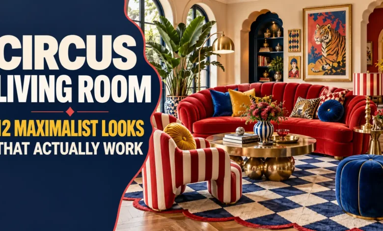
The most useful circus living room ideas give your eye somewhere to land: a bold stripe, a theatrical color, or a playful shape, supported by furniture you actually want to sit on. Pick one of the 12 looks below as your starting point, then borrow smaller details from another.
For an easy first move, try striped curtains or a patterned rug. For a bigger transformation, choose a painted ceiling or a jewel-tone seating scheme. Each look includes a palette, a reason the pieces work together, and an adjustment for everyday living.

1. The Big-Top Accent Wall
Palette: Crimson, ivory, navy, and walnut.
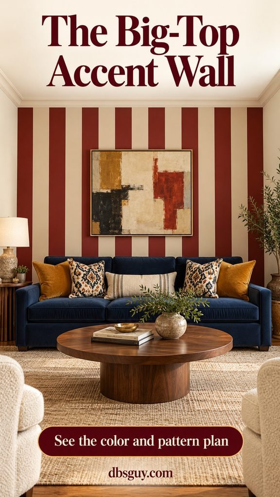
A striped wall behind the sofa gives this room its identity immediately. Muted crimson and warm ivory carry the circus reference, while a solid navy sofa and walnut table make the seating area feel settled. Ochre cushions provide a warm bridge between the red wall and blue upholstery.
Keep the adjacent walls plain so the stripe has a clear boundary. Before choosing a width, sketch the wall to scale and account for corners, outlets, and artwork. Around 8–12 inches per band is a useful starting point for a broad-stripe look, not a rule for every room.
Ask a painter for a measured stripe layout and a sample of the two colors together. If you are doing it yourself, follow Benjamin Moore’s stripe-painting guide for preparation, measuring, and taping. Test colors in your room before committing to the whole wall.
2. A Ceiling Worth Looking Up For
Palette: Oxblood, cream, and olive.
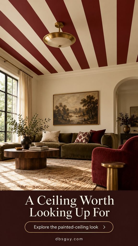
Put the spectacle overhead with parallel painted stripes across a flat ceiling. This version keeps the walls cream and uses a low olive sofa, so the ceiling reads as a deliberate feature rather than one more competing pattern. A burgundy chair repeats the stripe color at seated eye level.
This is the most committed architectural look in the list. View a taped paper mockup from the doorway and from the sofa; a pattern that looks balanced standing up may dominate your view when reclining. Use a simple light fixture with enough visual space around it.
Request a ceiling drawing showing stripe direction, the first and last bands, and how the pattern meets the light fixture. Paint achieves the tent reference without hanging fabric overhead. Have a qualified professional handle any fixture changes, and leave vents and detectors unobstructed.
3. Harlequin Underfoot
Palette: Rust, cream, petrol blue, and ochre.
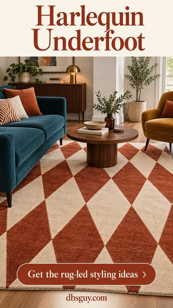
A diamond-pattern rug can do the visual work of a decorated wall while staying movable. Here, rust-and-cream harlequin diamonds give the room rhythm, and a petrol-blue sofa provides the contrasting solid shape. An ochre chair adds another color without another large pattern.
Measure the seating group before choosing a rug. Aim to place the front legs of the sofa and chair on it, with the coffee table fully inside its footprint. Tape the proposed rug outline on the floor first; do not choose solely from a cropped product photo.
Keep the table plain so the diamonds remain legible. If the rug already has sharp contrast, choose textured solid cushions rather than another geometric print. This is a strong option when painting is off the table or you want to move the look between homes.
4. Curtains That Set the Stage
Palette: Mustard, ivory, coral, and blue.
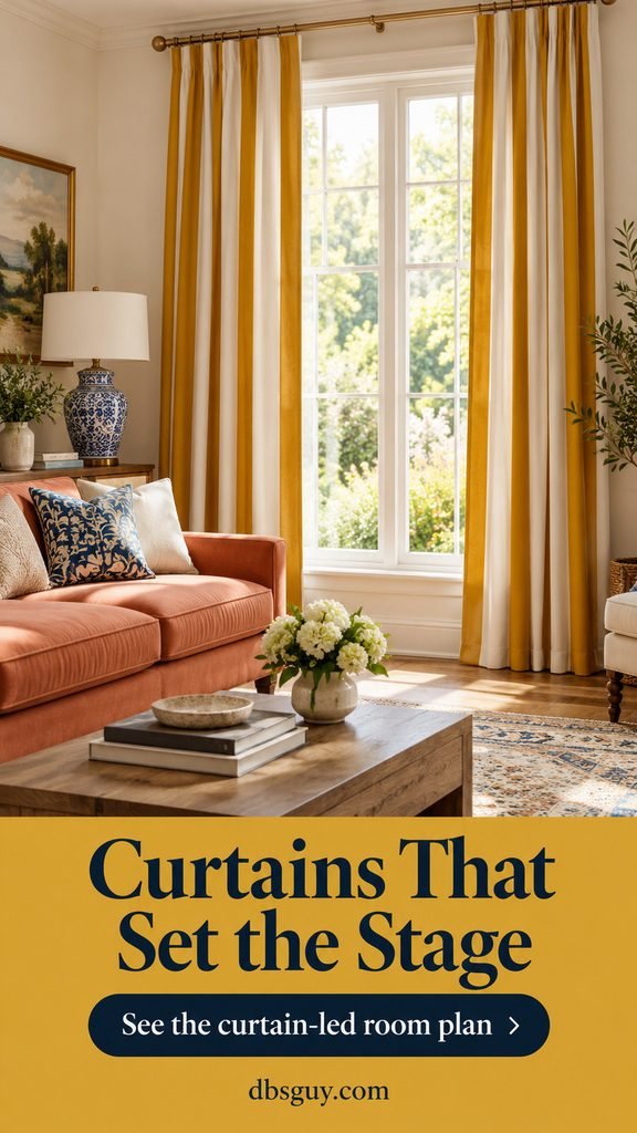
Wide mustard-and-ivory curtain stripes turn the window into the room’s focal point. The coral sofa picks up the warmth, while a blue ceramic lamp prevents the scheme from becoming entirely yellow and orange. The walls remain off-white.
Order or borrow a fabric sample and look at it both in daylight and with lamps on. Gathered fabric makes stripes appear narrower than they do on a flat swatch. Measure the rod position and finished drop, then choose enough panel width to look full when closed.
In a room used every day, hem the curtains to meet or just clear the floor instead of creating a fabric puddle. Keep the window accessible and the panels away from heaters. For a seasonal update around this feature, our fall window decorating ideas offer additional ways to style the surrounding area.
5. The Vintage Poster Salon
Palette: Muted teal, tan, burgundy, and brass.
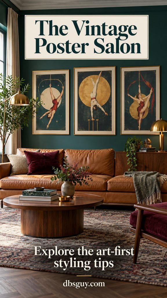
Build the room around art rather than stripes. A small group of vintage-inspired acrobat illustrations brings movement and a circus connection to muted teal walls. Tan leather seating and walnut furniture give the colorful wall a warmer foundation.
Lay the frames out on the floor before hanging them. Choose one larger anchor and let the other pieces support it; a shared frame finish or repeated burgundy accent can connect different illustrations. Paper templates make it easier to check the arrangement over your sofa.
Look for licensed reproductions, original pieces, or public-domain artwork with clearly stated reuse terms. Do not assume that a picture found on Pinterest is free to print. If you already own a sofa, build the art palette around its undertones; our guide to living room sofa designs can help you compare shapes before buying a new anchor piece.
6. A Jewel-Tone Velvet Lounge
Palette: Burgundy, emerald, navy, and cream.
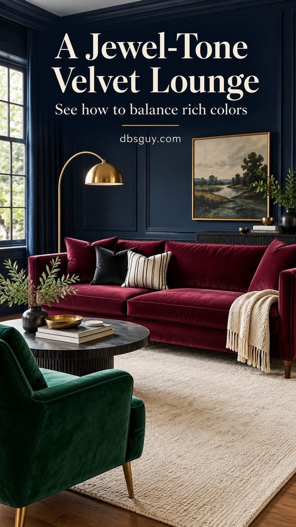
This room gets its richness from large areas of solid color: a burgundy velvet sofa, emerald chair, and navy walls. Small black-and-cream striped cushions provide the graphic circus detail, while a plain cream rug gives the furniture a lighter base.
The balance comes from changing texture as well as color. Velvet, brass, and a quieter rug create layers without asking every surface to carry a print. Place lamps near the seating instead of relying on the ceiling fixture alone, and check that you can still read comfortably.
Before buying upholstery, ask for a swatch and the manufacturer’s cleaning instructions. Fabric labeled “velvet” can have different fiber content and care requirements. If dark walls feel too much in your room, keep them cream and let the sofa and chair carry the same palette.
7. The Candy-Color Carousel
Palette: Blush, lavender, mint, butter yellow, and raspberry.
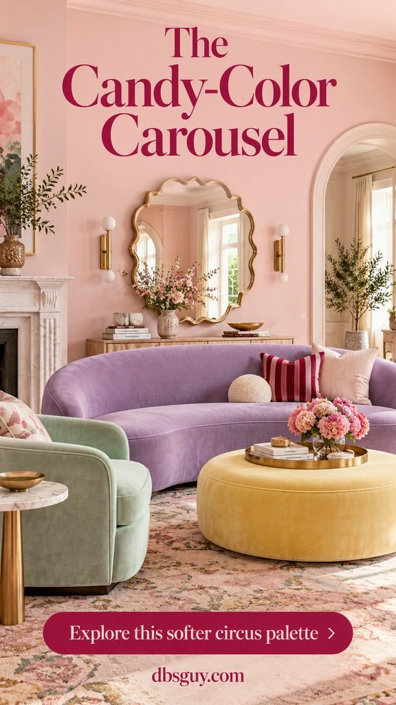
Circus style can be soft without becoming bland. A curved lavender sofa, mint chair, and butter-yellow round ottoman bring the rounded geometry of a carousel into a blush room. A scalloped brass mirror and one raspberry-striped cushion add a little sharper definition.
Repeat the curves in two or three places rather than buying every piece in a rounded shape. A plain rectangular rug or straight curtain rod keeps the room from feeling overly sugary. Use a stable tray on the ottoman when you need a place for drinks.
This suits a light-filled living room or someone who prefers pastel color to primary red. Compare samples together: a very cool lavender can feel disconnected from a yellow with strong orange undertones. Let one pastel occupy the largest area and keep the others smaller.
8. Black, Cream, and One Red Accent
Palette: Black, warm ivory, red, and pale wood.
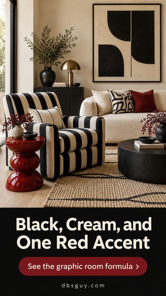
A striped armchair and a sculptural red side table can introduce circus energy into an existing cream living room. Black-framed abstract art echoes the chair, and pale wood keeps the strong contrast from feeling severe.
The red table is the punctuation mark. Give it room to stand out instead of scattering equally bright red objects across every shelf. Check that its top is large and stable enough for the way you will use it; a playful silhouette still needs to function.
This approach works particularly well when your main sofa is staying. Start with the chair or table, live with it for a week, then decide whether a small striped cushion is needed. Plenty of visible wall and floor helps the graphic pieces look intentional.
9. A Curiosity Cabinet with Rhythm
Palette: Olive, mustard, rust, and brass.
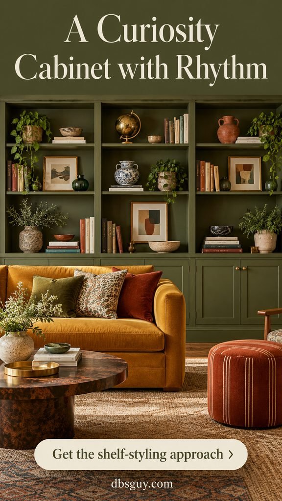
Let a cabinet become the feature instead of decorating the whole room. Olive shelving holds books, colored ceramics, a brass globe, and small framed pieces. A mustard sofa and rust-striped stool repeat colors from the collection without copying every object.
Group objects by a shared color or shape, then vary height within each group. Leave visible shelf backing between arrangements. Closed doors below provide space for remotes, games, cables, and the things you want nearby without displaying them.
Put heavy items low and keep everyday objects within comfortable reach. Follow the CPSC’s Anchor It guidance to secure freestanding furniture with shelves, drawers, or doors, using suitable hardware and the furniture’s instructions. A display can be generous without becoming unstable or blocking access.
10. Scallops, Fringe, and Soft Edges
Palette: Terracotta, teal, burgundy, and cream.
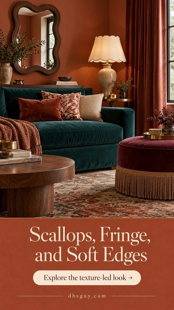
This look borrows the decorative edges of a stage: a scalloped lampshade, a wavy mirror, and gold fringe on an ottoman. Solid terracotta walls and a deep teal sofa let the outlines become the pattern.
Use trim where people will notice it at close range. The cream shade shows its scalloped edge clearly, and a small burgundy ottoman gives fringe a defined location. Plain curtains prevent the room from becoming a collection of competing borders.
If adding trim yourself, check the fabric and attachment method with an upholsterer rather than gluing it to a valuable piece. Use a properly made lampshade compatible with the lamp and bulb; keep decorative trim away from the bulb. For pets or young children, tightly attached short trim may be a more practical choice than long loose tassels.
11. The Circus Reading Corner
Palette: Cobalt, ochre, red, and warm neutral.
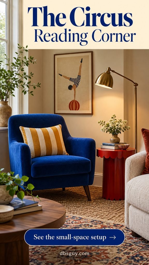
Try the style in one corner before changing a whole living room. A cobalt chair, ochre-striped cushion, and red scalloped side table create a compact color story. One acrobat-inspired print supplies the reference; a nearby neutral sofa lets the corner feel connected to the larger room.
Place the reading lamp where it lights the page without shining directly into your eyes. Keep the table within reach and leave a clear route past the chair. If the corner becomes a squeeze, drop the extra stool or decorative basket before sacrificing useful space.
Use our small-space reading nook ideas to compare layouts. For a rental, portable pieces are a straightforward starting point; check your lease before mounting art or replacing fixtures.
12. A Pattern Mix with a Shared Palette
Palette: Muted blue, terracotta, cream, and walnut.
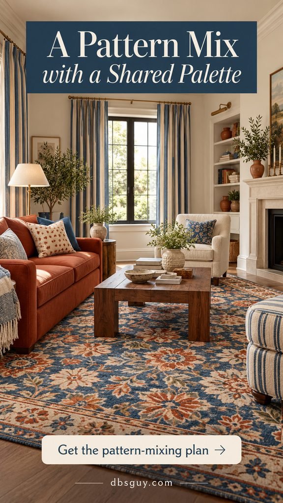
For the fullest maximalist look, mix three patterns that speak the same color language: wide blue-and-cream curtain stripes, a small dotted cushion, and a larger blue-and-terracotta floral rug. A solid terracotta sofa sits between them as a visual pause.
Spread the patterns across different planes rather than stacking all of them on the sofa. The window carries a clean linear rhythm, the cushion contributes a small detail, and the floor supplies the organic shape. Plain walls and a walnut coffee table keep the arrangement readable.
Gather samples and photograph them together before ordering. If the mix feels restless, remove the smallest pattern first and see whether the room settles. Matching every blue exactly is less important than checking that their undertones and intensity feel comfortable together.
Make Your Chosen Look Work in Your Actual Room
Begin with what stays: your sofa, flooring, built-ins, or a favorite piece of art. Choose the scheme that complements those pieces, then make the largest visual change first. A new curtain or rug is easier to judge before the room is filled with small accessories.
- For a rental: start with the rug, curtains on approved hardware, or the reading corner. Removable wallpaper is not automatically damage-free; get permission and check the surface requirements.
- For a busy household: prioritize useful tables, accessible storage, clear walking routes, and upholstery care you can manage.
- For an October refresh: mustard, rust, or burgundy textiles can sit comfortably alongside fall decor. Keep permanent choices based on what you enjoy year-round.
- For a limited budget: choose one visible change, then reuse colors already present in books, artwork, or cushions. There is no need to buy a complete matching room.
Before the final purchase, sit in the room and look toward the television, window, and doorway. Remove anything that interrupts the activities the room needs to support. Maximalism feels more welcoming when the collection has order and the furniture is easy to use.
Frequently Asked Questions
What makes a living room feel circus-inspired?
Bold stripes, harlequin diamonds, theatrical colors, curved shapes, and decorative trim all provide a connection. You can choose one of these elements and build around it. Literal circus art is optional.
Can circus decor work in a small living room?
Yes. Try one defined area, such as the reading corner, or put the main pattern on curtains or a rug. Choose furniture that fits your measured layout and protect your walking space. A small room does not need miniature accessories scattered everywhere.
How do I stop it from looking like a party setup?
Use the references through everyday furnishings: a striped chair, well-framed art, or a rich sofa. Repeat a few colors and leave some plain surfaces visible. Save temporary bunting and novelty signs for occasions if they do not suit the room you want year-round.
Do I need to replace my neutral sofa?
No. The black-and-cream look and the reading corner both work around neutral seating. A rug, chair, or curtain can introduce the style while the sofa provides a quieter background.
Which idea should I try first?
If you are unsure, start with a movable piece that will remain useful even if your taste changes. A striped cushion is a small experiment; a properly sized harlequin rug or set of curtains creates a more visible change. Check measurements and return policies before ordering.