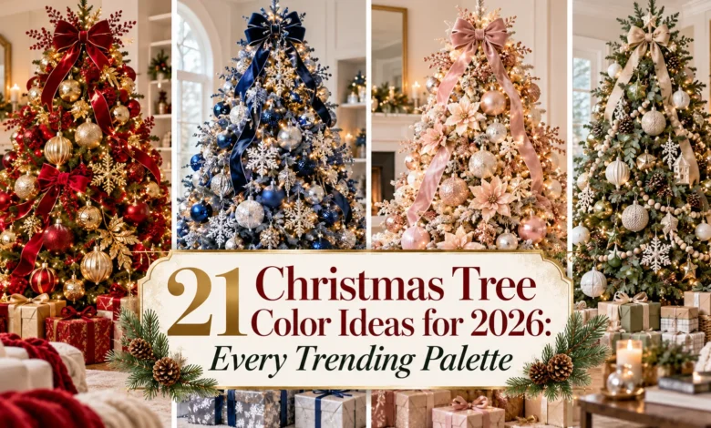
A Christmas tree color scheme gets easier to choose when you picture it in your own room. Cool blue and silver suit an airy winter look; burgundy and antique gold bring warmth; jade and ivory feel gentle; bright ornaments turn a white tree into a cheerful focal point.
These 21 Christmas tree color ideas cover the five colors in Pinterest’s 2026 forecast, along with classic, earthy, metallic, pastel, and colorful combinations. Each idea includes a tree base, a ribbon direction, and a practical way to arrange the colors—so you can move from inspiration to an actual decorating plan.
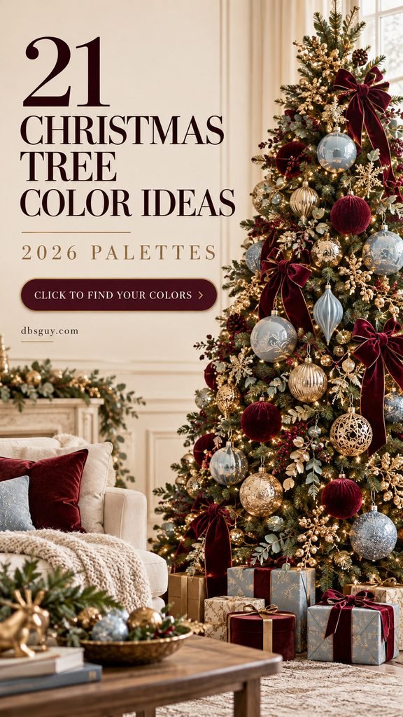
The images in this article are AI-generated decorating concepts. Use them as visual inspiration; ornament finishes and colors will look different under your own lighting.
Which Christmas Tree Colors Are Trending for 2026?
Pinterest’s official 2026 color forecast names Cool Blue, Jade, Plum Noir, Wasabi, and Persimmon. This is a broad color forecast, rather than a ranking of Christmas tree palettes. The first five ideas below translate those shades into holiday decorating combinations.
Christmasworld’s Trends 26+ also gives room to copper, red and violet, misty pastels, matte silver, and clean colors paired with metal. Those directions support several different holiday moods. The combinations here are editorial styling suggestions, not claims that every palette has the same popularity.
Before buying anything, put your existing ornaments beside one ribbon sample. Look at them with the tree lights on and off. A gold that looks soft in daylight may look yellow at night, and pale pink can become peach under a very warm bulb.
1. Cool Blue, Silver, and Snow White
Icy blue gives a snowy tree enough color to feel decorated without losing its winter softness. Choose pale blue rather than turquoise, then use silver for sparkle and white for the larger ribbon shapes.
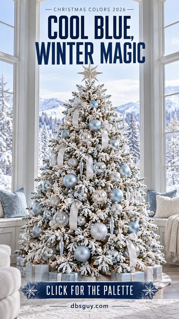
A flocked green tree is a forgiving starting point because the white branch tips already connect the palette. Mix matte blue rounds with reflective silver baubles and a few clear hanging ornaments. Keep the blue pieces near the outer branches, where their color is easy to see; clear pieces can sit closer to the lights.
White ribbon looks best in loose, separate loops instead of a tightly wound spiral. A silver star or snowflake finishes the top. If the room already has cool gray upholstery, try neutral white lights; if it feels chilly in the evening, a gentle warm white glow can soften the effect. Test a small cluster before decorating the whole tree.
2. Jade, Ivory, and Brushed Gold
Jade offers a little more color than a neutral tree while staying relaxed. Look for a green between mint and moss, then pair it with warm ivory and a restrained amount of brushed gold.
This combination works especially well around pale oak, woven furniture, linen curtains, and softly colored walls. On a green tree, vary the ornament finish: a ribbed jade bauble catches light differently from a smooth matte one, helping both stand out from the needles.
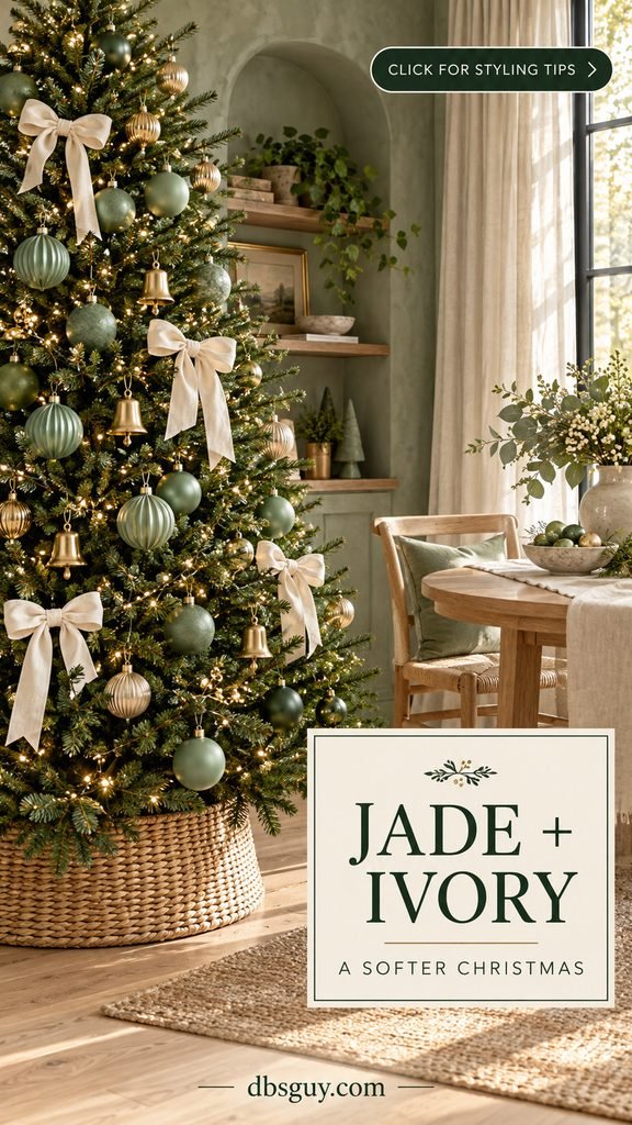
Use ivory bows as the visible rhythm across the branches. Gold bells or small metallic rounds can fill the spaces between them. A woven collar keeps the base casual, while an ivory skirt makes it softer. Avoid filling every gap with shiny gold; the quiet appeal comes from seeing jade, fabric, and foliage together. If jade ornaments are hard to find, start with jade ribbon and keep your existing cream ornaments.
3. Plum Noir, Pewter, and Dusty Blush
Deep plum brings drama without needing a bright red ornament. Here, the purple is the main character, pewter supplies reflection, and dusty blush lifts the darker branches.
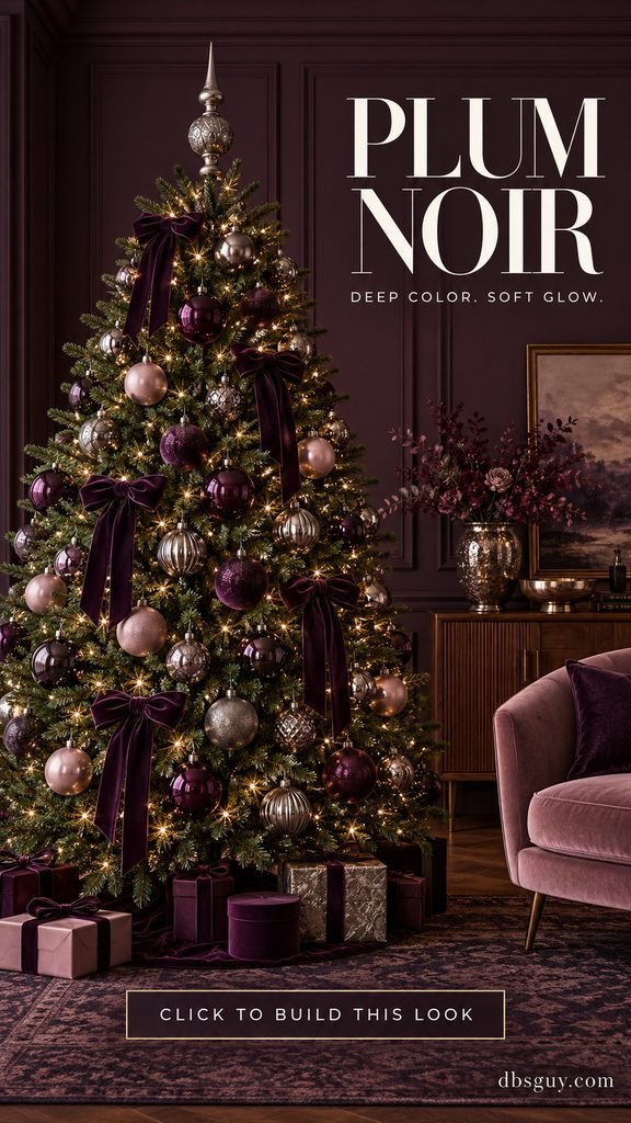
Try this in a room with walnut furniture, muted pink upholstery, or deeper wall colors. Choose plum ribbon with a visible purple undertone so the finished tree feels different from a burgundy scheme. Velvet bows and glossy purple glass create a useful contrast: one absorbs light, the other reflects it.
Place the pale blush pieces at different heights rather than collecting them near the bottom. They should create little pauses throughout the dark color. A pewter finial keeps the top elegant without introducing another shade. If your tree and room are both dark, use fewer large bows and more reflective accents near the front. You can get the mood from a handful of plum pieces without replacing every ornament.
4. Wasabi, Charcoal, and Chrome
Wasabi is an electric yellow-green, and it makes an unusually fresh accent against charcoal. This is a good option for someone who likes graphic interiors, black furniture, or a holiday tree with a strong silhouette.
A black artificial tree gives the clearest contrast. Use chartreuse ornaments as the bright punctuation, then chrome or silver mirror baubles to connect them. Small charcoal bows can add softness without changing the palette.
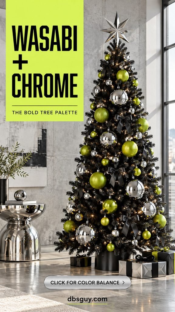
Begin with more silver than chartreuse, then add the vivid pieces one at a time. Stand back after each small group; saturated yellow-green can take over surprisingly quickly. A slim tree makes the combination easier to control, and a silver star echoes the reflective ornaments. If you already have a green tree, try the same colors with black ribbon, leaving plenty of foliage visible. The important part is the balance between bright green, dark background, and shine.
5. Persimmon, Copper, and Cream
Persimmon is a lively red-orange. Paired with copper and cream, it brings a warm holiday glow to a room with plaster walls, terracotta pottery, or golden wood.
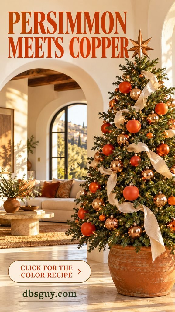
Choose a green tree for a clear backdrop. Put the strongest orange-red baubles where the room light reaches them, then weave copper through the rest of the branches. Cream ribbon provides breathing room between the two warm colors. A copper star repeats the metal at the top.
Keep the persimmon vivid if you want this look to feel distinct from a rustic rust palette. Mixing too many brown-orange shades can make the tree read as autumn decor. The cream ribbon and metallic ornaments help steer it toward Christmas. For an easy update, keep your gold or champagne ornaments and add persimmon bows first; you can introduce copper gradually. A simple cream skirt or a pot-style collar finishes the base without competing.
6. Burgundy and Antique Gold
Burgundy and gold suit a tree that needs to feel rich, warm, and welcoming. The finish of the gold matters: softly aged or brushed pieces give the wine color a gentler partner than a very yellow metallic.
Build the display around burgundy velvet bows, then scatter gold baubles in several shapes. A ribbed round, a small finial, and a filigree ornament can share the same color while bringing different textures. Keep some gold deeper in the tree so the warm lights have something to reflect against.
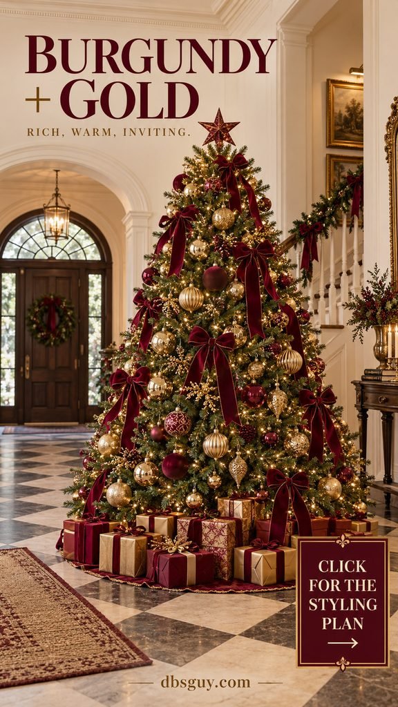
On a tall tree, repeat the burgundy from top to bottom rather than making one dense red patch. Gift wrap in wine and muted gold can carry the palette below the branches. If you prefer a lighter version, swap a few burgundy baubles for cream and keep the ribbon dark. That preserves the warmth while reducing the visual weight.
Also Read: 21 Burgundy and Gold Christmas Tree Ideas That Feel Rich and Inviting
7. Cherry Red, Espresso, and Champagne
Glossy cherry red and matte espresso brown give a tree a cozy, almost confectionery quality. Champagne accents keep the brown from disappearing into the greenery.
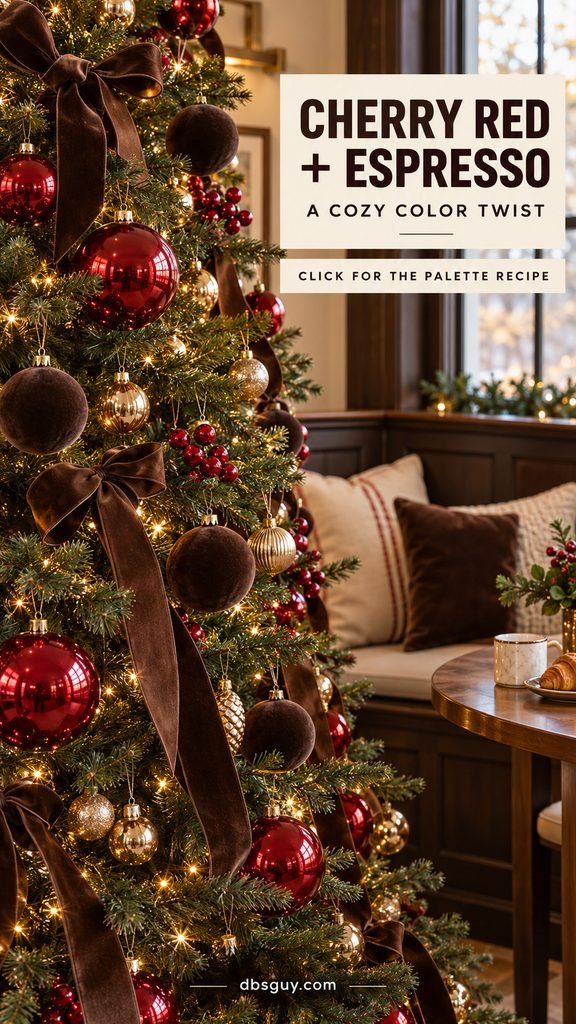
The difference from burgundy and gold is deliberate: use a brighter red, a clearly brown ribbon, and paler metal. This combination suits a breakfast nook, a wood-filled living room, or a space with cream upholstery. Brown velvet bows provide soft shapes, while shiny red baubles give the eye something bright to follow.
Hang the red ornaments at varied depths, with the most reflective ones toward the front. Spread champagne pieces between the brown clusters rather than placing all the shine on one side. A cream or champagne topper can work if your brown ribbon already dominates. When the tree looks too dark, add a few pale ornaments before adding more lights. Sometimes it is the color balance, rather than the amount of lighting, that needs adjusting.
8. Forest Green, Navy, and Brass
This heritage palette feels at home beside bookshelves, leather, dark wood, and traditional patterns. Forest green connects to the tree, navy adds depth, and brass creates small points of warmth.
A navy-and-green tartan ribbon ties the colors together without requiring every ornament to match. Pair it with navy velvet baubles, glossy green rounds, and a few brass-colored bells. Keep the pattern to one ribbon design so the tree stays readable.
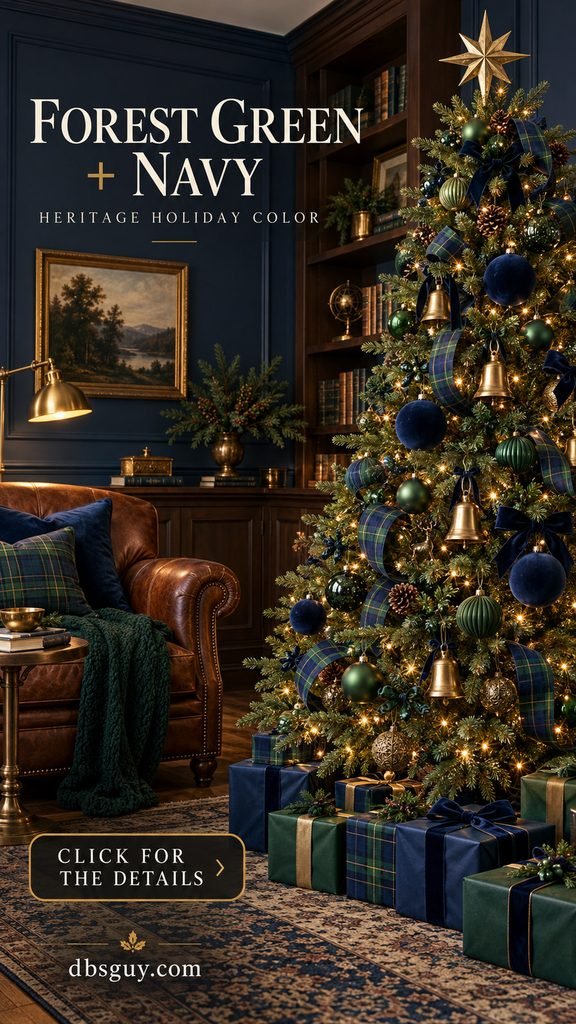
Because both main colors are dark, place the larger blue ornaments toward the front. Use brass between dark sections and at the top. A warm white light setting usually suits this mood, but judge it beside your room lamps rather than in isolation. For a smaller tree, replace wide ribbon loops with short tartan ties. The palette still reads clearly, and the branches retain their shape.
Also Read: 19 Ralph Lauren Inspired Christmas Tree Ideas for a Cozy Plaid Holiday
9. Chocolate, Cream, and Caramel
A brown Christmas tree scheme can be surprisingly inviting. Chocolate adds depth, caramel brings an amber glow, and cream makes the whole arrangement easier to see.
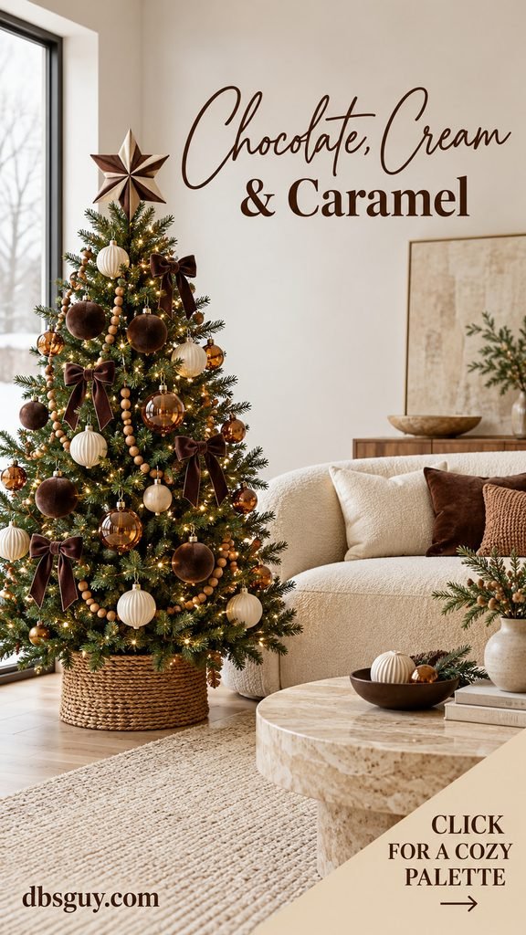
Use a natural green tree and repeat cream ornaments throughout its height. Mix chocolate velvet with caramel-colored glass or wood beads; the contrast between soft, shiny, and natural surfaces keeps the colors from feeling flat. A brown-and-cream star or a simple fabric bow makes a fitting topper.
This palette is a comfortable choice for rooms with a cream sofa, beige rug, walnut furniture, or a travertine table. To keep it festive, give the cream pieces enough room to stand out and use a gentle white light setting. Avoid choosing every ornament in a medium brown: the darker and lighter ends of the palette are what create definition. A compact tree can carry the entire look with one ribbon and three ornament finishes.
10. Sage, Oatmeal, and Pale Wood
Sage and oatmeal are softer and more rustic than jade and ivory. Here, the wood accents matter as much as the colors. Think pale wooden stars, simple beads, linen bows, and a tree with visible spaces between its branches.
A lightly decorated green tree suits this approach. Let sage ornaments sit beside oatmeal ribbon, then use a wooden bead strand to connect a few branches. A white paper star adds a light finish without introducing glitter.
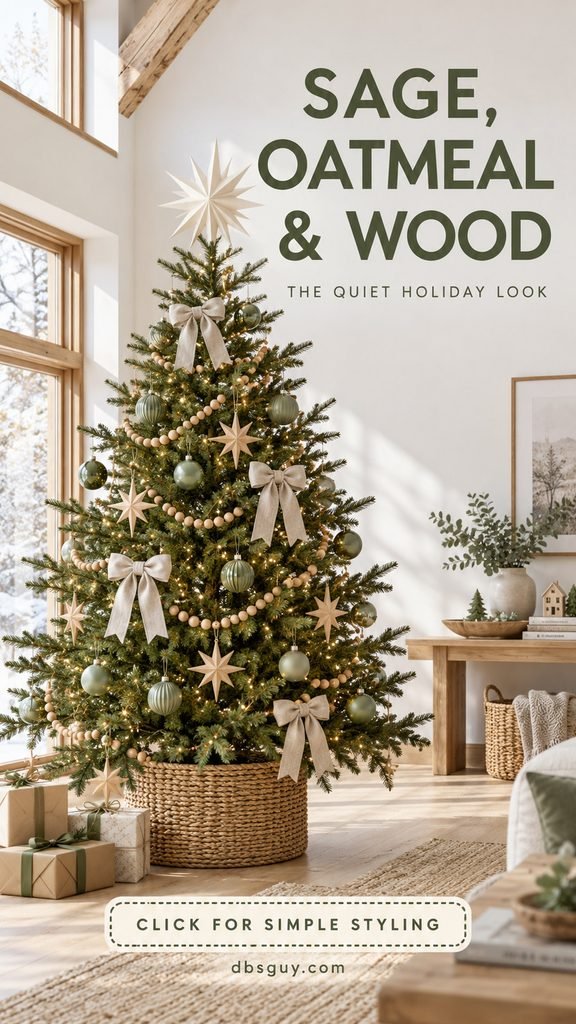
You do not need to make the tree look densely filled. Choose a few repeated shapes and stop while the greenery still feels airy. If a bead garland pulls a branch down, shorten the span or use a lighter strand. On a compact tree, small sage rounds and narrow linen ties often look more comfortable than oversized ornaments. A woven basket-style collar echoes the wood and fabric while keeping the base neat.
Also Read: 17 Small Christmas Tree Decorating Ideas That Won’t Take Over Your Living Room
11. Terracotta, Rust, and Linen
This earthy palette uses muted, clay-like orange rather than bright persimmon. It is particularly easy to imagine around woven textiles, warm plaster, pottery, and natural wood.
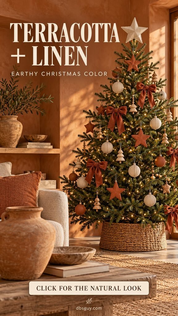
Mix rust fabric bows with linen-covered baubles and terracotta-colored stars. The handmade appearance of a matte ornament helps the scheme feel relaxed. Pale wood can join the palette as a small supporting detail, especially at the base or in a bead strand.
Keep the linen visible across the tree; it separates the warmer colors from the green needles. Choose a simple fabric or wooden topper rather than a glittery statement piece if you want to preserve the quiet mood. Clay ornaments can be heavier than they look, so check their weight against the branch strength before committing to a set. Lightweight clay-colored paper or wood ornaments can create a similar visual effect. Cream wrapping beneath the tree helps the display feel lighter.
12. Ivory, Champagne, and Pearl
Ivory and champagne give a green tree a soft, dressed-up finish. Pearl-like beads make the palette feel layered even when the individual colors are close together.
The trick is to vary the surfaces. Combine satin-finish ivory rounds, ribbed champagne baubles, a few shiny ornaments, and a creamy ribbon. Let a bead strand form shallow curves instead of tight straight lines. A pale metallic finial can echo the ornaments at the top.
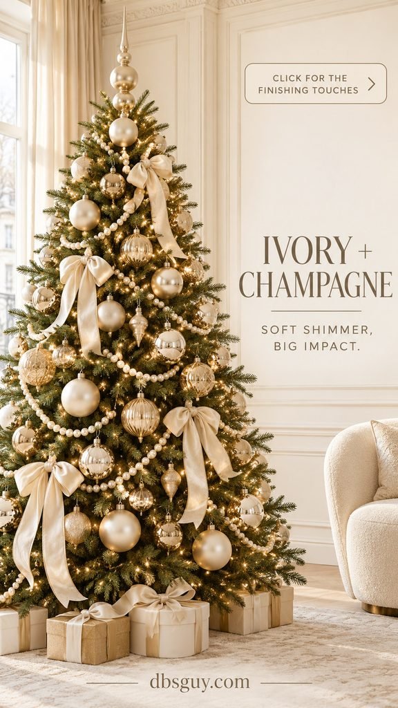
This works well in rooms with cream curtains, pale upholstery, and warm metal hardware. Check the champagne ornaments together before hanging them; some lean pink, some yellow, and some almost silver. A reasonably consistent undertone makes the palette easier to repeat. If everything looks too similar from across the room, add texture or a larger ribbon shape rather than another color. Keep enough dark foliage visible to outline the pale decorations.
13. White, Silver, and Clear Crystal
A white tree with silver and clear ornaments creates the brightest, coolest option in this lineup. The appeal comes from reflection and transparency, rather than a strong accent color.
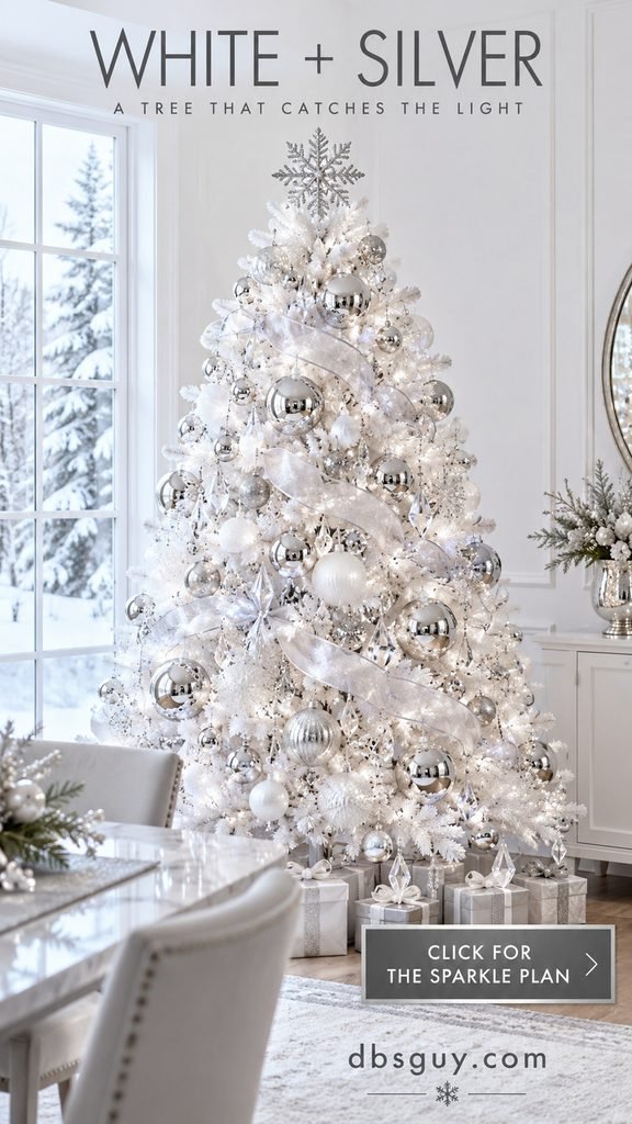
Choose a white artificial tree or a generously flocked one. Pair frosted baubles with mirror-finish silver rounds, translucent ribbon, and clear crystal-look drops. A silver snowflake or star gives the top a recognizable shape.
On a white tree, clear ornaments can disappear in daylight. Hang them near a light or beside an opaque silver piece so their edges catch the eye. A neutral or cool white light setting helps preserve the icy mood; very yellow lighting will change it. If the result feels overly shiny, remove a few mirror ornaments and add matte white ones. Silver-wrapped gifts or a plain white skirt keep the base connected without adding another metallic tone.
14. Navy and Warm Gold
Navy and gold offer stronger contrast than the forest-green heritage scheme. This version is especially useful when you already own blue upholstery or want a polished tree in a bright, neutral room.
Start with navy ribbon and a mixture of dark blue baubles. Gold rounds, stars, or finials supply the brighter shapes. Smooth, ribbed, and patterned ornaments can all work if their blue and gold tones stay reasonably close.
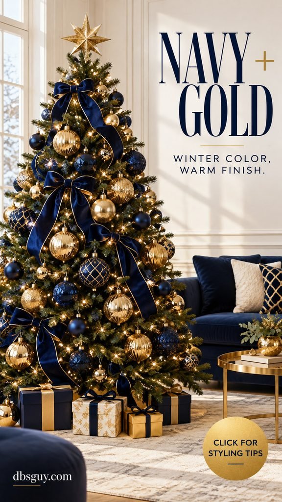
Use the gold to separate groups of navy rather than alternating the colors mechanically. A gold star repeats the brightest finish at the top, while navy wrapping brings the deeper color below the branches. If you have navy velvet bows, you can skip a second ribbon pattern altogether. In a dark room, increase the gold accents near the front; in a cream room, let more navy show. The same two colors can feel quite different depending on the backdrop.
15. Peacock Teal, Sapphire, and Emerald
Peacock colors give a tree a vivid jewel-toned look while keeping the palette within a blue-green family. Teal bridges the sapphire blue and emerald green, so the colors feel connected rather than randomly mixed.
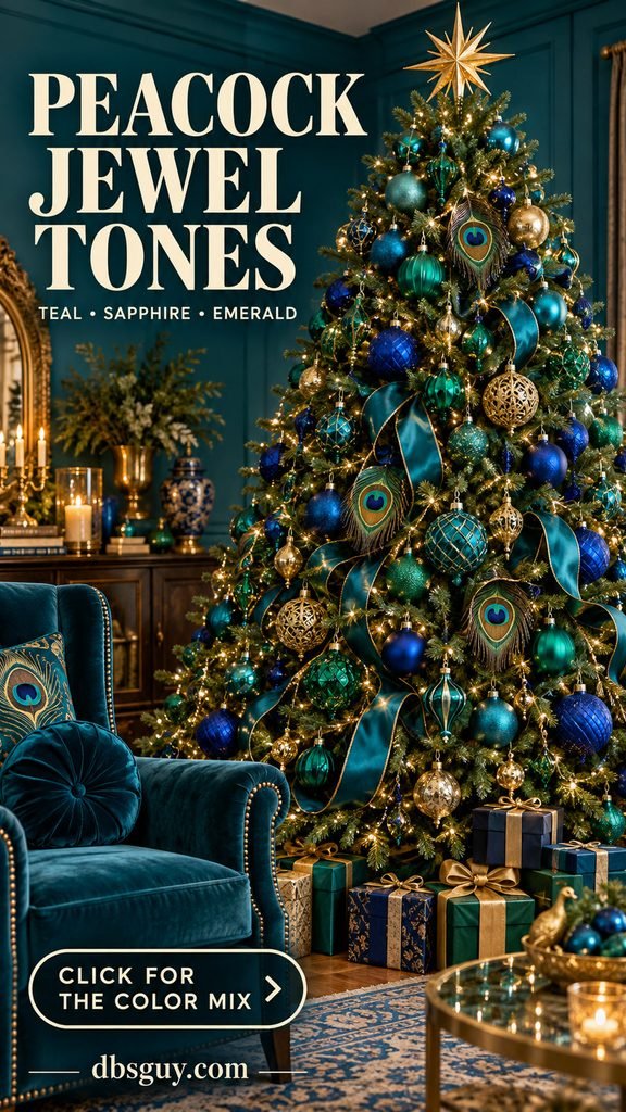
Choose teal ribbon as the repeated element, then distribute sapphire and emerald baubles around it. A little antique gold adds warmth; treat it as an accent rather than an equal fourth color. Decorative peacock-eye ornaments can make the theme recognizable, but the color mix works without them.
Keep the strongest blue and green pieces near the outer branches, where they will not disappear against the tree. This palette suits an eclectic room, a teal wall, or a neutral space that can handle one colorful focal point. If the tree feels crowded, remove some novelty shapes before removing the color. Repeated rounds and a few elongated ornaments often give jewel tones enough structure. A simpler topper lets the saturated branches remain the focus.
16. Dusty Rose, Taupe, and Rose Gold
Dusty rose has a muted, almost mauve quality that feels calmer than candy pink. Taupe gives it a warm neutral partner, and rose gold adds a soft metallic glow.
Try the palette around beige walls, blush upholstery, or warm wood. A green tree helps define the pale ornaments. Use dusty-rose velvet ribbon, taupe baubles, and small rose-gold pieces in different finishes. The metal should support the soft colors rather than cover them.
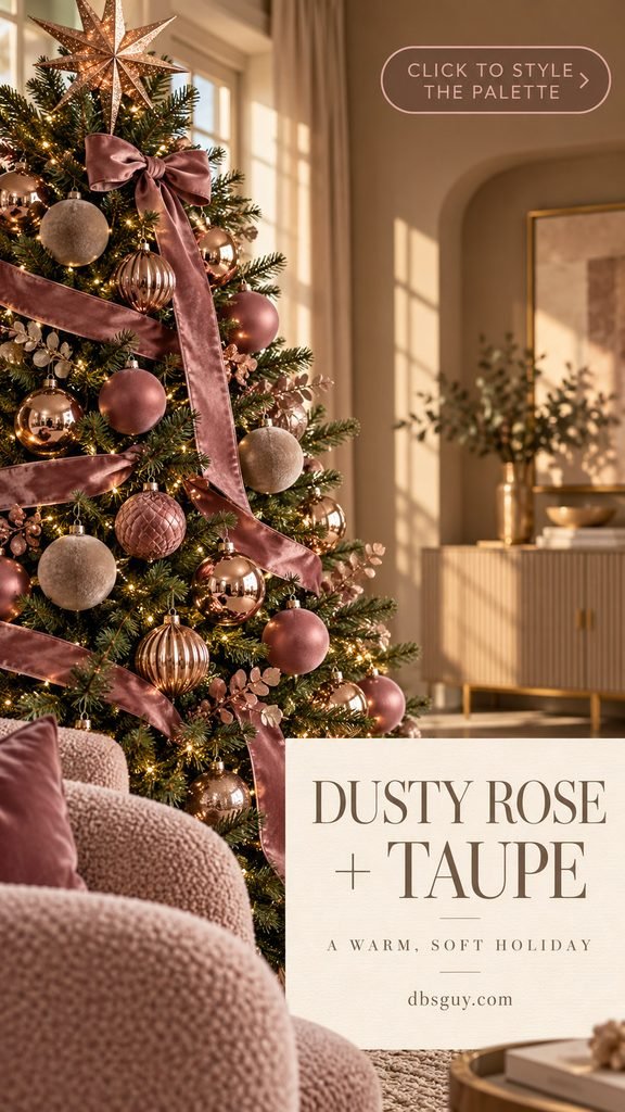
Hold the pink ribbon beside the ornaments before buying more. A peach-pink ribbon and a purple-pink bauble can look disconnected under room lighting, even when both are labeled “blush.” Repeat the ribbon in separated bows or short tucked sections. If the palette begins to look overly beige, move a few deeper rose pieces toward the front. A taupe or cream skirt keeps the base quiet and gives the pink room to show.
17. Blush, Pistachio, and Pale Champagne
Blush and pistachio create a sweeter pastel scheme than dusty rose and taupe. Light flocking makes the soft pink and pale green ornaments easier to see.
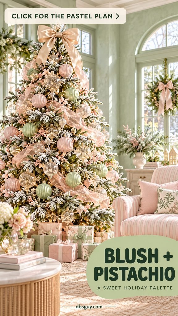
Choose shell pink and gently yellow-green pistachio, then add a small amount of pale champagne for reflection. Ribbed ornaments bring definition to these light colors. A pink ribbon and a champagne-toned bow topper connect the branches without adding another strong shade.
This combination suits a bright sitting room, a sunroom, or a small secondary tree. Keep the pink and green distributed throughout the tree rather than making separate halves. If your room already has mint walls, choose a pistachio with a slightly warmer undertone so the ornaments do not blend into the backdrop. White or cream ornaments can stretch the palette when you have only a few pastel pieces. Keep extra glitter restrained if you want the finish to stay soft.
18. Lilac, Icy Pink, and Silver
Lilac and icy pink are the cooler side of pastel Christmas decorating. Silver gives them a wintry edge, especially on a white tree.
Use a pale lavender ribbon with cool pink glass, lilac baubles, and a few silver stars. The colors should have a soft blue or purple undertone rather than a peach cast. A silver topper and small white lights keep the display connected.
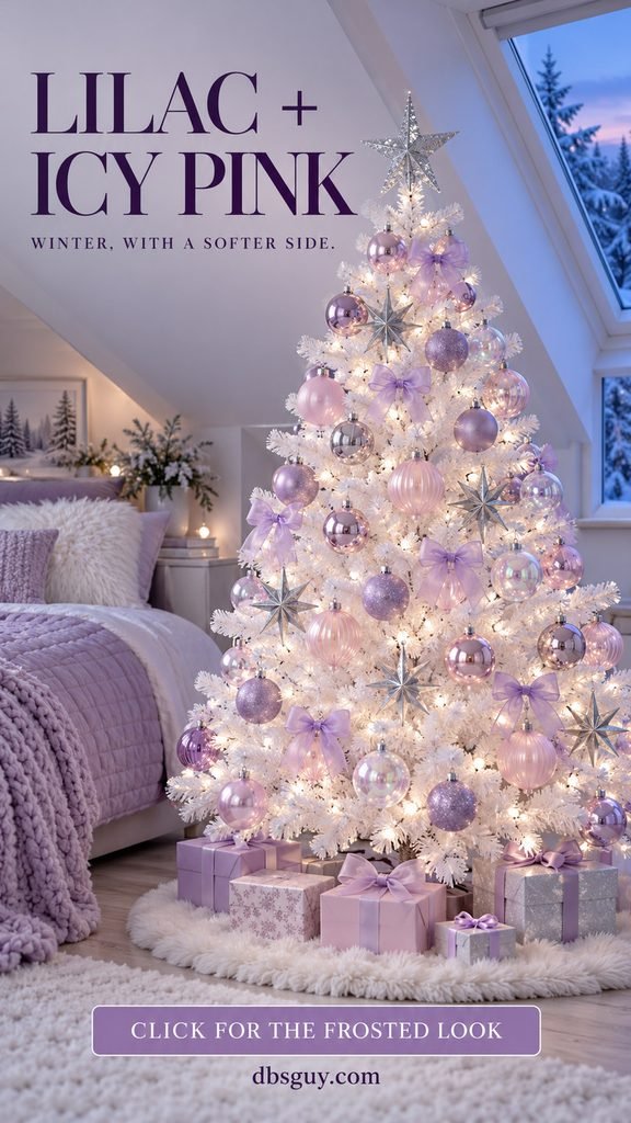
This is a lovely direction for a bedroom tree or a quiet corner with gray and lavender textiles. On white branches, vary the ornament finish so the outline stays visible: glossy pink, matte lilac, and brushed silver each catch light differently. If the tree looks too pale, deepen a few purple ornaments instead of adding black. On a green tree, use a little more silver and white ribbon to keep the same frosty mood. Clear ornaments can provide sparkle without adding another color.
19. Peppermint Red and White
Red and white become especially playful when stripes and peppermint shapes enter the mix. The green branches act as the backdrop, while the decorations stay within two main colors.
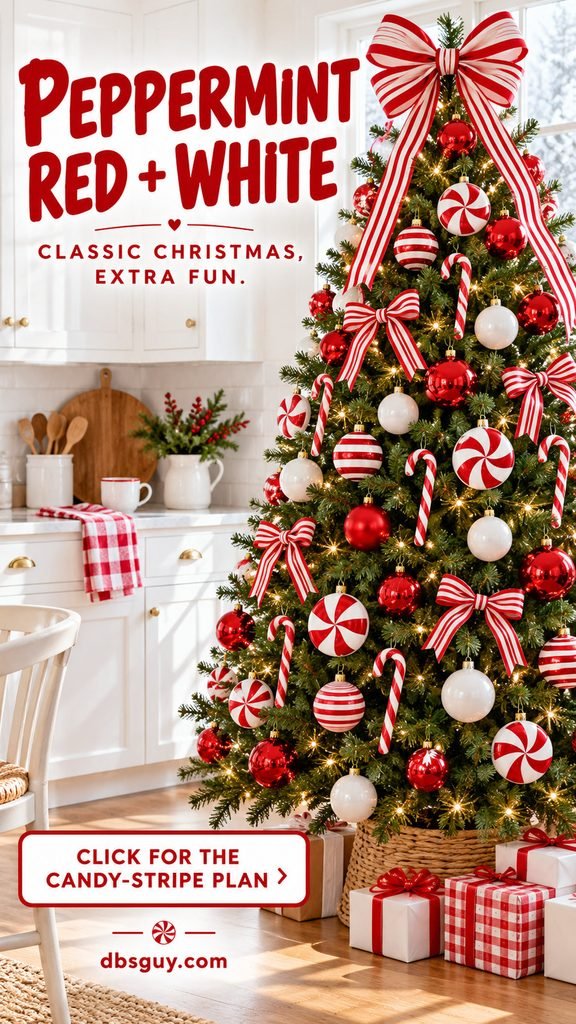
Choose one red-and-white striped ribbon, then combine plain red baubles, white rounds, and a few candy-cane or peppermint-disk ornaments. A striped bow at the top makes the theme clear without needing a novelty topper. This works well in a kitchen corner or a cheerful family space.
Patterns can dominate quickly. If the ribbon is broad and bold, keep many of the ornaments plain. If the novelty shapes are the focus, use smaller striped bows. Repeat the same red tone where you can; a mix of orange-red and pink-red may make the white stripes feel less crisp. Gift wrap can echo the pattern, but solid white packages are a useful pause beneath a busy tree.
Also Read: 23 Vintage Christmas Tree Decorating Ideas That Bring Back Childhood Christmas
20. Classic Red, Evergreen, and Gold
Red, green, and gold remain an easy choice when the family ornament box already contains several familiar colors. A coordinated arrangement can still leave room for the handmade pieces everyone wants to see.
Use true Christmas red as the visible accent, evergreen ornaments for depth, and gold for sparkle. Red bows establish a rhythm across the branches. A gold star gives the top a clear finish, while a woven collar or a red skirt can suit the room.

The green ornaments need a little attention on a green tree. Choose a different finish from the needles, then hang some close to the front where the lights catch them. Spread treasured ornaments through the display rather than placing them all in one cluster. If a keepsake introduces another color, give it some space and keep the repeated ribbon consistent. A tree can look intentional while still showing the things that make it yours.
21. Joyful Rainbow on a White Tree
A white tree gives bright ornaments a clean background. Cobalt blue, teal, red, fuchsia, and yellow can feel lively and organized when you repeat them across the branches.

Begin with a few ornament shapes in several colors. Repeated rounds help the eye follow the display even when the colors change. Small bows can echo those shades, and one simple topper keeps the outline clear. You can also use this approach to bring a mixed ornament collection together.
Distribute each color at the top, middle, and bottom instead of collecting all the yellow on one side or making strict rainbow bands. Step back and look for gaps in the color, not just gaps in the foliage. If it feels busy, simplify the shapes or remove a second ribbon pattern. A white skirt and plain packages give the lower part of the tree a little rest. On a green tree, slightly larger bright ornaments make the same colors easier to see.
Also Read: 21 Budget Christmas Tree Decorating Ideas That Make Affordable Ornaments Look Expensive
How to Choose a Palette That Works in Your Room
Start with the color you already enjoy seeing at home. A navy sofa gives navy and gold an easy connection. Pale wood and linen suggest sage or jade. A room full of family keepsakes may feel most comfortable with classic red, green, and gold—or a cheerful mixed palette.
Your tree base changes the effect too. Green branches provide a dark, natural backdrop. Flocking softens contrasts. White branches make pastel and bright colors easy to see. Black branches make reflective metal and vivid accents especially noticeable. You can adapt a palette to the tree you own; the images are starting points rather than shopping requirements.
For a simple trial, gather a ribbon sample and 10 ornaments. Try six in the main color, three in a supporting color, and one accent. This is just a styling exercise, not a decorating rule. A large bow may carry more visual weight than several small baubles, so judge the balance by looking at the tree rather than counting pieces.
Give Each Finish a Job
Matte and fabric ornaments supply clear color. Reflective metal gives the lights something to catch. Transparent glass adds delicacy. Using two or three finishes often creates more depth than buying several nearly identical shades.
Set up a small sample section first. Put a larger bauble a little inside the branches, a smaller accent nearer the tip, and a ribbon loop beside them. View it from the doorway, then check it after dark. Once that section feels right, repeat the relationship around the tree without copying the spacing exactly.
Also Read: How to Put Ribbon on a Christmas Tree: 7 Beautiful Styles for Beginners
Refresh What You Own Before Buying a Full Set
Sort your ornaments into broad color groups, then choose the palette that uses the largest useful group. A new ribbon can shift the mood of familiar gold ornaments toward burgundy, navy, jade, or cream. You may only need a few accent pieces to make the change visible.
Bring the same colors into the wrapping or tree skirt, but give the room some quiet space. The tree does not need matching decorations on every surface. If you are shopping before the holiday season, keep a photo of your sample cluster on your phone so you can compare undertones and avoid buying a near-match that looks different at home.
Christmas Tree Color Questions
What Is the Best Christmas Tree Color Scheme for 2026?
For a palette tied directly to the year’s color forecast, start with cool blue, jade, plum, wasabi, or persimmon. For an easy choice using familiar ornaments, burgundy and gold or classic red, green, and gold are practical options. The best result depends on your room, tree, and existing decorations; these ideas are not a popularity ranking.
How Many Colors Should I Use on a Christmas Tree?
Two main decoration colors and one accent are a manageable starting point. Treat the branches as the backdrop. A rainbow or keepsake tree can use more colors successfully if you repeat a few shapes, finishes, or ribbon details to connect them.
Can I Mix Gold and Silver Ornaments?
Yes. Choose one as the dominant metal and repeat the other in several places, rather than leaving a single silver ornament among many gold ones. Soft champagne and brushed silver can create a gentle mix. Remember that warm tree lights may make silver appear more golden at night.
Which Colors Look Best on a Flocked Christmas Tree?
Cool blue and silver, blush and pistachio, and soft ivory with champagne all work with a snowy backdrop. Burgundy, navy, or deep plum can also look striking because the white branch tips separate the darker ornaments. Keep the flocking visible so it remains part of the color story.
Should My Tree Match the Rest of My Christmas Decor?
It helps to repeat one color or material nearby, but an exact match is optional. Navy ribbon can connect to a blue sofa; a wooden tree ornament can echo an oak table. Repeating one thread usually feels more relaxed than matching every ornament, wreath, package, and pillow.
How Do I Make a Neutral Tree Look Festive?
Use contrast in texture and shape. Cream fabric bows, ribbed champagne baubles, pale wood stars, and a few reflective ornaments can give a neutral palette plenty of interest. Leave enough foliage visible to outline the pale decorations, and check the display with your room lights on before adding more pieces.
The most useful palette is the one you can picture beside your own sofa, curtains, and favorite ornaments. Choose a small cluster, check it in the room, and let that guide the rest of the tree.