Winter January Nail Colors by Skin Tone: Compare Cool, Warm and Neutral Shades

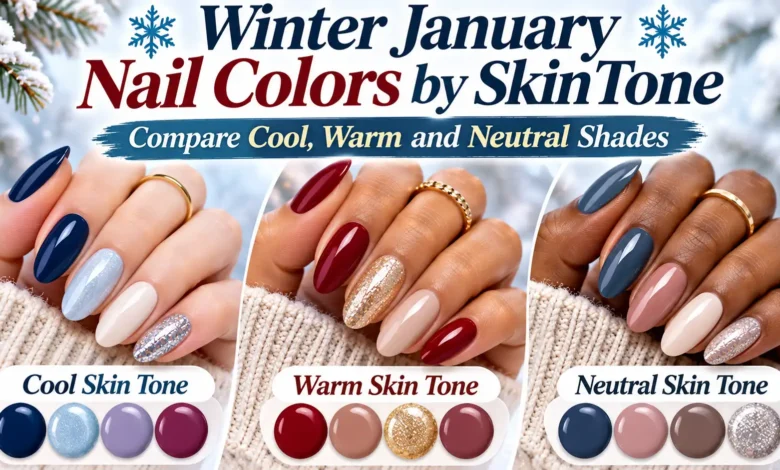
To choose winter January nail colors by skin tone, separate two decisions: which color direction you enjoy beside your skin, and how much contrast you want. Dusty rose, lilac taupe, icy blue, and blue-based berry make a cool starting palette. Creamy ivory, caramel, cocoa, and brick red offer a warmer direction. Balanced beige, rose taupe, gray-brown, and oxblood are useful middle-ground comparisons.
Your skin depth does not assign you an undertone. Fair skin can lean warm, and deep skin can lean cool. Use the palettes below to choose two finished swatches to compare against your own fingers, rather than looking for a color your skin is supposedly allowed to wear.
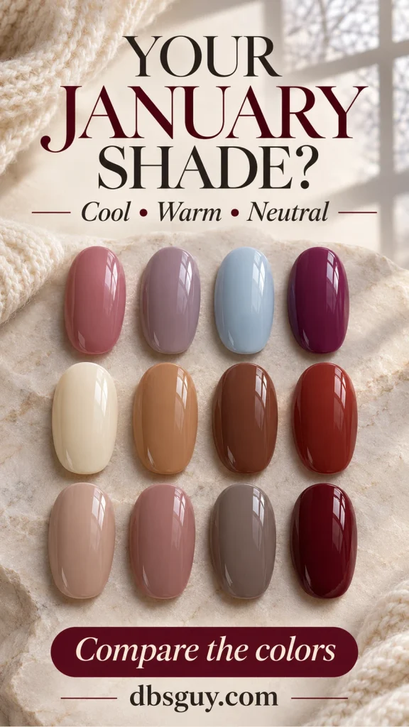
The visuals are AI-generated color concepts, not salon photographs or product swatches. They illustrate shade relationships; confirm the actual polish, coverage, and finish in person. The mixed-color hands show palette comparisons, so you can choose one shade for a full set.
Skin depth, undertone, and polish temperature are different
Skin depth describes how light or deep your skin appears. Undertone describes its underlying color direction: cool can have pink, red, or bluish notes; warm can have golden, yellow, or peach notes; neutral describes a balance of warm and cool.
A polish has its own color direction, too. A rosy beige and a caramel beige may be equally light, yet look quite different beside the same hand. Likewise, a berry red can lean cooler than a rusty brick red without being lighter.
You do not need to settle your undertone before choosing a manicure. Vein color and jewelry preferences are clues, not a reason to reject a shade you like. If the label remains unclear, compare a cool and warm version of the same color at a similar depth. That keeps the decision focused on what you can actually see.
Also, January is a calendar season here. You do not need a personal color-analysis label such as “True Winter” to use this guide.
A quick comparison of cool, warm, and neutral January shades
These are editorial starting points for a winter palette, not rules about which colors suit a particular complexion. Shade names vary between brands; judge the finished sample.
| Color direction | Soft starting point | Deeper option | Compare for |
|---|---|---|---|
| Cool | Dusty rose or lilac taupe | Blue-based berry | Rosy or violet notes versus peach or orange |
| Warm | Creamy ivory or caramel beige | Warm cocoa or brick red | Golden or earthy notes versus pink or gray |
| Neutral / balanced | Balanced beige or rose taupe | Gray-brown or oxblood | A middle ground between strongly warm and cool samples |
“Neutral” has two meanings in nail color: a beige or brown can act as a wardrobe neutral, while a balanced undertone sits between warm and cool. A caramel beige is a neutral color in the first sense but still looks warm. A bottle called “nude” is not automatically a skin match.
Cool January nail colors: rose, lilac, ice blue, and berry
Start here if you want a rosy, smoky, or icy color direction. Keep the finish glossy and the artwork out of the first comparison; it is easier to judge the shade when a reflective topper is not changing it.
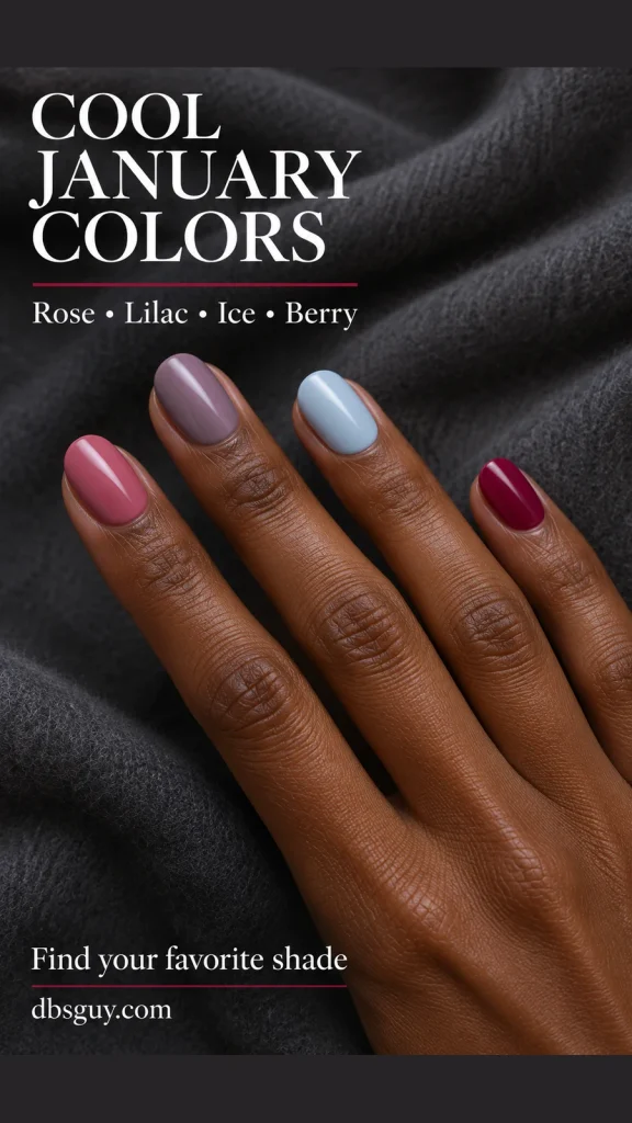
- Dusty rose: choose a muted pink with a rosy rather than peachy base. It is the softer choice in this palette when you want visible color without a white-based pastel. Compare a deeper rose if the first sample feels too pale.
- Lilac taupe: look for gray-brown softened by a violet note. It gives a familiar taupe a cooler edge. If it reads more gray than you enjoy, move toward the dusty rose rather than choosing another nearly identical gray.
- Icy blue: choose this when you want a clearly wintry color instead of a nude. Hold it beside a white sample to see how much blue remains visible. An opaque pale blue will give a different effect from a transparent blue tint.
- Blue-based berry: compare a red-purple berry with a brick red at roughly the same depth. Choose berry if you prefer the cooler red direction. Check it away from the brightest salon light so you can see whether it still reads berry or looks almost black.
For a full manicure, pick one of the four shades. The cool palette is shown on deep skin to demonstrate that cool polish is not reserved for fair hands; the image does not diagnose the model’s undertone.
Salon request: “Please show me a dusty rose and a lilac taupe with similar coverage. I want to compare the pink and violet notes beside my hand, then choose one glossy shade for short oval nails.”
Also Read: 17 Light Blue January Nail Ideas for a Frosty, Airy Finish
Warm January nail colors: ivory, caramel, cocoa, and brick
A warm winter palette can be light and creamy or deep and earthy. It does not have to mean orange polish. In this comparison, the distinction is the golden or reddish-brown character of the color.

Creamy ivory is the lightest option. Compare it with a pink-based milky shade if you want to decide between a warmer cream and a rosy white. If the ivory looks more yellow than you intended, choose a less yellow sample; you do not need to abandon light polish altogether.
Caramel beige gives you more brown and golden color than ivory. It can be a noticeable tan shade on fair skin and a lighter contrast on deeper skin. If your goal is a close tonal match, check the depth against your fingers rather than choosing caramel simply because it is labeled nude.
Warm cocoa is the brown to compare when gray-brown looks too smoky for your taste. Look for an earthy brown with a warm cast, and check that the finished sample still shows the brown you want under ordinary room lighting.
Brick red introduces a rusty or earthy note instead of berry’s violet direction. Put the two reds side by side: choosing between them is more useful than deciding whether all red polish is warm or cool. The reference uses a muted brick rather than a bright orange-red.
The warm palette appears on fair skin because warmth and depth are separate choices. Borrow the color even if you prefer an oval outline to the short squoval nails shown.
Also Read: January Dip Nail Colors for Winter: Soft Neutrals and Rich Jewel Tones
Neutral January nail colors: compare the balance, then the depth
If you like both warm and cool shades, a balanced palette gives you a useful place to begin. Neutral undertones do not make every bottle interchangeable. A very yellow beige, pale gray, and dark red will still create different effects.
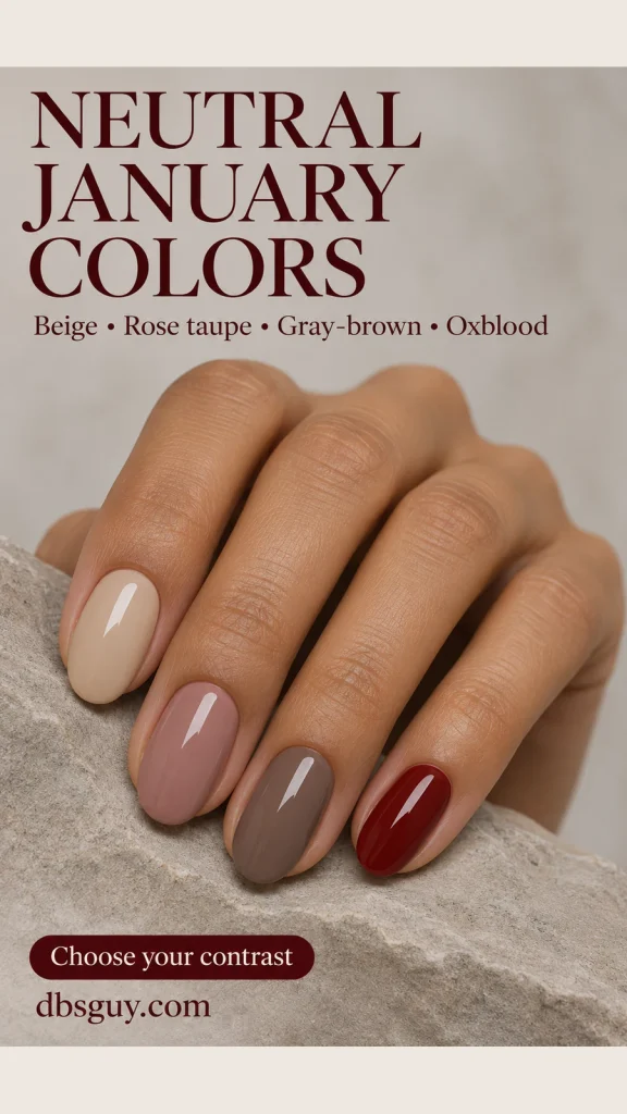
In this palette, balanced beige means a beige that does not look strongly pink, yellow, or orange beside the other samples. Rose taupe adds a muted rosy note without becoming a clear pink. Compare those two first if you want an everyday shade: beige puts the emphasis on cream and brown, while rose taupe makes the pink more noticeable.
Gray-brown gives you a smokier, deeper neutral. It is useful if pale beige feels too close to your skin but a rich red feels like a bigger change than you want. Check the balance against your hand; some gray-browns lean violet, while others lean earthy.
Oxblood is the dark red-brown option shown here. It is not a standardized neutral shade, and some versions lean warmer or cooler than others. Compare it with the berry and brick samples, then choose the one whose red direction you prefer.
For more context, OPI’s guide to nude and brown nail polish discusses both undertone and contrast. A neutral manicure can blend with your skin or stand apart from it; decide which result you want before looking for a match.
Also Read: January Nail Art for Square Nails: Crisp Edges, Fine Lines and Tiny Accents
Adjust the contrast for fair, medium, tan, and deep skin
Once you like a color direction, compare its lightness with your hand. A pale polish is not automatically subtle, and a dark polish is not automatically dramatic. The amount of separation from your skin changes the effect.
Fair and light skin
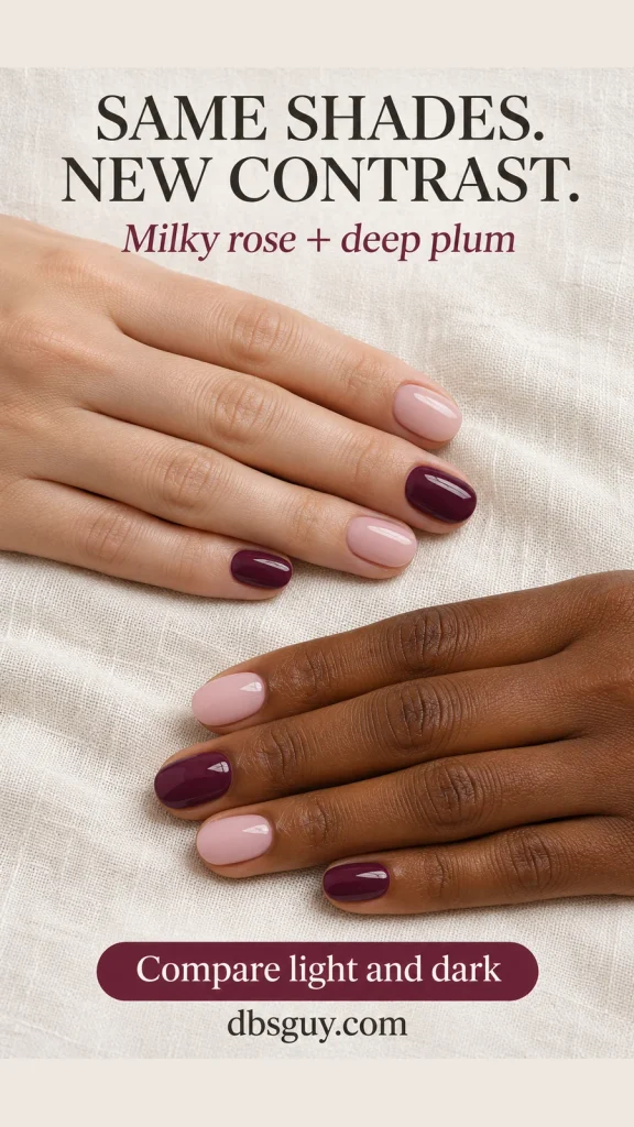
A light rose or beige can sit close to the surrounding skin for a quieter look. Deep plum or oxblood creates more obvious separation. If a light sample seems to disappear more than you want, compare a slightly deeper version before switching to a completely different color family.
Medium and tan skin
Mid-depth shades such as rose taupe or caramel may give a more tonal effect, depending on your own coloring. Ivory and icy blue offer a lighter contrast; berry and oxblood offer a darker one. Set a light and a dark sample beside the same finger to decide which direction feels right.
Brown and deep skin
A pale milky rose or ivory can be a clear, deliberate contrast. A deeper cocoa, gray-brown, or red-brown may sit closer in depth, though the exact result depends on both the polish and your skin. If you want a tonal manicure, compare several brown depths instead of assuming the darkest bottle will match.
If your skin has an olive cast
Use the same comparison method rather than automatically choosing a yellow beige. Put rose taupe beside caramel, then compare gray-brown with warm cocoa. If one sample makes the combination look too yellow, pink, or gray for your taste, try the other direction. Olive coloring does not require you to skip either palette.
The two-hand reference uses milky rose and deep plum on both skin depths. It shows why a shade can feel soft on one hand and more graphic on another. The model’s skin is a contrast reference, not a substitute for checking your own.
Also Read: January Nails: How to Choose Your First Manicure of the Year
How to compare your final two shades before a manicure
- Choose the effect first. Decide whether you want the polish to sit close to your skin or stand out. Then shortlist two colors instead of comparing a whole display at once.
- Keep coverage and finish comparable. A sheer rose and an opaque beige differ in more than undertone. Ask to see finished samples with the coverage and glossy finish you actually want.
- Hold both beside the same fingers. Check near a window in indirect daylight, then in ordinary indoor light. Include a sweater sleeve you wear often. For nail polish, the view beside your fingers is more relevant than a foundation match on your face.
- Check the actual product. Confirm the shade is available in the service you are booking. A regular lacquer, gel, dip powder, and press-on with a similar name need not look identical.
- Describe the difference you care about. Say “less peach,” “more rosy,” “a clearer berry,” or “lighter than this cocoa.” If a sheer shade is your finalist, ask how it will look over your own natural nail.
A useful appointment note is: “I want one glossy color on short oval nails, with a little contrast against my skin. Please compare this rose taupe with a slightly deeper version before we begin.” A reference image helps explain the direction; the finished swatch settles the shade.
January nail color questions
Can warm skin wear icy blue January nails?
Yes. Choose icy blue if you enjoy its cool contrast. Compare an opaque white-based blue with a softer, grayer blue to see which effect you prefer. Matching the polish’s temperature to your undertone is one styling option, not a requirement.
Is milky white a nude on every skin tone?
No. Milky white describes a pale color and soft-looking coverage, not a universal skin match. It may sit close to very light skin and create much stronger contrast on deep skin. Both are valid looks; decide whether you want brightness or a closer tonal effect.
What if I cannot decide whether my undertone is cool or neutral?
Skip the label for this appointment. Compare dusty rose with rose taupe at similar coverage, then choose the one you prefer beside your hand. You can make a useful color decision without completing a personal color analysis.
Does choosing a flattering shade mean I need longer nails?
No. The palette references use short nails so you can judge the color without needing extensions. Keep a length and shape you already find comfortable, then choose the amount of contrast you enjoy seeing every day.