Choose the shape around the room’s job: a petal pendant can anchor a dining table, a paper cloud can soften a living room, and a pleated bedside shade can leave more space on a nightstand. The best statement pendant lights look interesting when switched off and deliver comfortable light when switched on.
These 12 picks are design directions to shop for, with room pairings and practical checks. The images illustrate concepts rather than exact retail products, so use the search terms to find a fixture with verified dimensions, specifications, and installation instructions.
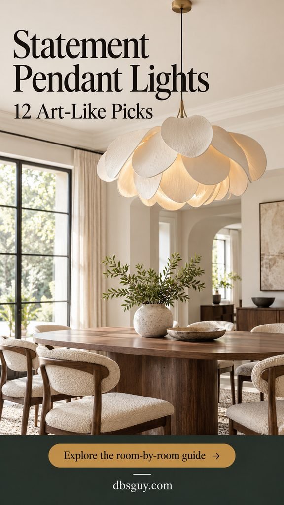
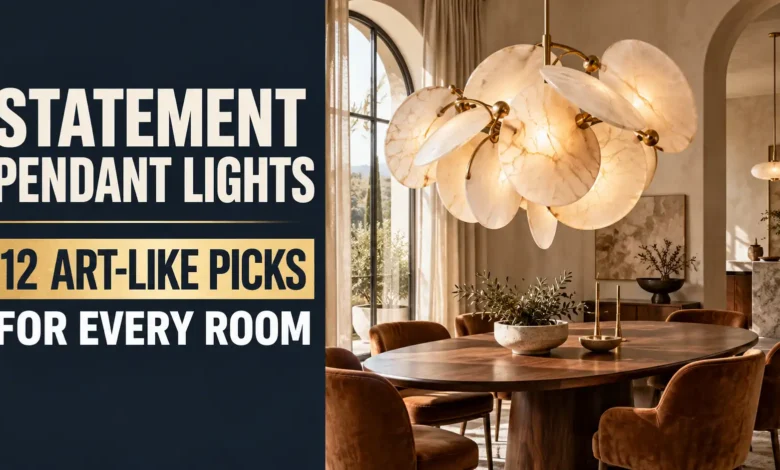
1. An Ivory Petal Pendant for the Dining Room
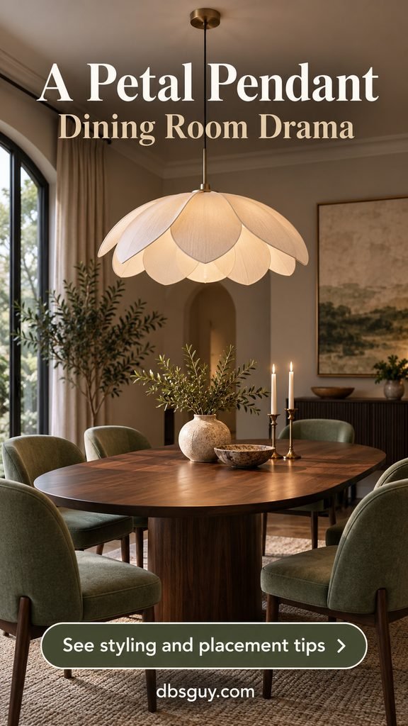
Overlapping petals give a pendant the presence of a small sculpture. An ivory finish keeps the shape readable without introducing another strong color, especially above a walnut or oak table. This is a good pick when the furniture is simple and you want the ceiling to carry the personality.
Center it over the table’s final position, even if that is slightly off the room’s center. A broad, shallow petal shape usually feels less intrusive than a tall shade of the same width. Keep the centerpiece low so guests can see the fixture and one another.
Shop for: “petal pendant” or “sculptural floral pendant.” Check whether the petals are opaque or translucent and whether a lower diffuser conceals the bulb. A beautiful silhouette does not tell you how comfortably it lights a meal.
2. A Paper Cloud Pendant for a Calm Living Room
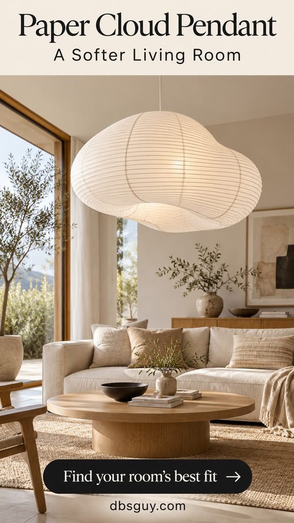
A softly rounded paper lantern brings volume without the visual density of metal. In a room with a low sofa, linen cushions, and pale wood, its ribbed surface gives the eye something interesting to rest on. It is an especially easy companion to these Japandi living room ideas.
Place it above the coffee-table zone if the layout and ceiling allow, with its lowest point clear of anyone standing or crossing the room. If the ceiling is low, choose a flattened lantern and a short suspension rather than forcing a long drop.
Look beyond the shade: Some listings sell only the paper shell. Confirm that the compatible socket, cord, and canopy are included or available separately. Follow the shade maker’s bulb and clearance limits; paper is a decorative material, not permission to improvise the electrical assembly.
3. An Amber Glass Droplet for the Breakfast Nook
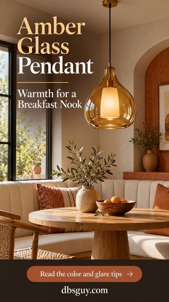
Amber glass makes a small nook feel collected rather than furnished from one matching set. Choose an organic droplet or gently uneven globe, then repeat the warm color once in a cushion, bowl, or terracotta vase. A single pendant over a round table can be enough visual punctuation.
Notice what the glass looks like both lit and unlit. Its tint can change the appearance of the light, and a transparent shade can expose a bright bulb directly to seated eyes. An opal inner diffuser, as in this concept, helps hide the source.
Before buying: Ask for a lit photo and a view from underneath. Measure the widest part of the glass, not just the neck. Avoid hanging the shade so low that it interrupts the view across the banquette.
4. A Branching Linear Pendant for the Kitchen Island
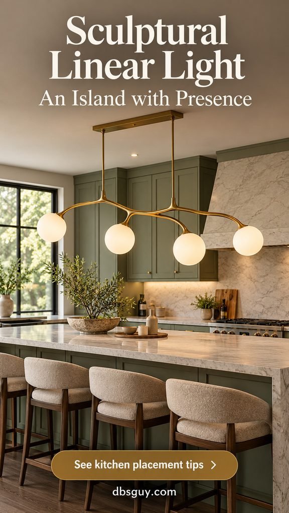
A brass branch with opal globes stretches the statement along an island rather than concentrating it in one bulky shade. It suits a long work surface and an open kitchen where several unrelated pendants would add visual clutter. The brass-and-green combination also fits these sage green kitchen design ideas.
Choose the fixture’s overall span against the usable counter length and check the outermost globes against cabinet doors, stools, and nearby walkways. One canopy can simplify the composition, but relocating a ceiling connection still needs planning.
Keep the light useful: A decorative branch may illuminate its own globes more effectively than the counter. Check delivered light output and distribution, and keep under-cabinet or other task lighting for preparation areas. Ask the installer to test glare from both the standing and seated sides before setting the final drop.
5. A Pleated Pendant Beside the Bed
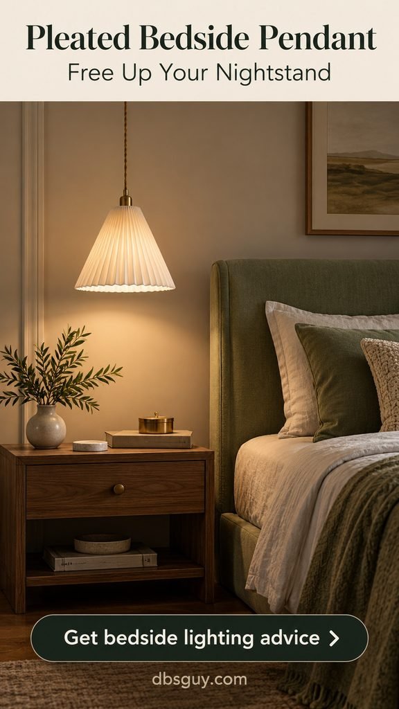
A small pleated fabric pendant can free space for a book and water glass on a narrow nightstand. The folds add a tailored detail that looks good against an upholstered headboard. Ivory fabric is an easy choice with muted green walls or a calming sage green bedroom palette.
Position it over the nightstand rather than over the pillow or the route into bed. Try the proposed height while sitting upright, reaching for the bedside surface, and getting out of bed. Your sightline matters more than a universal bedside measurement.
Plan the switch first: A bedside fixture is frustrating if its only control is across the room. Arrange a reachable switch or suitable control, and add an adjustable reading light if the pendant’s glow is too diffuse for a page. For a plug-in design, follow its mounting instructions and manage the cord securely.
6. A Ceramic Cone for a Reading Corner
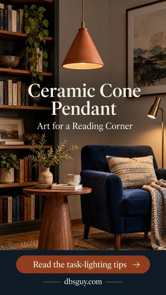
A terracotta ceramic cone reads like pottery suspended in the air. Its opaque walls and downward opening make it a different choice from a lantern: the shape is solid, and the light is more directional. A navy chair and a little wood furniture give the warm clay color a clear setting.
Hang it over the side table, away from the chair’s standing path. In this concept a separate reading lamp handles the page; the pendant gives the corner its atmosphere. For layout options, borrow from these small-space reading nook ideas.
Ask the maker: How wide is the opening, how heavy is the complete fixture, and what bulb will fit? Ceramic can be substantial. Confirm appropriate ceiling support and avoid assuming that a narrow cone will light the whole nook.
7. An Open Geometric Pendant for the Entry

An angular black frame draws a crisp outline against pale walls. Because you can see through it, the fixture can feel spacious even with a substantial silhouette. Use it in an entry with enough height to appreciate the geometry, then keep the console styling simple.
An opal globe inside the frame, rather than an exposed bright bulb, makes the view from below more comfortable. Check the entry from the front door and from the adjacent room: the pendant should frame those views without obscuring them.
The practical test: Include the fixture’s full height, chain, canopy, and minimum suspension when calculating clearance. Check door swings and the tallest person who uses the space. If a pendant cannot fit safely, choose a shallow version of the same geometric language.
8. A Wood Ribbon Pendant for the Home Office
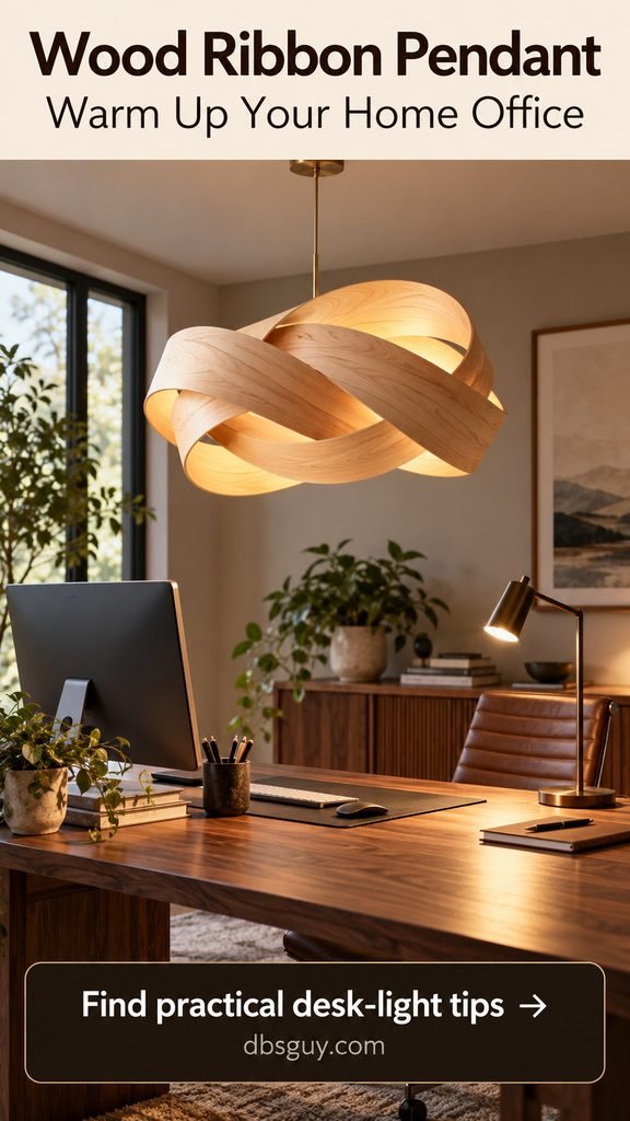
Curving wood-veneer strips look like a suspended drawing. Birch or pale oak tones soften an office with a dark desk, black monitor, and straight-edged storage. This is a useful pick when the room feels functional but lacks a tactile detail.
Position the pendant where it contributes ambient light without appearing as a bright reflection in the monitor. Keep a desk lamp for papers and detailed work. Check the lighting after sunset, when window light no longer masks shadows or glare.
Compare construction: Look for a finished, purpose-built luminaire, not a decorative wood shell combined with an arbitrary bulb. Ask about the diffuser, recommended cleaning, bulb access, and suspension adjustment. A very intricate ribbon can look wonderful but be awkward to dust above a working desk.
9. An Opal Globe Cluster for the Stairwell
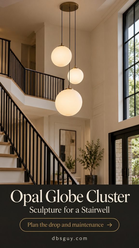
Three staggered opal globes make an airy vertical composition in a double-height stairwell. Here the drama comes from the rhythm of the drops, not a complicated shade. A shared canopy keeps the grouping coherent while the globes occupy different levels.
Keep the cluster in the open void, away from steps, landings, and railings. Check it from every level before deciding the lowest drop. A fixture that looks perfectly placed from downstairs can block a view or become reachable from an upper landing.
Budget for access: Ask how bulbs, drivers, and globes will be reached for replacement and cleaning. Confirm maximum cord length and whether the drops are adjustable independently. High-ceiling installations often cost more to service; the fixture price alone is an incomplete budget.
10. A Fluted Glass Pendant for the Powder Room
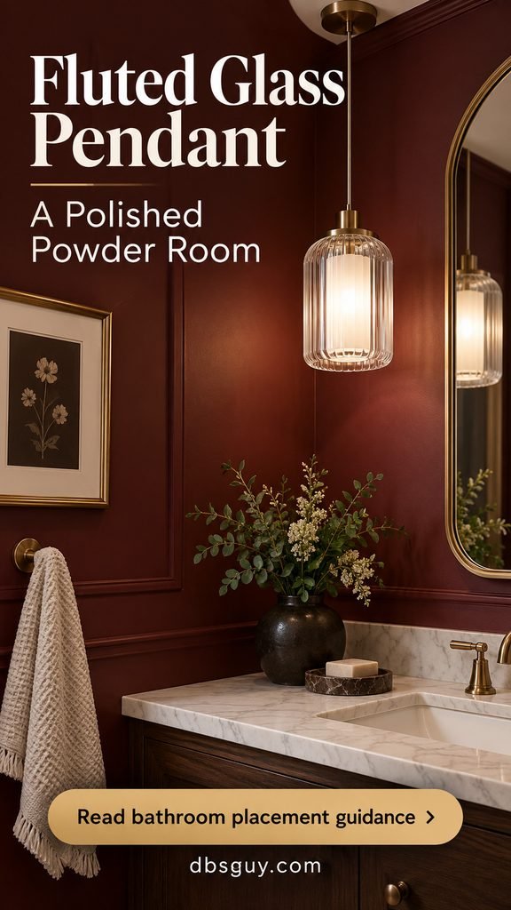
Fluted glass catches light in narrow vertical lines, giving a small powder room a polished detail. Beside a mirror, a compact pendant can balance a dark wall without covering much of the reflection. The pictured opal inner diffuser gives the glass a quieter glow.
Place it above the dry end of the vanity with enough room for normal movement and mirror use. A single side pendant is decorative; add suitable mirror lighting if it leaves one side of the face in shadow. For a room that lacks daylight, see these windowless bathroom ideas.
Choose by rating, not appearance: Have an electrician confirm the fixture’s suitability, location rating, and local bathroom requirements. A powder room and a bathroom with a shower can call for different conditions. Do not use this image as a mounting plan for a tub or shower area.
11. A Woven Wave Pendant for the Sunroom
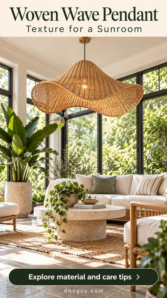
A wave-shaped rattan shade adds movement to an enclosed sunroom with simple lounge seating. The woven texture is the feature, so let the nearby upholstery stay mostly solid. Greenery and tile make the room feel relaxed without needing a matching set of wicker furniture.
Choose a fixture intended for the room’s actual conditions. A dry enclosed sunroom, a humid covered porch, and a space exposed to rain are different environments. Natural-looking material alone says nothing about a fixture’s moisture rating.
Keep maintenance realistic: An open weave can cast patterned shadows, which are attractive for lounging but distracting for puzzles or reading. Add focused light where needed and follow the maker’s cleaning instructions. Consider how sunlight reaches the shade and ask about finish care before hanging it beside a bright window.
12. A Colored Metal Dome for the Laundry Room

A sculptural dome in muted cobalt turns a folding counter into a considered part of the house. Its shallow profile is useful where a tall fixture would feel cumbersome. Let the shade be the only strong color against white cabinets and pale counters.
Keep the pendant high enough for folding, sorting, and carrying baskets. Locate it away from cabinet doors and appliance access. Because an opaque dome concentrates light downward, check the rest of the room for shadows rather than expecting this single fixture to cover every task.
Buy for daily use: Look for an easy-to-clean finish and straightforward bulb or driver access. If the room also serves as a mudroom or sink area, confirm the appropriate rating. A color statement should make the room more enjoyable without making chores harder.
Get the Size, Drop, and Light Right Before You Order
Start with the ceiling height, the furniture underneath, and the routes people use. Tape out the fixture’s widest dimensions or hold a cardboard silhouette at the proposed height. Check from the doorway, from a seat, and while standing nearby. An open frame and a solid shade can feel very different at the same diameter.
For a kitchen island, Visual Comfort recommends a 30–36-inch distance above the surface. Treat that as a starting range, then account for the fixture, ceiling, glare, and users. Measure to the lowest part of the light, not the canopy. Dining tables also need a seated sightline check; walking routes require their own clearance assessment.
- Separate brightness from warmth. Lumens describe light output; kelvin describes the light’s color appearance. A warmer color is not automatically a dimmer light.
- Choose a comfortable color. For living and dining areas, 2700–3000 K is a useful warm starting range; Philips Hue’s pendant guide also distinguishes warmer ambient light from cooler task-light options.
- Check color rendering. For art, fabrics, and paint colors, look for good color fidelity. The Department of Energy explains that CRI 90 or higher indicates excellent color fidelity, while noting that CRI has limitations.
- Verify the complete installation. Confirm weight, ceiling support, electrical listing appropriate to your market, location rating, maximum and minimum drop, sloped-ceiling compatibility, and bulb or driver access. Use a qualified electrician for hardwiring and any necessary changes.
- Confirm dimming compatibility. “LED” does not mean every bulb, fixture, driver, and wall dimmer will work together. Check the actual model’s specifications.
Compare the total cost: fixture, bulbs or driver, installation, ceiling repair if needed, and future access. In an open-plan home, choose one visual lead and let nearby fixtures share a finish or shape without competing. Before fall and winter gatherings, test the room after dark so the pendant works with the rest of the lighting, not just with daylight.
Frequently Asked Questions
Can a small room have a statement pendant?
Yes. Choose one strong shape and size it against the furniture and available clearance. A broad but shallow paper lantern can feel lighter than a smaller solid metal shade. Check its full dimensions in the room rather than relying on a product photograph.
Do pendant lights need to match throughout the house?
They do not. In rooms visible together, repeating one finish, curve, or shade material can create continuity. Separate rooms can have distinct personalities. Keep the most expressive fixture where you want the eye to settle.
Can one pendant light the whole room?
Sometimes, but the shade and distribution matter as much as total output. A ceramic cone may light the surface below while leaving the walls dim. Plan ambient, task, and accent light around the room’s activities, especially for offices, kitchens, and reading areas.
What should I choose for a low ceiling?
Look for a shallow shade and a short permitted suspension. Compare the fixture’s minimum overall height with the clearance you actually have. If there is not enough space for a hanging light, a sculptural flush or semi-flush fixture can deliver a similar effect.
Are these exact lights available to buy?
The illustrations are AI-generated concepts, so their exact forms are not guaranteed retail items. Shop using the style terms in each section, then check the real product’s measurements, lighting performance, and instructions. Choose the room first, shortlist one or two shapes, and measure before ordering.