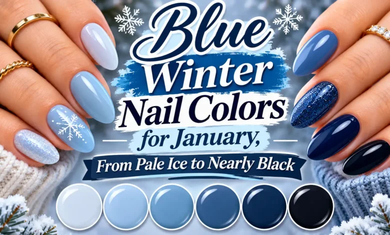
For blue winter nail colors in January, start with how light or dark you want your manicure to look. Pale ice blue gives you an almost-white finish; powder blue adds more obvious color. Slate and denim sit in the muted middle, cobalt brings brightness, and midnight navy or blue-black takes the look into darker territory.
The distinction that matters most at the dark end is simple: do you want people to see blue, or do you want an almost-black manicure that reveals blue when the light catches it? These seven shades help you make that choice before you pick a bottle or book an appointment.
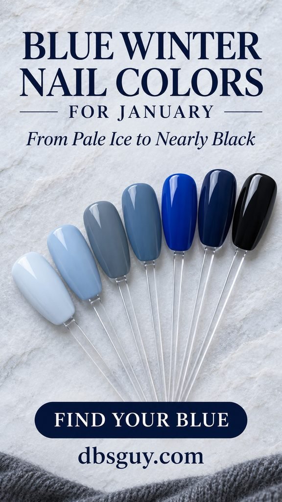
The visuals are AI-generated color concepts for dbsguy.com, not photographs of completed salon services or product swatches. Use them to explain the look, then choose from a physical polish sample.
Find Your Starting Shade
- You want a light winter manicure: compare pale ice with powder blue. Ice is closer to white; powder reads more clearly blue.
- You usually wear neutrals: try slate blue-gray for a smoky look, or denim for a little more color.
- You want the manicure to stand out: choose cobalt. Its brightness does the work without added artwork.
- You like dark polish: compare midnight navy with blue-black in the room where you will usually see your hands.
These are descriptive color families, not standardized shade names. One brand’s “ice” may resemble another brand’s “powder,” so judge the painted sample rather than the name.
1. Pale Ice Blue: Almost White With a Cool Tint
Pale ice blue is the lightest option here. Look for a white-based blue that seems softly tinted rather than bright sky blue. On short oval nails, an opaque glossy finish gives the color a clear outline without needing snowflakes, glitter, or a contrasting tip.

Compare the swatch against something white before you commit. If it disappears into the white, you may prefer a slightly bluer sample; if it looks too stark against your hand, try a softer, less white-heavy blue. A sheer blue will give a different result because the natural nail shows through. Ask for opaque coverage if you want the look pictured.
Useful salon wording: “A very pale, white-based ice blue on short oval nails, glossy and opaque, with no pearl or glitter.”
2. Powder Blue: A Pastel That Clearly Reads Blue
Powder blue moves one step away from white. It has enough color to remain visibly blue beside a cream sweater or white shirt, but it still gives you a light manicure. The reference pairs it with short, softly squared nails and rounded corners.

Choose a cream finish if the pastel itself is what you like. Pearl, shimmer, and translucent formulas can carry similar names while producing a different surface or level of coverage. Ask to see the finished sample with its top coat, rather than assuming every baby-blue bottle will look alike.
This is a useful choice when you want light nails without the near-white effect of ice blue. If you decide you want a small detail after choosing the shade, explore these light blue January nail ideas for ways to use that lighter palette.
3. Slate Blue-Gray: The Muted Choice
Slate blue-gray is worth comparing if bright blue feels like too much of a departure from your usual taupe or gray manicure. Its gray cast reduces the intensity of the blue, so the result feels smoky rather than pastel or electric.

Keep an eye on the undertone: some blue-grays lean toward lavender, while others look more charcoal. Ask to compare a gray-leaning blue with a purple-leaning one side by side. That comparison is more useful than asking for “something muted” without a reference.
For a named color reference, OPI describes Less is Norse as a slate blue-gray. It is a starting point for discussing the color family, not a claim that the generated image shows that polish. For the pictured direction, request a medium smoky blue-gray cream with a glossy finish.
4. Denim Blue: The Everyday Middle Shade
Denim blue keeps more visible blue than slate while avoiding cobalt’s intensity. Think of the muted blue in worn jeans rather than the near-black indigo of a new dark pair. It works well as a middle option when neither pale pastels nor very dark polish is what you want.
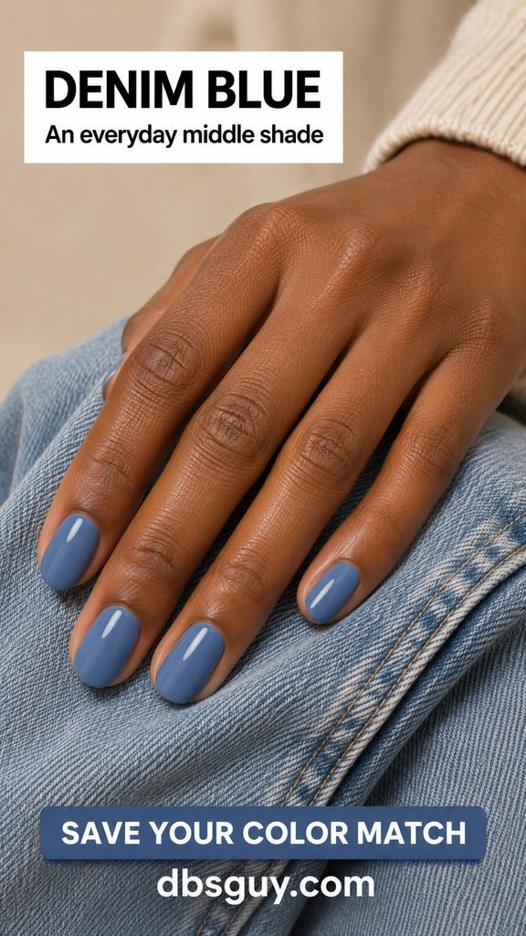
The main thing to check is depth. A bottle labeled denim might contain anything from a dusty medium blue to a deep inky shade. Show your artist where you want it to sit between the slate and navy references. If your first sample looks too gray, ask for more visible blue at a similar depth.
Wear it as a single color on short oval nails to keep the reference easy to interpret. There is no need to recreate fabric texture; “denim” describes the color direction here.
5. Cobalt Blue: Clear, Saturated Color
Cobalt is the brightest blue in this group. It is deeper and more saturated than powder blue, but it has more visual intensity than denim or navy. This is the shade to compare when you want your manicure to supply a strong accent against charcoal, cream, or black clothing.

Look at the color away from a phone screen before settling on it. A vivid blue can appear more purple or more turquoise in a photograph than it does beside your hand. Tell your artist whether you want a clear blue, a violet-leaning blue, or a greener blue instead of treating those results as interchangeable.
For this reference, ask for saturated cobalt cream with a glossy finish on softly squared nails. You can keep your usual length; the strong color does not depend on a long extension.
6. Midnight Navy: Dark, With Blue Still Visible
Midnight navy is for a dark manicure whose blue color remains part of the look. The pictured shade reads deep blue across the nail surface, rather than revealing blue only in a narrow reflection. A glossy cream finish keeps that distinction easy to see in the reference.
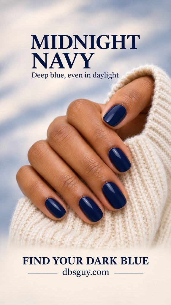
Take the painted sample away from the salon’s brightest task lamp. If it looks black in ordinary room light and you wanted obvious navy, compare a slightly lighter or more saturated blue. There is no universal cutoff between navy and blue-black; the useful test is whether you can see the amount of blue you want.
What to request: “Deep navy with blue still visible in normal indoor light, a glossy cream finish, and no shimmer.” Ask for a sample with the intended coverage, since a thin streak of polish may not represent the completed manicure.
7. Blue-Black: Nearly Black, With a Blue Undertone
Blue-black is the deepest option here. At a glance, the manicure can look black; the blue is a quieter undertone that becomes easier to notice in brighter or cooler light. Choose it because you enjoy that nearly black effect, rather than expecting it to look like cobalt after sunset.

Essie’s After School Boy Blazer, which the brand describes as blue-black with a cream finish, is a useful named reference for this end of the spectrum. The concept image illustrates the color direction rather than an exact product match.
Before choosing, hold a blue-black sample beside a navy one. If they look equally black in your usual lighting, choose the navy only if its brighter-light appearance is the one you prefer. For the pictured look, request nearly black blue with a glossy surface on oval nails, without metallic particles.
Check the Sample Before You Commit
Narrow your choice to two shades, then compare them under the same conditions. A few specific checks make the decision easier:
- Use a painted sample. The color through a bottle is not the same view as a finished nail. Ask for the intended coverage and top coat on a sample tip or nail.
- Look in two kinds of light. Compare indirect daylight with normal indoor lighting. Pay particular attention to whether a dark blue becomes indistinguishable from black.
- Bring the color beside your hand. Judge the contrast you enjoy. Pale blue, cobalt, and navy are not reserved for particular skin tones.
- Confirm the finish. Cream means color without reflective shimmer particles; glossy describes the shiny surface. A cream color can also be finished matte, so specify both the color and the surface you want.
Once you choose, save the shade name, product line, and finish. A similar name in another formula is not automatically an identical match. For application, coverage, drying, or curing, follow that product’s directions rather than using a timing estimate from an inspiration image.
Questions About January Blue Nail Colors
What is the difference between ice blue and powder blue?
In this guide, ice blue is the near-white shade with a cool blue tint, while powder blue is a more visible pastel blue. Brands use those names differently, so compare their finished swatches instead of relying on the label.
Which blue should I choose for very short nails?
Start with the effect you want: powder blue for a light, visible color; slate for a muted manicure; or navy for a dark outline. A solid shade does not require room for artwork, so you can choose any of the seven at the length you already find comfortable.
Why does my navy polish look black indoors?
A very dark blue can be difficult to distinguish from black in low light. Compare the finished sample in the lighting where you will usually wear it. If the distinction matters to you, move toward a lighter or clearer blue rather than relying on glossy reflections alone.
Can I get these colors without gel?
These are color directions, not gel-only effects. You can look for comparable shades in regular nail polish or ask which options your salon carries in your preferred service. A glossy appearance alone does not identify the formula, and the images do not demonstrate a particular product’s wear time.
If you are still between two colors, let one question settle it: do you want lightness, muted color, brightness, or depth? Choose the sample that gives you that effect in ordinary light. That is a more useful match than trying to duplicate every reflection in a saved image.