15 New Year’s Aesthetic Ideas for Party Mood Boards and January Inspiration


Choose a New Year’s aesthetic by deciding what you want to carry into the room: the sparkle of a late party, the warmth of a small dinner, or the quieter feeling of a January morning. Then repeat a small palette across your lighting, materials, and paper details. You do not need to redecorate the whole house.
These 15 New Year’s aesthetic ideas give you distinct directions for a party mood board or January inspiration board. Each includes a palette, specific references to collect, and a manageable way to try the look.

The visuals are AI-generated styling concepts created for dbsguy.com. They illustrate the suggested looks rather than document real parties or completed rooms.
Find the Direction That Fits Your Plans
- For a dressed-up evening: start with champagne satin (1), silver disco (2), midnight stars (4), or plum velvet (8).
- For a table with one memorable detail: try graphic black and white (3), ice blue glass (5), cherry ribbons (6), or pink bows (7).
- For a relaxed gathering: look at emerald greenery (9), retro amber (10), or cocoa knits (11).
- For a January refresh: choose winter-white paper (12), sage linen (13), ink and kraft (14), or peach sunrise (15).
1. Champagne Satin and Soft Gold
Palette: warm ivory, champagne beige, and brushed gold.
This is a good starting point for a small dinner where you want the table to feel dressed without filling every inch. Save a satin close-up, a simple white place setting, and one softly lit table photograph. Look for warm cream backgrounds; bright white and yellow gold can pull the references in different directions.

Try an ivory cloth, a champagne-colored napkin, and one gold detail at each setting. A fine ribbon on a place card is enough. If you have a brass tray, use it to group glasses rather than buying matching metallic decorations for the whole table.
Keep the napkin practical: a washable fabric with a slight sheen gives you the look without a slippery decorative cloth. After the party, remove the ribbon and keep the cream-and-brass combination for January dinners.
2. Silver Disco in One Midnight Corner
Palette: silver, charcoal, and clear glass.
A disco board needs a lighting reference as much as a picture of a mirror ball. Collect a close-up of mirrored tiles, a dark room with scattered reflections, and a fringe backdrop. Those three references show the surface, the atmosphere, and the scale of the idea.
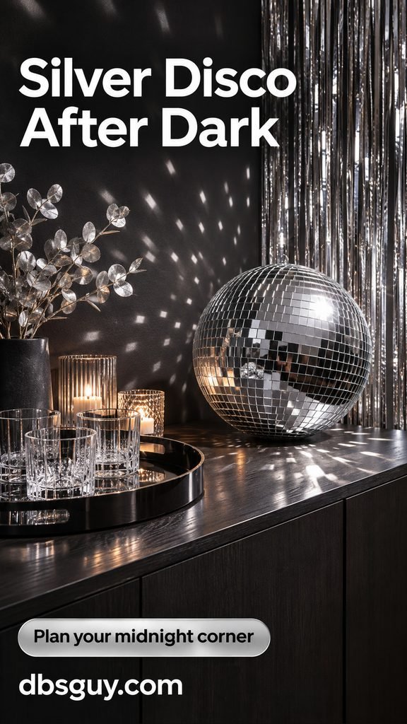
Concentrate the effect on a sideboard or drinks station: one mirror ball resting securely, a silver fringe panel behind it, and a dark tray to give the glassware definition. A directed light creates the reflections; ordinary room lighting will give a softer result.
Test the corner after dark before adding more silver. A single reflective area can carry the party mood while leaving the rest of a small room comfortable for sitting and talking.
3. A Graphic Black-and-White Countdown
Palette: black and white, with clear glass as the quiet third element.
Choose this when you enjoy clean invitations and bold lettering more than glitter. Build the board around a large New Year greeting, a black border, and one small checkered reference. Leave plenty of white space so the pattern stays an accent.
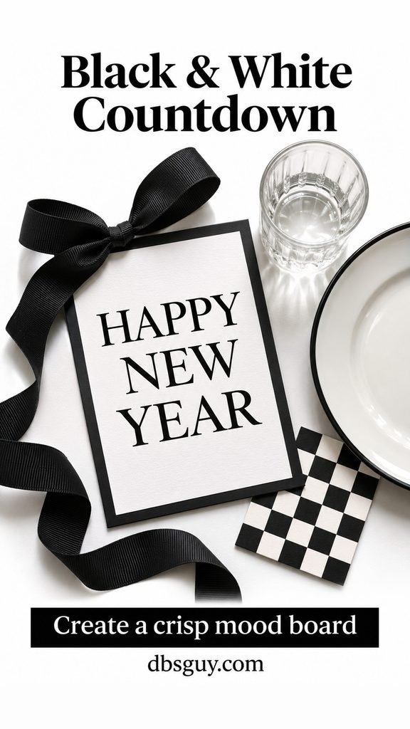
On the table, pair white dishes with black ribbon or black-edged paper menus. Use the same lettering style on the invitation and place cards. You can make the paper details from ordinary cardstock and use dishes you already own.
If you add the year, keep it to a removable card. The rest of the board can then become January desk or stationery inspiration. Avoid mixing checks, stripes, polka dots, and several competing fonts in the same small setup.
Also Read: 21 Easy New Year’s Eve Appetizers, From Warm Dips to Bite-Size Snacks for a menu to serve alongside your party look.
4. Midnight Blue With Tiny Stars
Palette: deep navy, warm ivory, and a little brass.
This celestial direction gets its character from the dark background. Save a navy textile, one star-shaped paper detail, and an evening table with pale dishes. Keep the stars small; a few repeating shapes feel more focused than a mixture of moons, planets, glitter, and zodiac symbols.

Use navy napkins or a runner, then add a small star to each place card or menu. A few flat paper stars are easier to manage than loose confetti near plates. Keep the middle of the table open for food.
If you want the palette to last beyond New Year’s Eve, remove the paper stars and keep the navy linen and ivory dishes. The room will still feel wintry without looking like the countdown never ended.
5. Ice Blue and Frosted Glass
Palette: pale ice blue, soft white, and silver.
Choose this for a winter lunch, a bright apartment, or a board that needs to work in daylight. Collect pale blue fabric, frosted glass, and a cool window-light reference. Check that the blue stays similarly pale across the board; a vivid turquoise image can change the whole direction.
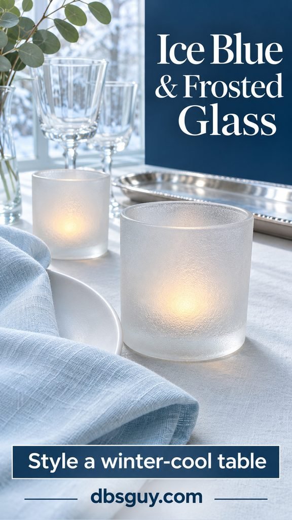
Try one blue napkin or narrow runner with white dishes and a frosted glass accent. Battery-operated votives provide a small glow without adding a warm-colored centerpiece. Clear glasses keep the setting light.
Skip fake snow and loose glitter on the dining surface. The glass finish and linen already communicate the winter idea. For January, carry the blue into a notebook, mug, or one small textile instead of buying a new set of decor.
6. Cherry-Red Ribbon Supper
Palette: cherry red, warm cream, and clear glass.
A strong red accent gives a supper table an identity even when the plates and tablecloth are plain. Save a red ribbon close-up, a red-bordered menu, and a low flower arrangement. Use those references to keep the red concentrated in a few deliberate places.

Tie a ribbon around each folded napkin, then repeat the shade in a menu border or a small bowl of flowers. Keep ribbons off glass stems so guests can pick up their drinks easily. The napkin bow can simply be untied before eating.
Leave out evergreen garlands and holiday ornaments if you want a clear New Year’s look. The red is doing the work here; it does not need a second seasonal theme. This is also a useful choice when you have leftover ribbon to use.
7. Pink Bows and Pearl Details
Palette: powder pink, ivory, and pearl white.
For a softer celebration, combine one romantic shape with a restrained table. Put a satin bow, a scalloped plate, and a pearly texture on your board. Choose either a large bow or several tiny accents so the setting has a clear focal point.

The easiest version is a pink bow around an ivory napkin. If you use faux pearls, keep the strand in a separate decorative dish, away from food and drinks. You can also use a pearl-colored paper detail instead of loose beads.
For a grown-up finish, keep the rest of the table plain and use simple lettering on place cards. After the celebration, the pink-and-ivory palette can become journal or bedroom inspiration without keeping every party accessory on display.
8. Plum Velvet After Hours
Palette: deep plum, smoky gray, walnut brown, and a small brass accent.
This direction suits an intimate dinner better than a bright, busy party backdrop. Save a velvet texture, a low-lit room, and a dark wood reference. Include one pale element, such as an off-white plate, so the board does not become a collection of nearly black images.
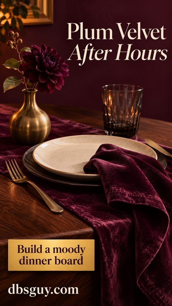
Try a plum runner over an existing wood table, smoky tumblers, and a brass bud vase. Keep the arrangement low enough for conversation. Lamplight gives the fabric a soft change of tone across its surface.
Check your chosen fabric in the actual room: a purple that looks rich in daylight may read much darker at night. If you are borrowing velvet fabric for a runner, keep it decorative and use washable napkins and placemats where needed.
9. Emerald Botanical Night
Palette: emerald green, warm wood, clear glass, and brass.
Green can feel fresh after Christmas when you change the shapes around it. Build this board with leafy stems in a vase, straight-edged linen, and cut or ribbed glass. Skip wreaths, tree silhouettes, and ornament clusters.
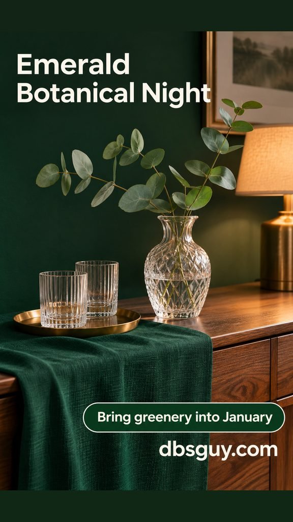
A sideboard works well: lay down an emerald runner, group glasses on a small tray, and add one vase with a few airy stems. Leave enough clear space for serving. The contrast between deep fabric and transparent glass gives the arrangement definition.
For January, remove the party tray and keep the vase and runner if they suit the room. You can make the same direction with a green textile you own; exact matching shades matter less than keeping the overall palette focused.
10. Retro Amber and Record Night
Palette: amber, rust orange, walnut, and cream.
This look is for a listening party, a small living-room gathering, or anyone who prefers warm color to metallic sparkle. Collect an amber glass detail, a simple record sleeve, a rounded lamp, and a wood surface. Let the objects suggest the era without turning the board into a costume.

Set glasses on a rust-colored tray near the seating, add a warm shaded lamp, and make the playlist part of the plan. If you actually play records, keep the drinks on a different surface from the equipment.
Use one or two retro pieces among everyday furniture. A whole room of themed purchases is unnecessary. The amber glass and lamplight can stay through January, making this a useful direction when you want very little cleanup.
11. Cocoa Knits for a Cozy Countdown
Palette: cocoa brown, oatmeal, and cream.
A night-in mood board should show how people will spend the evening. Save a game table, a pair of mugs, a comfortable seat, and a knit texture. A close-up of a blanket alone will not help you decide where everyone can sit.

Fold a throw over the sofa, put mugs on stable coasters, and give a board game its own clear patch of table. Choose a lamp that lights the game as well as making the room look warm. Set snacks elsewhere if the playing surface is small.
For one or two people, a game, warm drink, and comfortable seat can be the whole setup. Keep the same corner for January reading nights; the party does not need a separate collection of decorations.
Also Read: 28 Cozy Reading Nook Ideas for Small Spaces in 2026 for seating ideas that fit a small corner.
12. Winter White With Folded Paper Stars
Palette: paper white, soft gray, ivory, and pale wood.
This is a useful bridge from the holidays into January. Gather references for folded paper, winter window light, and simple ceramic shapes. Shadows and texture give a mostly white board its interest.

Rest a pair of folded paper stars securely on a wide sill or shelf, then leave space around them. An ivory vase with a bare twig adds a different outline without introducing another strong color. Keep the arrangement off a sill that needs to stay clear for opening the window.
Use stars you already have or make a small tabletop version from paper; there is no need for a ceiling installation. When you want a quieter January look, remove one star and leave the vase as the focal point.
13. Sage Linen for a January Reset
Palette: muted sage, beige linen, pale oak, and stone.
Choose this when your New Year inspiration is about making a desk pleasant to use. Save a real writing surface, a textile sample, and a simple notebook. Include open space in the reference image so you do not accidentally plan a desk full of decorative objects.

Start with a sage notebook, a small pen tray, and a mug on a coaster. Put reference scraps on a pinboard above the work area rather than across the desktop. Keep the space where your arms, keyboard, or paper need to go clear.
Give the board one concrete purpose: “make room to plan my week,” for example. Then choose an action that serves it, such as removing unused desk accessories. The palette can guide the refresh without requiring new furniture.
Also Read: 30 Japandi Living Room Ideas for Effortless 2027 Calm if you want to extend the pale wood and simple textures into a living space.
14. Ink and Kraft for a Creative January
Palette: kraft brown, cream paper, and black ink.
This board can be personal and slightly unfinished. Gather a black-and-white photograph, a sketch, a torn paper edge, and a small example of lettering you like. Use your own photographs or suitable licensed images if you plan to share the finished board publicly.

Open a kraft journal and arrange a few paper pieces before attaching anything. Leave most of the facing page available for notes. A single strip of tape or one repeated paper shape can connect the pieces without covering the whole spread.
Add a small creative action beside the inspiration: sketch a familiar street, make one collage, or print a favorite photograph. That gives the board a use beyond looking finished. You can add to it as January unfolds.
15. Peach Sunrise for the First Morning
Palette: apricot, warm ivory, and pale sky blue.
This direction is for New Year’s morning or a gentler January board. Collect a warm sky, a simple breakfast, and soft linen. Keep the colors muted so the board feels like early light rather than a summer party.

Try a pale blue mug, a cream plate, and an ivory napkin near a window. Orange wedges or another ordinary breakfast detail can bring in the apricot color. You do not need to wake up at sunrise or depend on a snowy view to use the palette.
For an ongoing January ritual, pair the image with something specific you would like to make time for: breakfast at the table, a short walk, or a page of journaling. Choose the scene that fits your actual mornings.
Also Read: 40 Happy New Year Wishes for Friends, Family, and Coworkers if you want a greeting to send with your first-morning plans.
Turn Your Favorite Aesthetic Into a Usable Mood Board
Pick one direction first. For a small starter board, try six references: one overall scene, two material close-ups, one lighting example, one paper or lettering detail, and one object you already own. Add three palette swatches beside them. This is an editorial starting point; you can use fewer images if the direction is already clear.
For a general explanation of combining imagery, color, type, and texture, Adobe’s mood-board guide is a useful reference. Keep your own board tied to its purpose: a party board needs serving and seating references, while a January desk board needs usable work space.
- Name the setting: “small dinner at home” is more useful than “New Year vibes.”
- Edit the palette: remove a beautiful image if its colors pull the board away from the look you chose.
- Check the real space: put a photo of your table, corner, or desk beside the inspiration before shopping.
- Translate it into actions: write down one thing to move, one detail to make, and anything you genuinely need to buy or borrow.
If you want both a party board and January inspiration, make two small sections. Repeat one color or material between them, then remove the countdown-specific pieces after the celebration. Silver glassware can stay with ice blue; cream linen can move from gold accents to sage.
Questions About New Year’s Aesthetics
What is the difference between a mood board and a vision board?
For this project, use a mood board to decide how something should look and feel: colors, materials, lighting, and shapes. Use a vision board to explore what you want to do or make room for. They can overlap, but a pretty desk image becomes more useful for a personal goal when you add the action you want the desk to support.
How can I make the look work on a small budget?
Start with your existing dishes, furniture, and lighting. Choose a direction that already shares their colors, then add one small focal detail, such as ribbon, a paper menu, or a borrowed tray. Photograph the arrangement before buying anything else; you may already have enough.
Can I mix two New Year’s aesthetics?
Yes. Choose one as the main direction and borrow a single detail from the other. For example, use the ice-blue table with a silver disco accent, or add a cherry ribbon to the graphic black-and-white setting. Keep the shared palette visible so the combination feels deliberate.
How do I keep January inspiration from looking like leftover party decor?
Remove year numbers, countdown signs, fringe backdrops, and disposable party accessories first. Keep the everyday materials you enjoy: linen, glass, wood, ceramics, and a limited palette. One small area is enough to carry the feeling into January.