Valentine Wallpaper for Your Phone: 17 Lock Screens for a Romantic Refresh

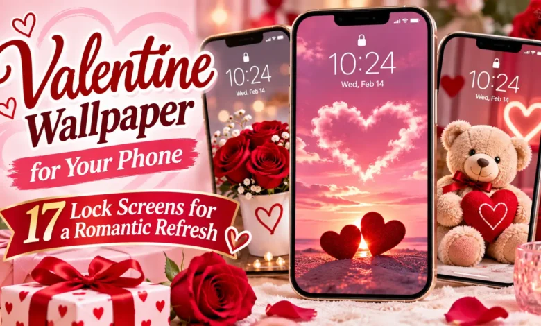
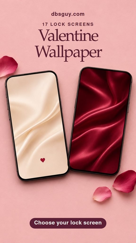
Pick a Valentine wallpaper with breathing room where your phone shows the time. Start with Tiny Garnet Heart if you like a light, minimal screen, Black Cherry Satin if you prefer a dark one, or Porcelain Lovebirds if you want a little romance in powder blue. All 17 designs below are vertical still images, with the main artwork set low on the screen.
To save a design on your phone, touch and hold the wallpaper and choose your browser’s option to save or download the image. On a computer, right-click and save it, then send the image to your phone. Use the image file itself for the sharpest result.
These wallpapers are original AI-generated artwork created for DBS Guy.
Quiet Valentine Colors and Details
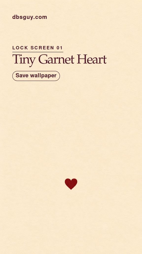
1. Tiny Garnet Heart
One little garnet heart sits low on ivory, with enough blank space above it for a large clock or a row of widgets. It’s a good first pick if you want a Valentine wallpaper that feels as quiet as your usual background. Try a dark clock on the cream field if your phone lets you change its color.
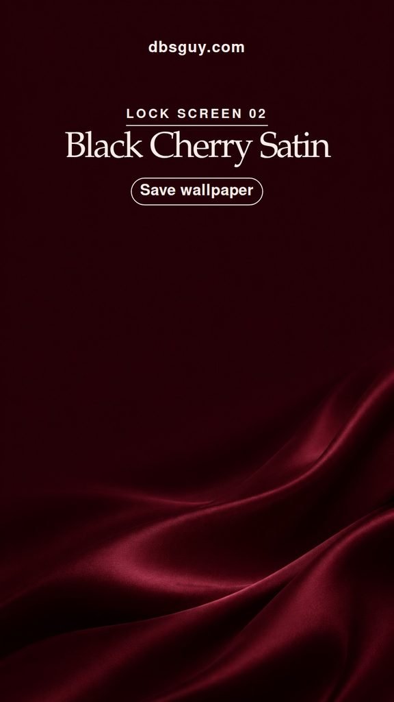
2. Black Cherry Satin
The black-cherry color gives this wallpaper a little drama. The satin catches the light low in the frame while the top stays dark and even. If you usually use white clock text, preview this one first. It has the contrast of a dark wallpaper and the richness of a deep red manicure.
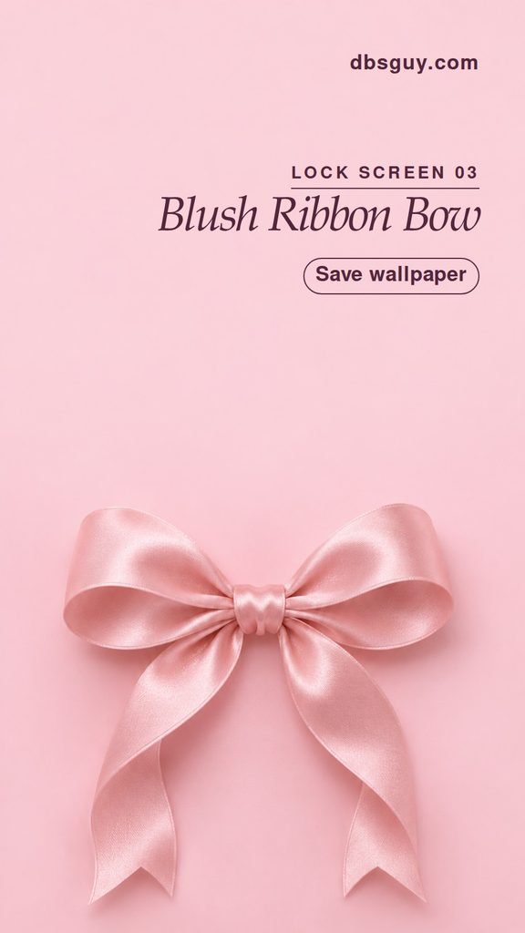
3. Blush Ribbon Bow
A satin bow gives you the ballet-pink look in one soft shape. The loops and ribbon tails make the silhouette, so start with the image at its widest available crop. A tighter zoom can cut off a tail and make the bow feel crowded.
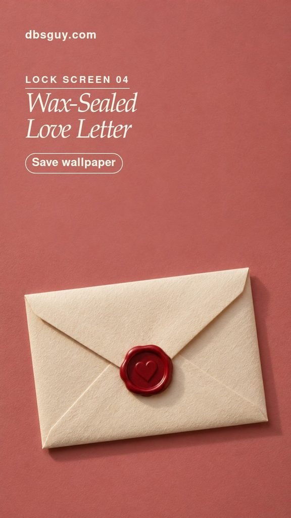
4. Wax-Sealed Love Letter
An ivory envelope and a red wax seal give this screen the feel of a Valentine you’d actually mail. Let the envelope’s slight tilt show in the preview. If notifications usually stack across the bottom half of your screen, check that you can still see the seal before you settle on the crop.
Sweet Patterns and Candy Colors
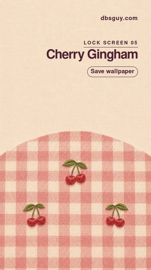
5. Cherry Gingham
Pick this for a little picnic nostalgia. Embroidered cherries sit over pink checks, with a calmer cream field above the pattern. If you want a coordinated Home Screen, borrow the warm cream from the top and use it as a plain background behind your apps.
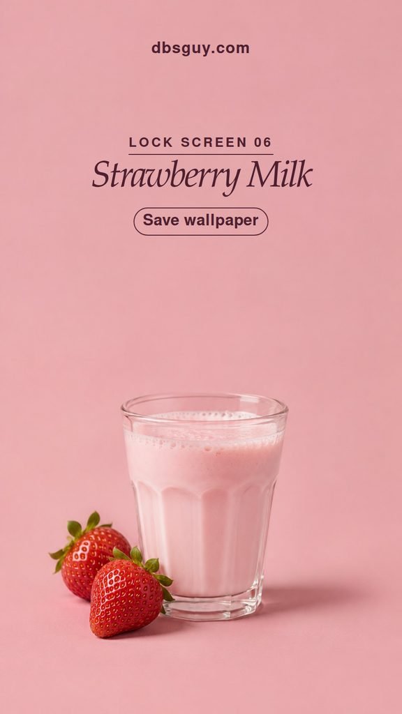
6. Strawberry Milk
A small glass of strawberry milk and fresh berries look like something from an old-fashioned milk bar. Most of the screen stays dusty pink, so you get the color even when a notification covers the berries. Choose this if you want something cute that can stay up after February 14.
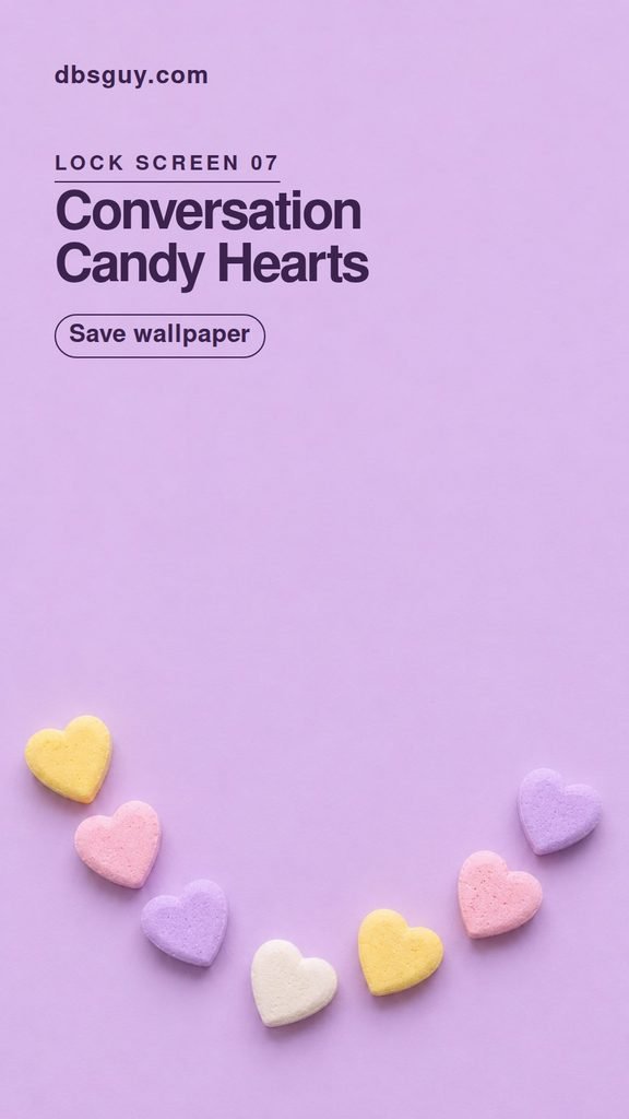
7. Conversation Candy Border
Little candy hearts frame the bottom of a lilac screen. Their blank faces keep the border from turning into tiny lettering you have to squint at. Leave the framing loose so the candies along the sides are still visible after your phone crops the image.
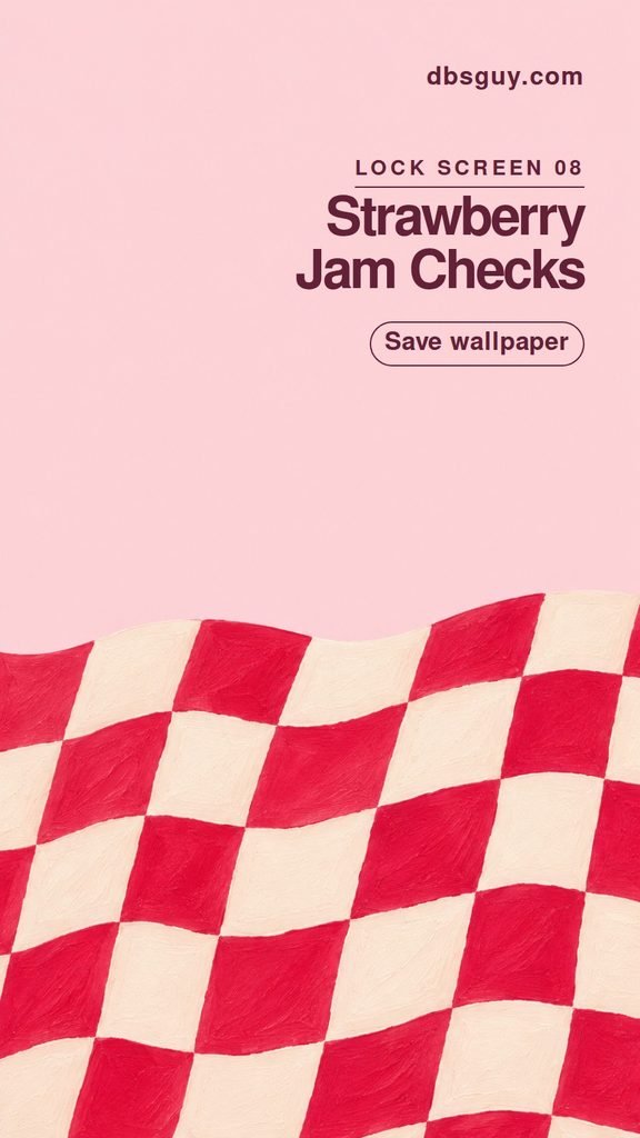
8. Strawberry Jam Checks
Hand-painted strawberry-red and cream squares give the lower half a bold, slightly wonky rhythm. This one is especially good if you like red and pink but want a break from hearts. Keep the pale area above the checks in the preview so the clock has an even background.
Flowers, Twilight, and Candlelight
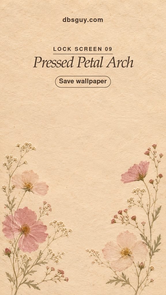
9. Pressed Petal Arch
Pink petals and thin sage stems curl upward from low on the screen like flowers tucked into a book. The arrangement gives you more detail at the edges and less through the middle. It’s a natural fit for anyone who wants a February wallpaper that still looks at home in March.
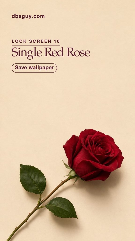
10. Single Red Rose
A crimson rose is the most classic February 14 choice here. Follow the stem when you crop. Keeping some of its diagonal gives the flower a sense of direction and leaves a clean patch above the bloom. This is a nice pick if you prefer one dramatic detail to a whole bouquet.
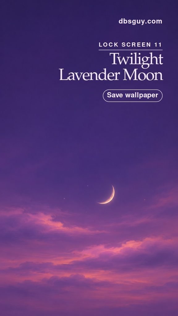
11. Twilight Lavender Moon
A small crescent hangs over lavender clouds, with a smoky violet sky above. Try a pale clock color so the digits stand apart from the dusk. If your clock is set lower than usual, check the space between the last digit and the crescent in the preview.
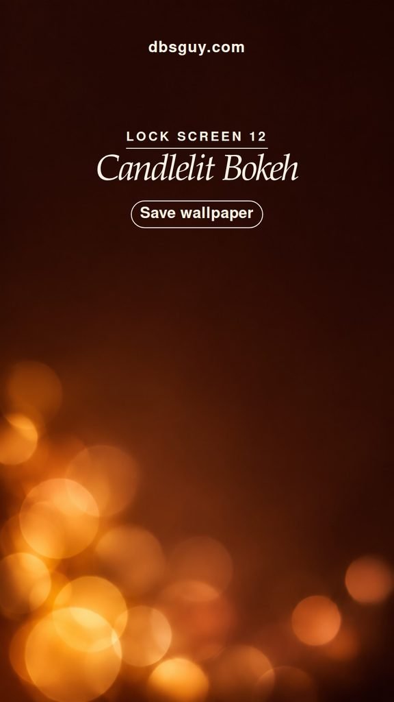
12. Candlelit Bokeh
Soft circles of amber light give this one the feeling of dinner by candlelight. The glow sits low and fades into espresso brown, so cropping a few soft edges won’t spoil the subject. It’s a forgiving choice if your phone zooms in farther than you expected.
Hearts and Keepsakes
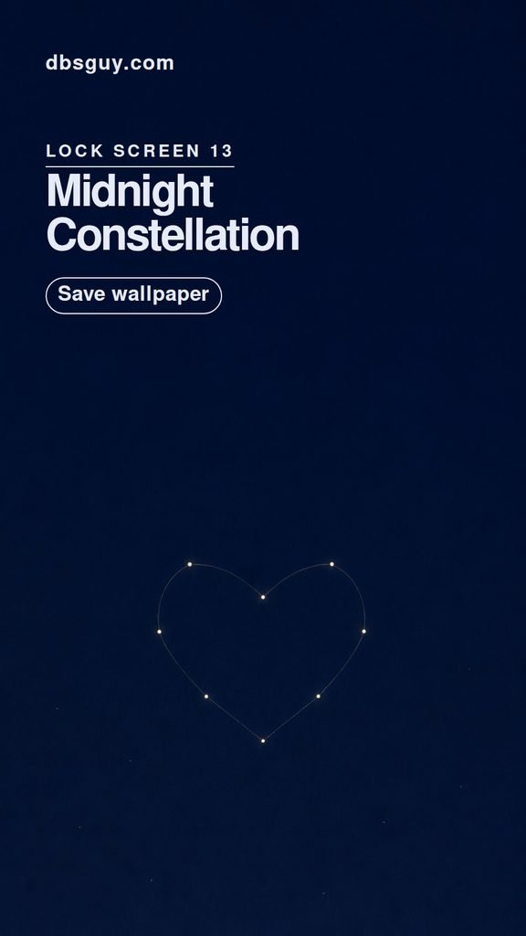
13. Midnight Constellation
Fine lines connect a small cluster of stars into a heart. The shape is easy to miss at a glance, which suits a midnight-blue screen you might want to keep past Valentine’s Day. Take a second look at the wallpaper with your usual brightness to see whether you like how softly the lines show up.
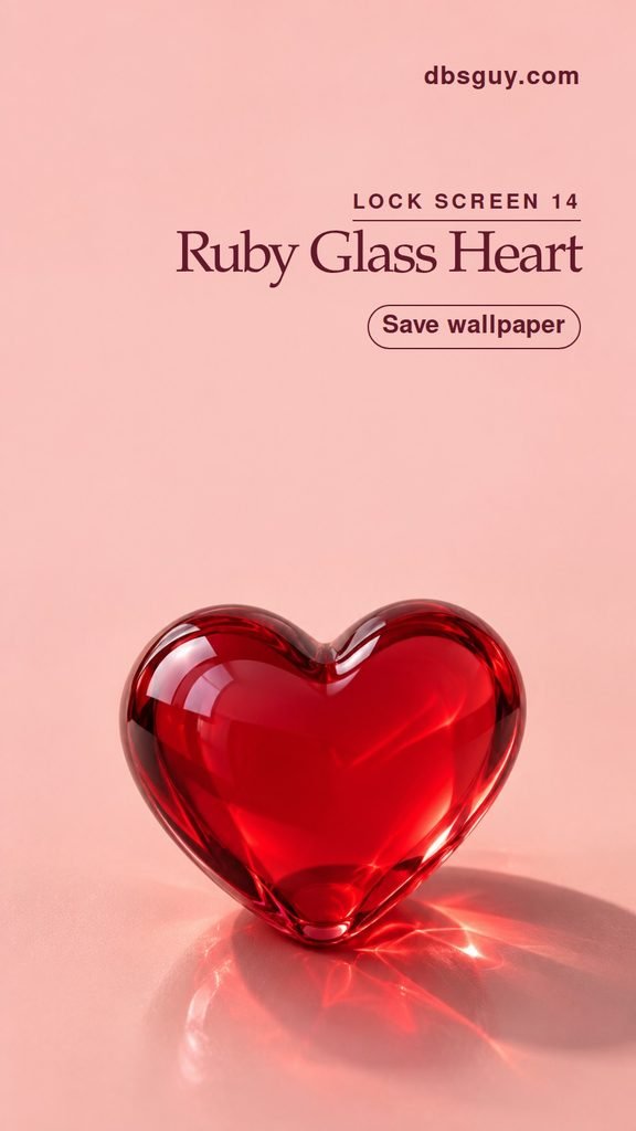
14. Ruby Glass Heart
A translucent red glass heart throws a soft reflection onto peach-pink. Give the glass a little room to breathe in the crop so you get both the red silhouette and the light coming through it. This is the bold heart to choose when you want one big accent.
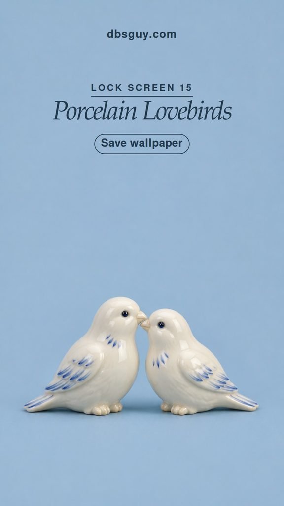
15. Porcelain Lovebirds
Two ivory lovebirds face each other against powder blue, with little painted details that give them a vintage look. If you want a softer color scheme than red and pink, start here. Leave both birds in the frame so the pair reads clearly even at a quick glance.
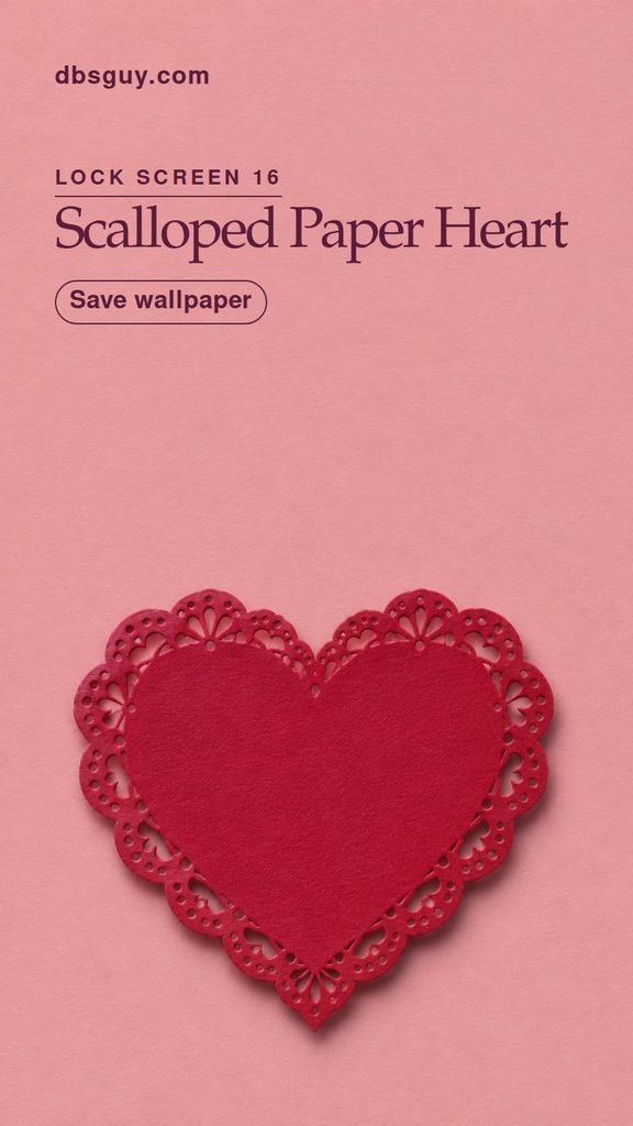
16. Scalloped Paper Heart
A raspberry paper heart takes its cue from old lace-trimmed Valentines. Pick this when you want something a little crafty and graphic. Start at the default zoom so the whole scalloped edge stays visible, especially near the widest part of the heart.
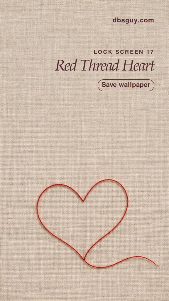
17. Red Thread Heart
A fine red thread loops into a heart across warm linen. Compared with the solid heart in idea 1, this one has a softer outline and more texture. It works well with an otherwise neutral screen. If you adjust the crop, keep the loose tail in view so the shape still looks like thread.
How to Set Your Valentine Lock Screen
- iPhone. Open Settings → Wallpaper → Add New Wallpaper → Photos and select the saved image. After framing it, tap Add. Choose Set as Wallpaper Pair to apply it to both screens, or Customize Home Screen to choose a separate Home Screen. See Apple’s iPhone wallpaper guide.
- Google Pixel. Press and hold a blank spot on the Home Screen, then open Wallpaper & style. In Change wallpaper, select Lock screen and Choose a photo. Pick your saved wallpaper, preview it, and apply it. On some versions, the photo picker is under More wallpapers.
- Samsung Galaxy. Press and hold the Lock Screen and unlock it if prompted. Tap Wallpapers → Gallery, pick the saved image, then tap Done to preview. Move or zoom the image as needed and tap Done again to apply.
Menu names can vary by software version. Before you finish, check where the clock and widgets sit and make sure the bottom controls leave the part you care about visible. If the edges look crowded, start with a looser crop and reposition the artwork.
Valentine Wallpaper FAQs
Why does my phone cut off the sides?
These wallpapers are 900 × 1600 pixels, a 9:16 portrait ratio. Many phones have taller screens, so filling the display can trim some width. If a bow tail or candy disappears, try zooming out as far as the picker allows. On a screen that still cuts in tight, the centered heart or black cherry satin will keep the design recognizable.
Which design works best when I have lots of widgets?
Tiny Garnet Heart and Black Cherry Satin are the easiest places to start. Both have a broad, even field behind the clock. On your phone, check the clock and the smallest widget text in the actual wallpaper preview, since both their position and their color affect readability.
Can I use the same design on the Home Screen?
Yes. A quiet image such as Black Cherry Satin can work behind app icons too. If a busier wallpaper makes labels hard to read, keep it on the Lock Screen and pick a solid color from its palette for the Home Screen. Try lilac with the candy hearts or pale blue with the lovebirds.