19 Cute Valentine Wallpapers With Tiny Hearts, Bows, and Candy Colors

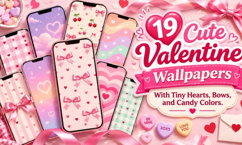
Start with tiny red hearts if you want a simple background, a satin bow if you prefer one pretty focal point, or pastel candy hearts if you want more color. These 19 cute Valentine wallpapers range from quiet pink backgrounds to gingham, cherry illustrations, and soft mint borders, so you can choose a design that works with the way you actually use your phone.
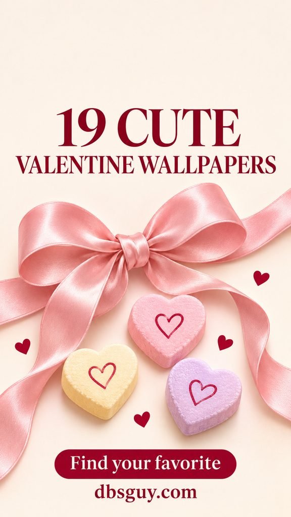
Each image is a branded, AI-generated wallpaper design with a short phrase, a save prompt, and dbsguy.com credit. Those words are part of the saved image. The files are 900 × 1600 pixels in a vertical 9:16 format; your phone may crop them to fit its screen. Save the individual image rather than taking a screenshot of the page.
Choose a Wallpaper for the Screen You Use
For a screen crowded with apps, start with the sparse hearts in idea 1 or the peach ombré in idea 19. For a Lock Screen with a prominent clock, compare the open upper areas in the bow, blue-background, and love-letter designs. Gingham and checkerboard have more visual movement, so they are better starting points if the pattern itself is what you want to see.
For more background styles, explore our wallpaper collection.
1. Tiny Red Hearts on Ballet Pink
Tiny red hearts give this background its Valentine detail without filling the screen. The wide spacing is the useful part: you can still see stretches of plain pink between the motifs, rather than a dense field of symbols.
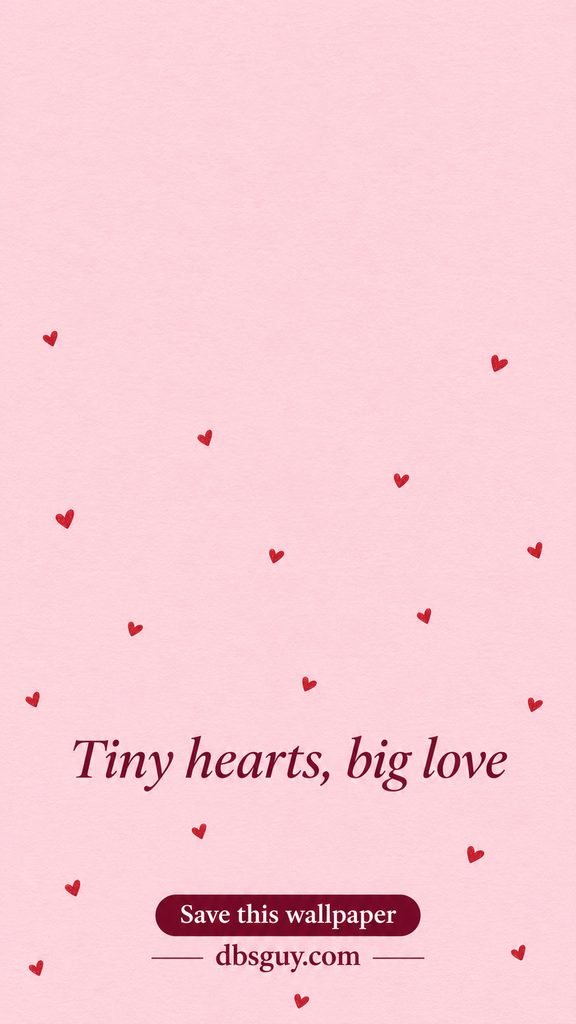
Try a dark berry clock against the pale background. If you have several rows of apps, check the lower phrase behind your labels; the sparse artwork is calmer than the typography near the bottom. Choose this one for small hearts rather than a single centerpiece.
2. A Rose-Pink Satin Bow on Ivory
The ribbon’s sheen gives this ivory background more depth than a printed bow pattern. With one bow instead of many, it feels closer to gift wrapping or a favorite hair ribbon.
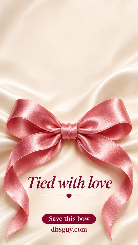
Keep the bow’s knot visible when positioning the image. Cropping a little of a trailing ribbon is less disruptive than cutting through the knot or one loop. This is a good Lock Screen choice when you want the clock above the decoration rather than across it.
3. Pastel Candy Hearts Around a Cream Center
Pink, lilac, butter yellow, and pale green give this wallpaper a candy-shop palette. The hearts have a chalky surface and no tiny candy messages to decipher; the cream center keeps the mixed colors from taking over.
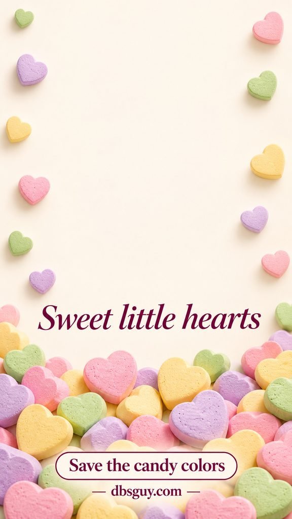
Choose this if you want several pastels in one background. Preview a dark clock inside the open center, and keep widgets out of the bottom candy cluster when possible. If the candies make app labels hard to follow, use it on the Lock Screen and choose a simpler Home Screen color.
4. Pink Gingham With Little Burgundy Hearts
Gingham adds structure that scattered hearts do not. The small checks give the wallpaper a picnic-cloth feeling, while burgundy hearts bring a darker accent into the pink-and-cream grid.
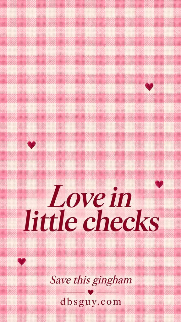
View this one at normal phone size before choosing it. Fine checks can look busier behind small labels than they do in a large preview. If you like the fabric effect but need an easier-to-read Home Screen, keep the gingham for the Lock Screen and pair it with a plain blush background.
5. A Cherry-Red Bow on Powder Blue
A red bow against powder blue makes a clear change from an all-pink Valentine screen. The ribbon sits low and toward the side, so the blue field remains the main color you see.
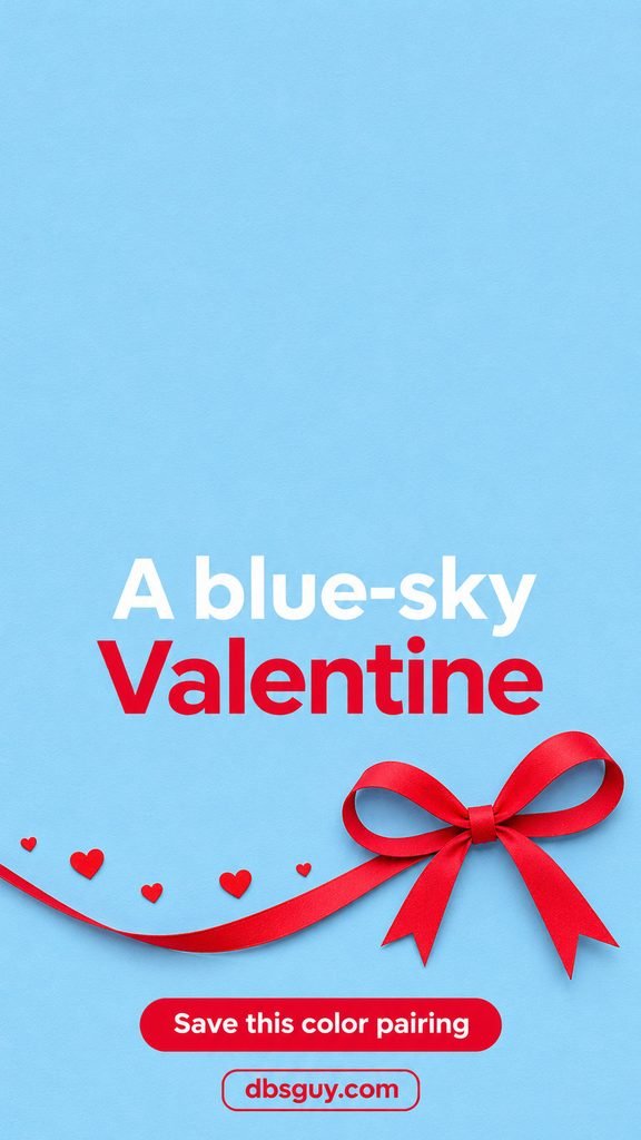
Check the bow’s position against your lower screen controls. Move the preview slightly if a control covers its center, while keeping both loops visible. This color pairing also works if you want a Valentine background that still feels at home with blue accessories or app icons.
6. Lavender Outline Hearts
These hearts are drawn as outlines, allowing the pale lilac background to show through each one. The effect is softer and more graphic than the glossy or candy-shaped hearts elsewhere in the collection.
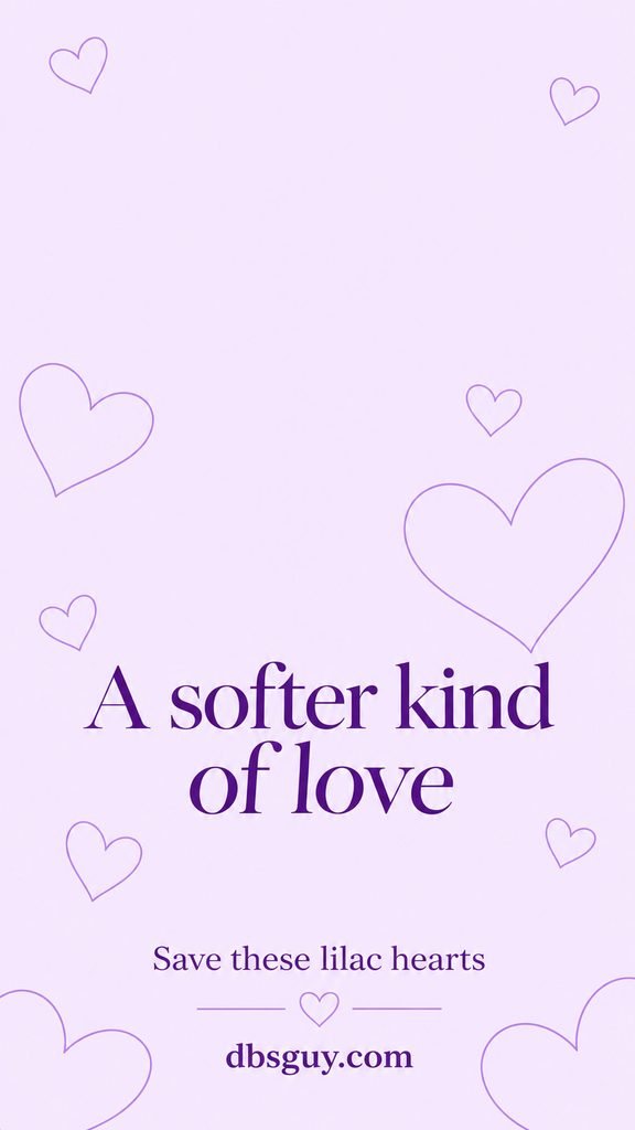
Use a deep plum clock rather than a similar pale purple if the digits disappear into the background. Notice where the largest heart outlines land after cropping: keeping one complete curve visible usually makes the motif easier to recognize than leaving only fragments around the edges.
7. Peach Checkerboard With Coral Hearts
This checkerboard uses larger blocks than the gingham design, so it reads as a bold graphic pattern. A few coral hearts sit in the cream areas instead of appearing in every square.
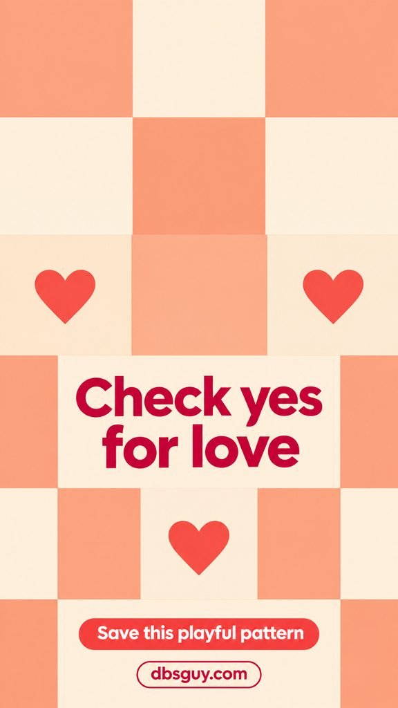
Choose it when you want the pattern to be part of the look, not simply a backdrop. Try the crop with a whole heart near the lower third. If the block boundaries cut through your clock or app labels, move the image a little and compare the result before applying it.
8. Pink Daisies on Butter Yellow
Butter yellow brings warmth without relying on a pink background. The flowers rise from the lower corners, and their red heart centers make the floral design feel tied to Valentine’s Day.
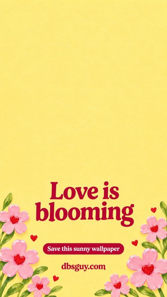
Keep enough of both corner clusters in the crop for the arrangement to feel balanced. A dark red clock picks up the flower centers; a pale yellow clock is more likely to blend into the open background. This one suits a floral screen you may want to keep after February 14.
9. One Pink-and-Lilac Marbled Heart
The flowing pink and lilac bands make this heart look like a small polished sculpture. Unlike a repeating print, it has one focal point, with soft lavender space around it.
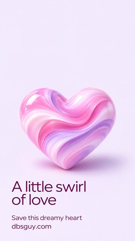
Position the heart below your clock and preview notifications over the middle. If you regularly keep several notifications visible, some of the heart will be covered. Save this design for the days you prefer a larger centerpiece, and use the outline-heart option when you want detail distributed around the screen.
10. A Mint Scalloped Frame With Tiny Hearts
A scalloped mint border gives the screen a stationery-like frame. Tiny red hearts and a small red bow provide accents, while the ivory center offers a quieter place for the clock and other information.
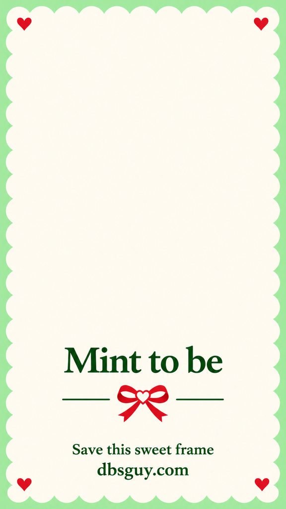
The border is also the feature most sensitive to cropping. Check both sides of the preview: if your phone trims away most of the scallops, choose a design whose decoration sits farther inward. Avoid stretching the image just to keep the frame; the curves should remain rounded.
11. Heart-Shaped Cherries Tied With a Ribbon
Two heart-shaped cherries joined by a pink ribbon create a fruit-inspired Valentine design. The cream paper background keeps the red fruit and fine green stems easy to see.
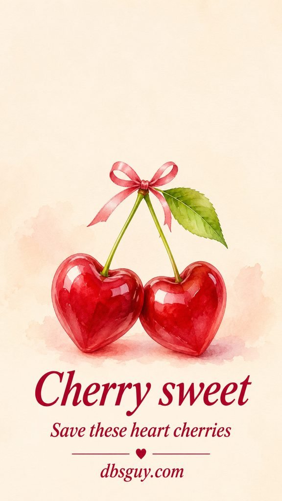
Keep the stem junction and bow inside your crop, since they explain how the two cherries connect. If you like a sweet illustration more than an all-over print, compare this with the single love letter in idea 15. Both leave the upper screen relatively open.
12. Strawberries and Little Pink Bows
This little print pairs seeded strawberries with ribbon bows. It gives you the candy-colored mood of the collection without making hearts the main motif.
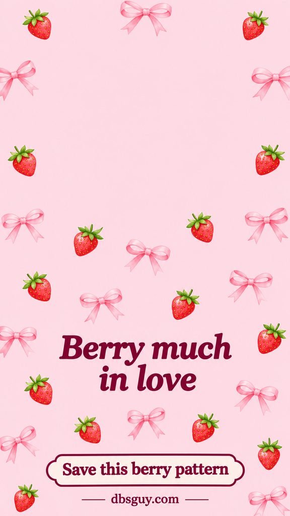
The repeating subjects make the crop more forgiving than a single bow or envelope: losing one strawberry at an edge does not remove the whole idea. Check that the tiny green leaves remain visible at normal display size. They help separate the fruit from the surrounding pink.
13. Ivory Lace Along a Rose-Pink Background
Eyelet lace decorates the side edges, with a small rose-trimmed lace heart and ivory bow lower down. The ivory-and-rose combination feels closer to a keepsake Valentine than a candy wrapper.
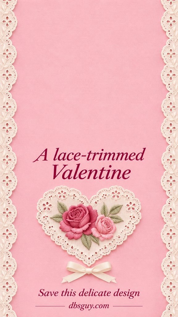
Preview how much lace survives along each side of your screen. This design depends on the edges, so it may suit one phone crop better than another. Keep the center simple when adding widgets, and let the lace supply the small decorative detail.
14. Glossy Pink Jelly Hearts
These pink hearts use shine and translucency instead of an outline or chalky candy texture. The pale background and soft shadows make the shapes seem to float.
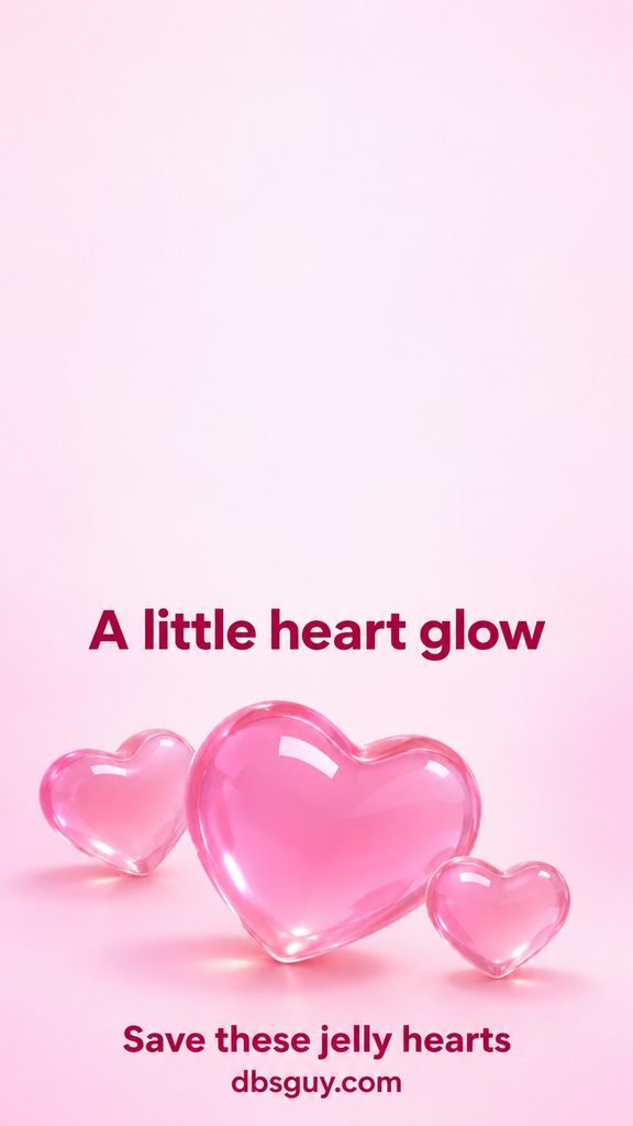
Choose a clock color with enough contrast to remain clear over the highlights. The hearts are still artwork, so they will not move or respond when you tilt the phone. Pick this one for the glassy-looking finish; use the matte candy hearts if you prefer softer, less reflective shapes.
15. A Tiny Love Letter on Peach
A pink note peeks from an ivory envelope, with a red heart seal supplying the Valentine cue. There is no personal message to read, so it works as a small symbol rather than a quote wallpaper.
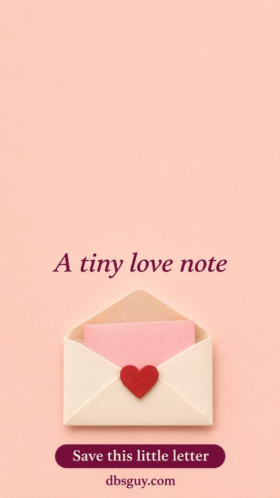
Keep the envelope below the clock and above any controls that would cover the seal. Its simple background makes it a useful partner for a plain peach Home Screen. If you want to turn the same mood into something handwritten, browse our Valentine card ideas.
16. A Heart Lollipop on Pale Pistachio
The lollipop introduces a larger candy shape, with a white stick and a little lavender ribbon. Pale pistachio gives the red and pink swirl a different setting from the cream candy-heart design.
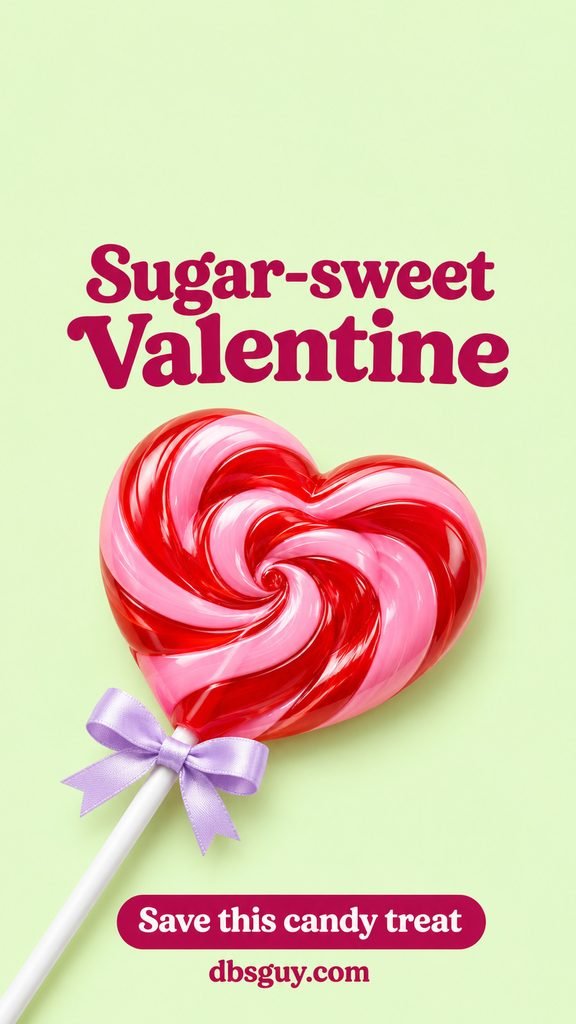
Check that the stick and bow remain recognizable in the preview. A tight crop of only the heart can hide what makes this option distinct. This is a playful Lock Screen choice when you prefer one treat to a scattered candy pattern.
17. Coral Scalloped Stripes With Tiny Hearts
Coral-and-cream stripes bring movement through the background itself. The scalloped edges soften the lines, while small red hearts add a second detail near the sides.
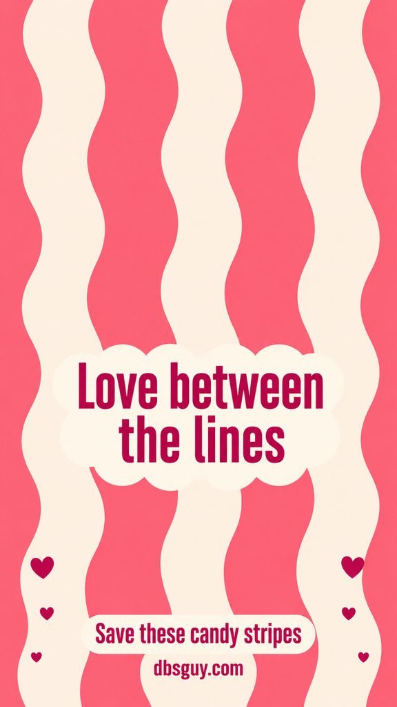
Use this if straight checkerboard feels too rigid. Preview your clock over both a cream stripe and a coral stripe before deciding on its color. If the vertical pattern makes a full page of apps feel crowded, use a solid coral Home Screen alongside it.
18. A Crescent Moon With Hearts and Stars
A cream crescent rises from pink-tinted clouds, with little pink hearts and yellow stars nearby. The lavender sky is light rather than a dark night background, making this a dreamy alternative to bows and sweets.
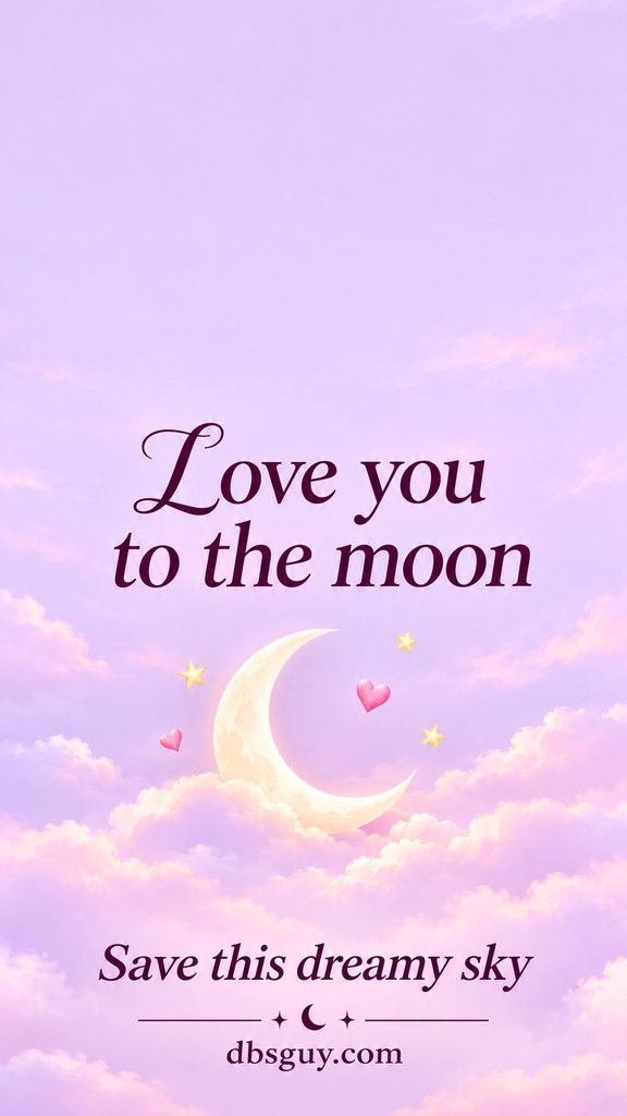
Keep the crescent’s inner curve in view when cropping; cutting it too tightly can make it read as an ordinary circle. Deep purple screen text fits the palette while remaining distinct from the pale sky. This option suits a soft celestial theme that does not depend on Valentine’s Day lettering alone.
19. Blush-to-Peach Ombré With One Little Heart
A blush-to-peach gradient makes the smallest decorative statement in the collection. One red heart provides the focal point, and the color change is gradual rather than divided into blocks.
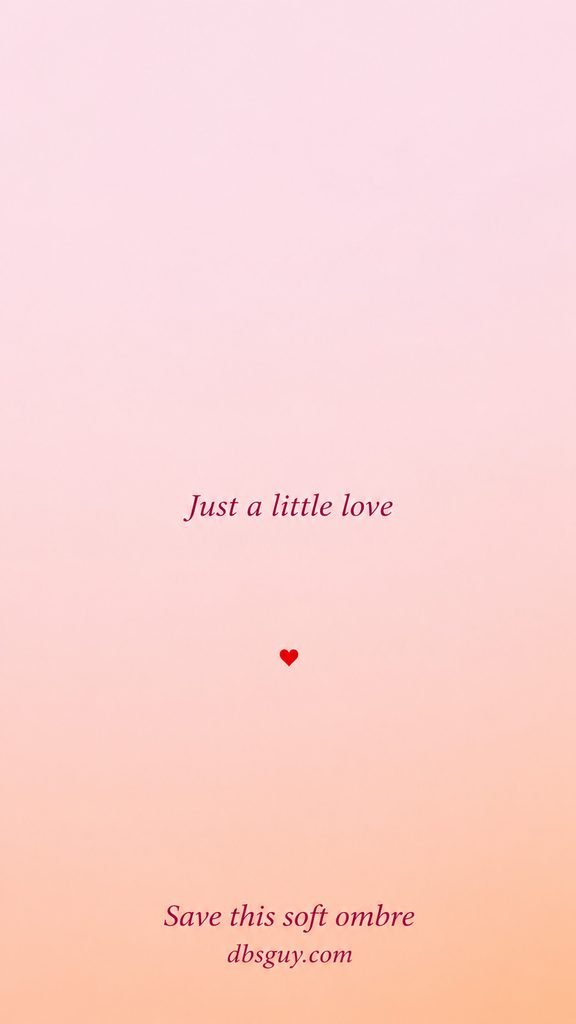
Try this first when your main concern is keeping apps and widgets easy to follow. Check the small heart after your phone fills the screen; if it slips under a widget, move the image slightly. The design phrase and footer remain part of this image, even though the artwork is minimal.
Save Your Favorite and Check the Fit
Press and hold an individual wallpaper, or right-click it on a computer, and choose the browser’s image-save option. The wording varies by browser. If an in-app viewer does not offer it, open the page in your regular browser. Save the image itself so you do not capture the article text or browser controls.
On iPhone
Open Settings → Wallpaper → Add New Wallpaper, then choose Photos and select the saved image. Adjust the preview, tap Add, and choose Set as Wallpaper Pair or Customize Home Screen. Apple’s wallpaper guide explains the available options.
On a Google Pixel or Another Android Phone
On a Pixel, touch and hold an empty area of the Home Screen and open Wallpapers & style. Use the wallpaper controls to choose your saved photo, preview it, and apply it to the screen you want. Other Android phones may use different labels; look for Wallpaper in Settings if this route is unavailable.
Before applying, check the clock, camera opening, widgets, and bottom controls together. A wallpaper can look lovely on its own yet place its main bow directly behind a control. Move the image in the preview if your phone allows it, or choose a design with the decoration in a different area.
Questions About These Valentine Wallpapers
Will a 9:16 wallpaper fit every phone?
The image may need cropping because phone screens do not all share one shape. These files are 900 × 1600 pixels, not 4K. Fine lettering or texture may look softer when enlarged on a higher-resolution screen. Check the full-screen preview before deciding, especially with the lace and mint borders.
Why does the wallpaper look blurry?
First check that you saved the image rather than a screenshot or a small preview. If the wallpaper controls offer a blur option, check whether it is enabled. Excessive zoom can also soften the image. Try a wider crop; if the result still looks soft, a simpler design may suit your display better.
Which design is easiest to pair with app icons?
Start with the tiny hearts or peach ombré, then preview your actual app layout. The open backgrounds give labels fewer shapes to compete with. If you love one of the busier prints, keep it on the Lock Screen and use a matching solid color on the Home Screen.