21 Valentine Wallpapers to Give Your Screen a Little February Romance


A tiny red heart, a pink satin bow, or a quiet lake at dusk can give your phone a little February romance. Start with the tiny heart or blush aura if you want an understated screen; choose gingham, cherries, or retro hearts for more color.
These 21 Valentine wallpapers include minimal designs, florals, soft textures, and darker backgrounds. Each numbered image is a saveable 900 × 1600-pixel portrait design. The images include a small DBSGuy caption and footer; they are branded designs, not text-free downloads.
The visuals are original AI-generated artwork and illustrative scenes.

Save your favorite before you set it
Press and hold a numbered image on your phone, then choose the option to save or download the image. On a computer, right-click the image and choose “Save Image As.” Menu wording varies by browser. Save the image itself rather than taking a screenshot of the page, which includes extra page content and may capture fewer image pixels.
The 9:16 format is a starting canvas, not a promise of an exact fit on every phone. Your wallpaper preview may crop the sides on a taller screen. Reposition the design there and check the clock, widgets, notifications, and bottom controls before applying. Cropping may hide the footer, but it can also remove artwork; check the full picture before you apply the crop.
For the clearest everyday layout, use a detailed design on the Lock Screen and a plain coordinating color on the Home Screen. That lets the artwork stay visible without putting the same detail behind every app label.
1. One Tiny Cherry-Red Heart
A tiny red heart on warm ivory gives you the Valentine detail without filling the screen. Choose this one if you keep several widgets or want a background that still feels quiet after February 14.
The heart sits below the middle, so start with the image centered in your wallpaper preview. Try a dark clock color against the pale background; if a notification covers the heart, move the artwork slightly rather than enlarging it immediately.

2. A Soft Blush Aura
This blurred wash of pink and cream has no single object to position. It is an easy choice when you want a February color change but find scattered hearts distracting behind app labels.
Use the softly glowing area as the backdrop for a sparse Home Screen. If your labels disappear over the lighter patches, preview a darker text or icon treatment where your phone offers one. The smooth gradient gives you more freedom to reposition than a detailed picture does.

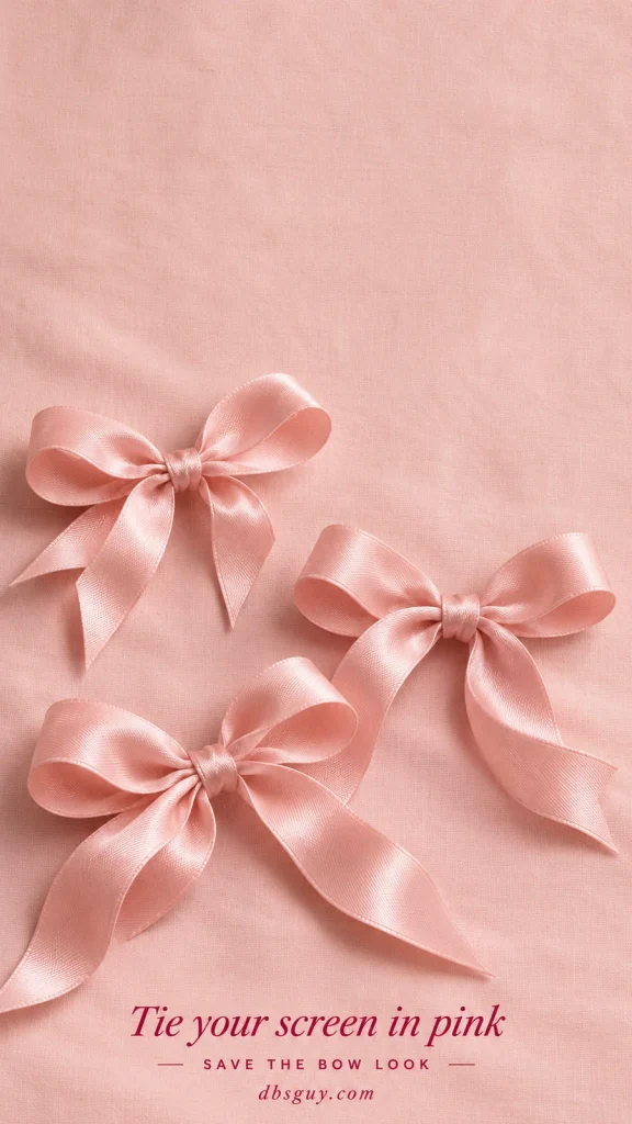
3. Pink Satin Bows
Three blush bows bring a ribbon detail to your screen without adding a quote or a large heart. Their folds and soft shadows suit a pink case, a pearl charm, or a simple cream-and-rose color scheme.
Keep the upper bow below your clock when you adjust the crop. This design works especially well on a Lock Screen with few widgets, where the ribbon texture can remain visible. A crowded row of colorful apps will compete with the bows.
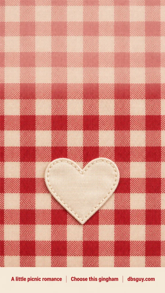
4. Cherry Gingham With a Heart
Cherry-red checks and a cream stitched heart give this background the feel of a little fabric keepsake. Pick it if you like picnic checks, vintage kitchen colors, or a bolder Valentine palette.
Because the checks cross behind the clock, test the time against both a red square and a cream square. If neither clock color stays clear, keep the gingham for your Lock Screen and pair it with a plain cream Home Screen.
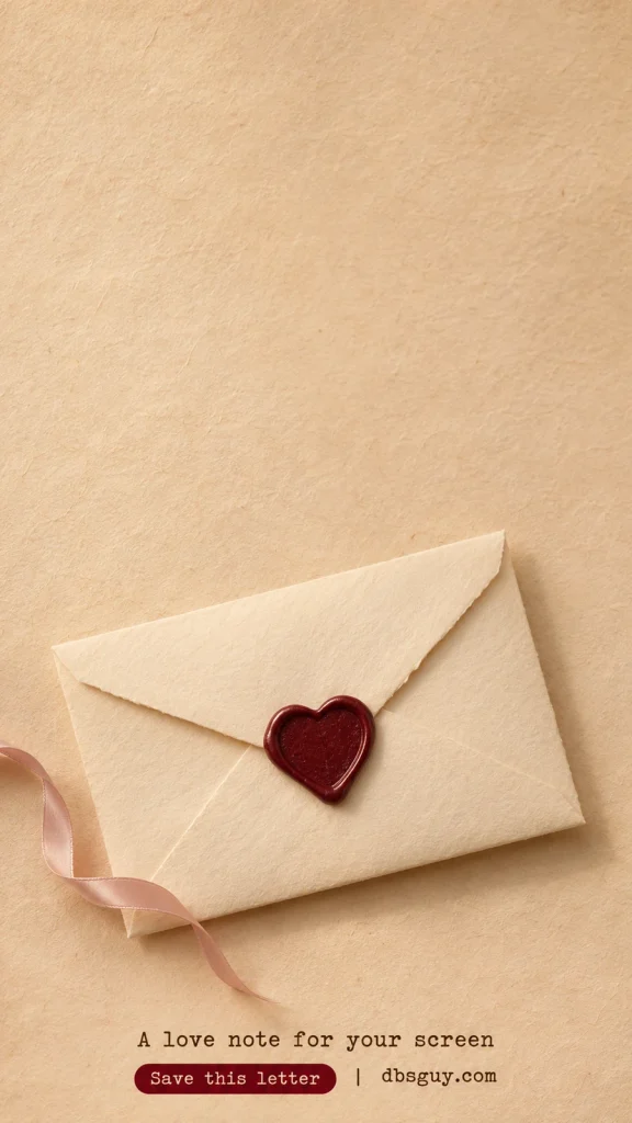
5. A Vintage Love Letter
A closed ivory envelope, burgundy wax seal, and loose pink ribbon make this wallpaper feel like a note waiting to be opened. The broad parchment area above the envelope gives the clock a quieter place to sit.
Keep the heart-shaped seal inside the crop; it is the detail that makes the envelope seasonal. This warm beige design also works if your usual screen colors are brown, cream, or muted gold.
If the envelope detail is your favorite, carry that mood into a real note with 21 Valentine Card Ideas That Make a Simple Message Feel Personal.
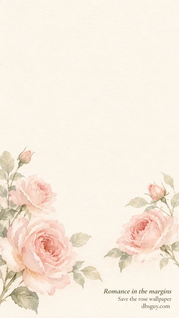
6. Watercolor Roses Around the Edges
Pale roses grow from the lower corners while the middle stays open. This is the floral option to try when a full bouquet would put too many petals behind your clock.
Preview the image before zooming: on a tall screen, the outside leaves may crop away while the larger roses remain. Keep enough of both corner sprays to preserve the framing effect. A dark olive or burgundy clock picks up a color already in the artwork.
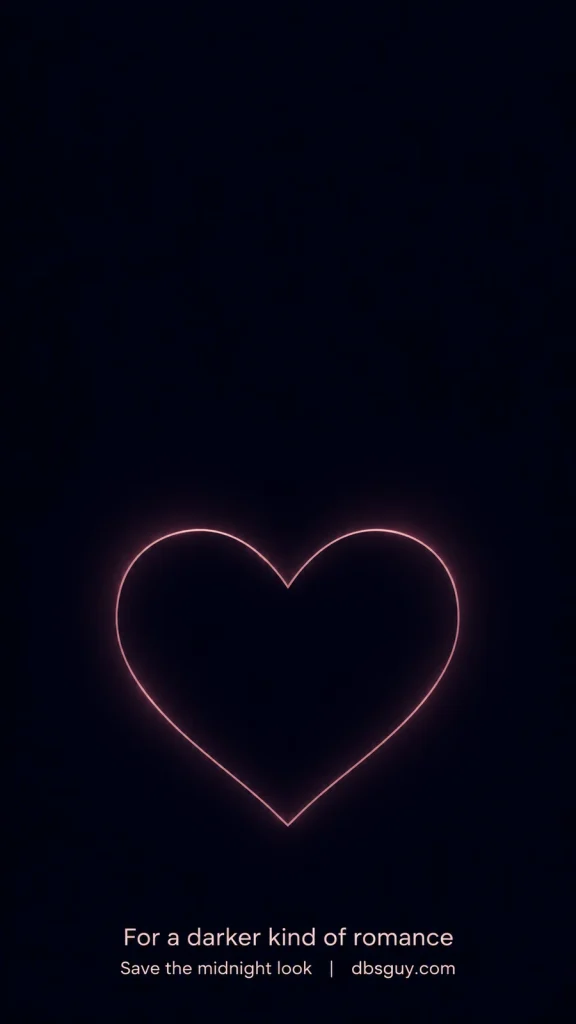
7. A Midnight Heart Outline
A fine rose-colored heart against deep navy gives you a dark Valentine wallpaper with one clear shape. It suits a screen where you prefer pale text and a restrained color palette.
Position the heart beneath the time, then check it with notifications showing. If the heart disappears behind a notification stack, lift it slightly in the crop preview. Keep the Home Screen simple so the outline does not become a frame around a crowded group of apps.
8. Candy-Pink Checkerboard
These oversized, gently wavy checks feel playful, and the two raspberry hearts give the pattern a small surprise. The larger blocks of color read more clearly on a phone than a tightly packed checkerboard would.
Let the checks fill the screen rather than trying to align every square with an app row. If the pattern makes labels harder to read, use it only on the Lock Screen or choose a softer Home Screen background from the same pink-and-cream palette.

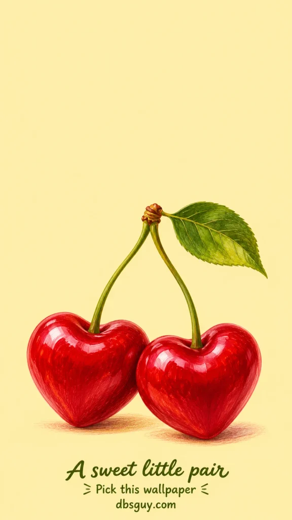
9. Heart-Shaped Cherries
A pair of illustrated cherries turns the Valentine heart into a fruit detail. The butter-yellow background makes this a cheerful option if pink is not your favorite color.
Keep the joining stems and the two cherries together in the crop. If your phone zooms in automatically, pull back enough to leave a little space around the leaf. The plain upper half works well with a dark clock and a short row of widgets.
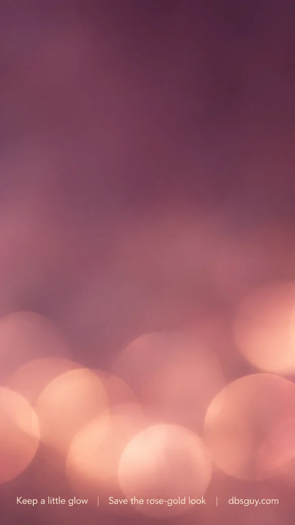
10. Rose-Gold Bokeh
Soft circles of light collect near the bottom of this plum-and-rose background. Choose it for a date-night mood without a literal Valentine symbol.
The upper area is darker, so try a pale clock there and check its edges at your normal screen brightness. If the glowing circles end up behind app labels, reserve this image for the Lock Screen. It gives you an atmospheric alternative to the flat blush gradient in idea 2.
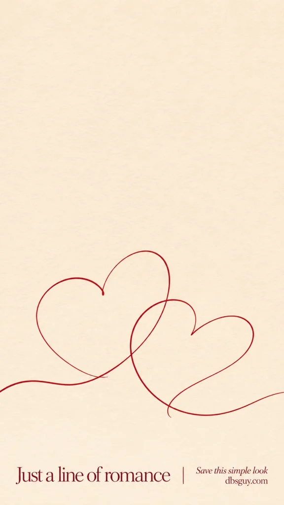
11. A Red Ribbon Line Drawing
One loose red line forms two overlapping hearts on cream paper. It has more movement than the tiny-heart design, while the unfilled shapes leave plenty of background showing through.
Use this if you like a hand-drawn detail rather than a glossy finish. Keep both heart curves visible in the preview; a tight crop can make the drawing look like an unrelated red squiggle. A burgundy clock keeps the screen to a small, coordinated palette.
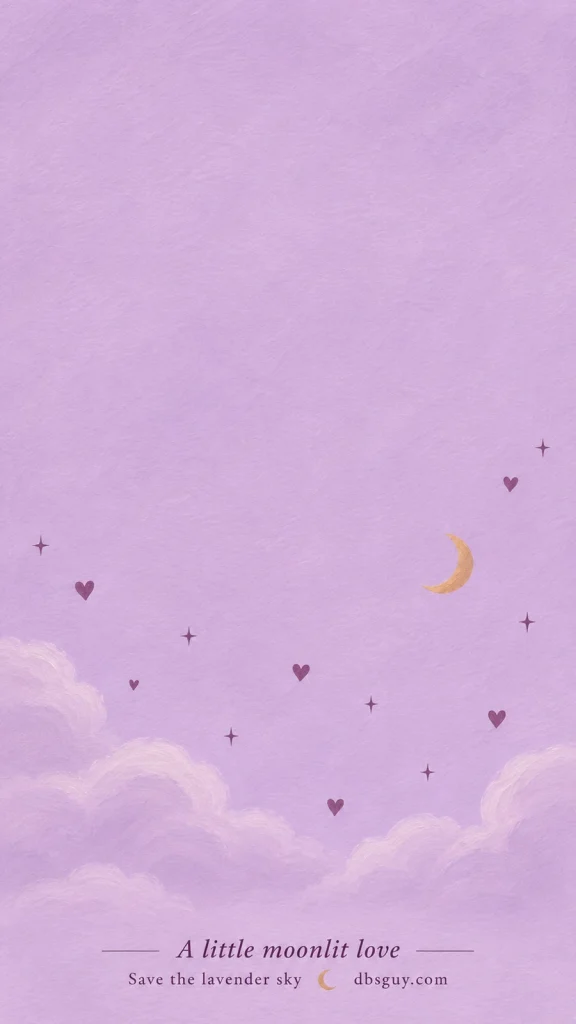
12. Lavender Celestial Hearts
A small crescent, plum hearts, and scattered stars sit above soft painted clouds. Lavender gives the design a nighttime feeling without taking the background all the way to black.
The open upper area is useful for the time, but the small motifs are easiest to enjoy with fewer widgets below it. Try a deep plum clock instead of white so it remains distinct from the pale lavender.
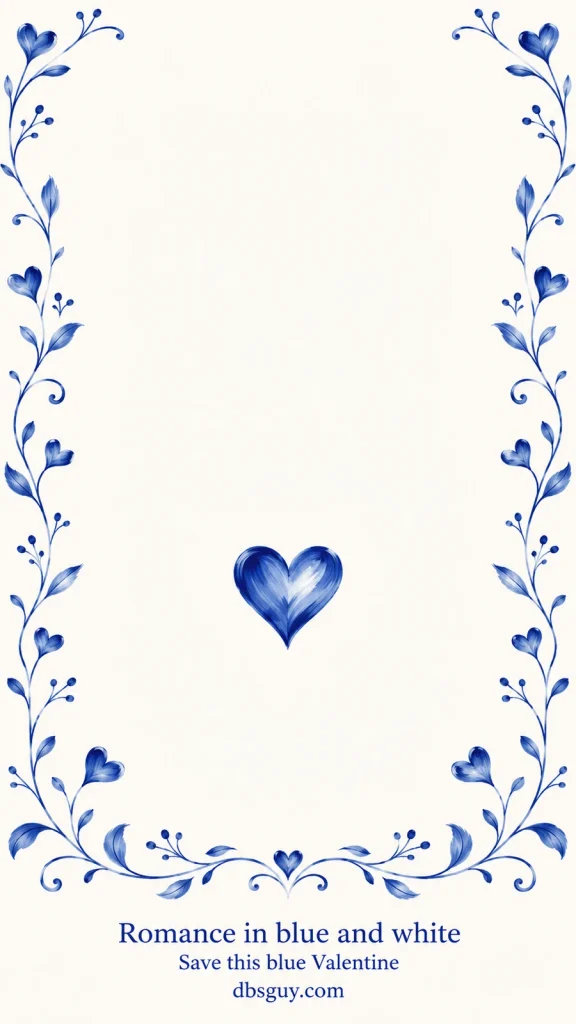
13. Blue-and-White Porcelain Hearts
Cobalt vines and little heart-shaped flourishes give this wallpaper a painted porcelain feel. It is a good choice when you want something romantic in blue and white rather than red and pink.
The border is part of the design, so begin with the widest crop your phone allows. A taller screen may trim the side vines; check that the central blue heart still has space around it. Use a dark blue clock to echo the painted details.
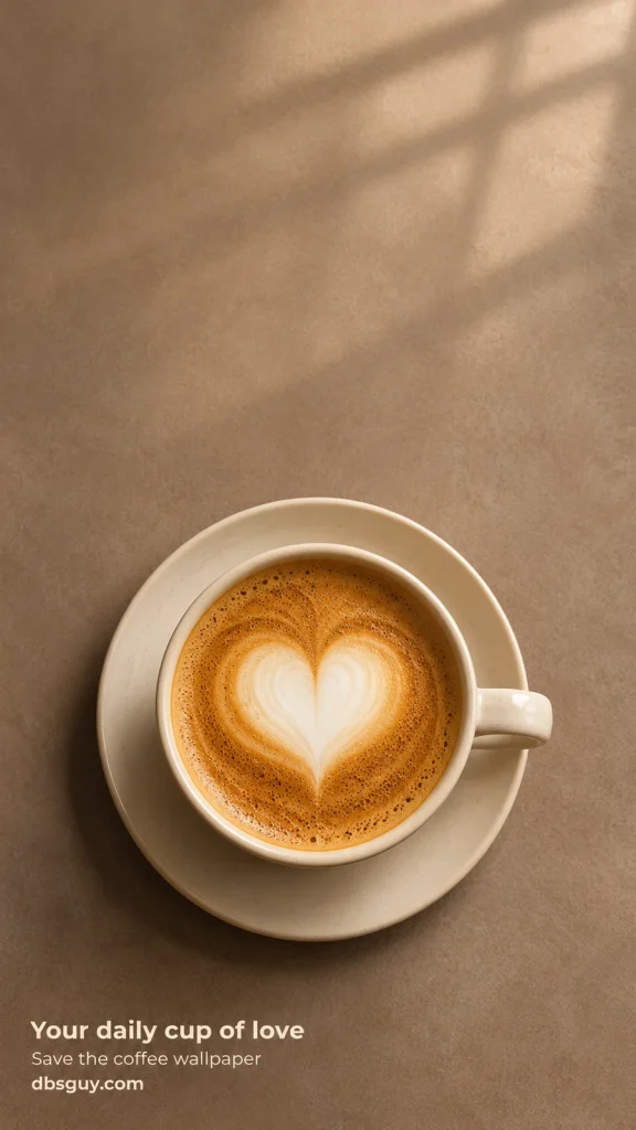
14. A Coffee Cup With a Foam Heart
A cream cappuccino cup makes this design feel like a slow February morning. The heart is part of the foam, so the image stays close to an everyday object rather than a decorative pattern.
Place the cup below your clock and leave enough of the saucer to show its round shape. The warm tabletop is a useful backdrop for pale text, though the window shadows are worth checking in the preview. This one pairs naturally with a plain taupe Home Screen.
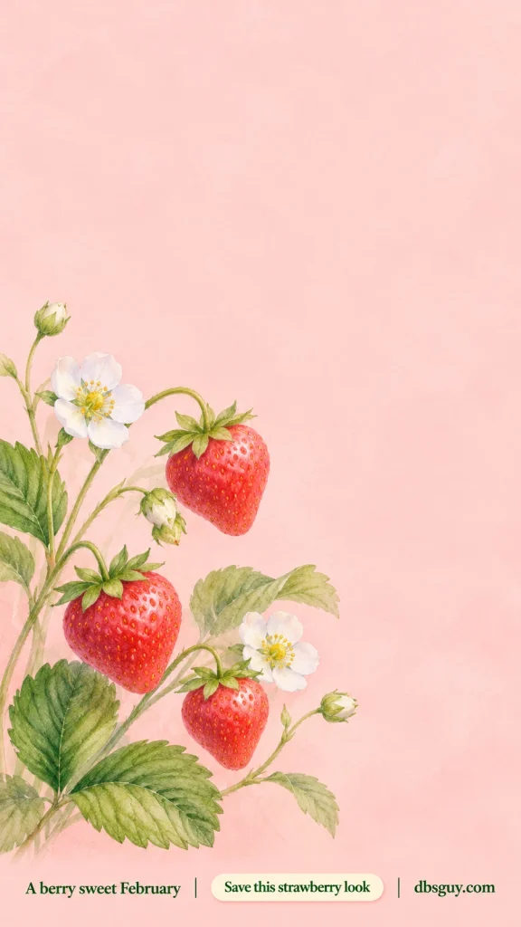
15. Strawberries and Tiny Blossoms
Three strawberries, green leaves, and white blossoms climb the left side of a pale pink background. This botanical design has a more lively, garden-like feeling than the softly framed roses.
Place your most important widgets toward the quieter upper or right-hand areas where your phone permits. Avoid zooming so far that the bottom berries disappear; the mix of fruit and flowers is what gives this option its character.
16. A Teddy With a Felt Heart
A honey-brown teddy holds a stitched red heart against a pale blush background. Pick it for a cute Valentine screen that feels soft and familiar, with one character rather than a page full of tiny toys.
Keep the bear’s face and the felt heart visible together. The blank area above its head gives the time a natural place, while a minimal notification layout leaves the stitched paws on show.

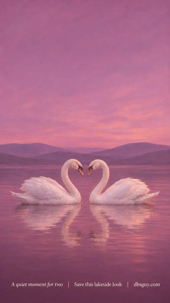
17. Two Swans at Rose-Colored Dusk
Two white swans face each other on a quiet pink lake, with violet hills behind them. This is the scenic option for a screen that feels like a small painting.
Keep both heads inside the crop and place the time in the open sky. Side cropping may trim the outer feathers on a narrow phone, so check the pair before applying. Pale text suits the mauve sky better than a very similar midtone pink.
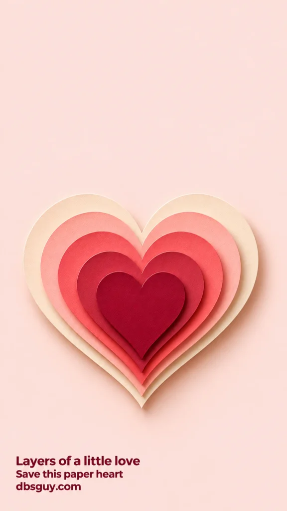
18. A Layered Paper Heart
Stacked cream, blush, coral, and burgundy paper shapes give this heart a sculptural edge. Unlike the flat checkerboard or line drawing, the shadows between the layers make the central shape feel dimensional.
Choose it if you want one substantial focal point. Keep the heart’s point above the phone’s bottom controls, then check that its widest layers remain visible. A plain pink Home Screen can carry the same color without repeating the large shape behind your apps.
19. A Pearl Heart on Pink Silk
Individual ivory pearls form an open heart on softly folded pink silk. This design suits a dressier screen palette, especially if you like pearl accessories or a pale rose phone case.
Give the outer pearls a little breathing room when you crop. The fabric highlights are fairly light, so try a darker clock and check that it remains readable across the folds. Keep widgets above the pearl outline if you want to see the complete shape.

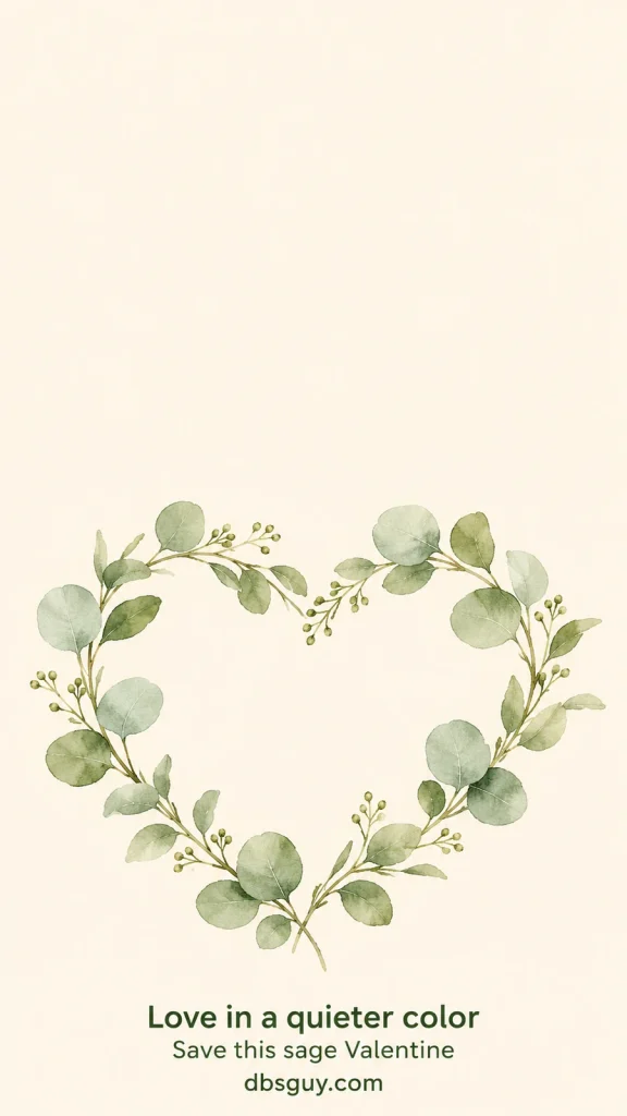
20. A Sage-Green Botanical Heart
Muted eucalyptus leaves form a loose heart on cream paper. With no red or pink in the artwork, this is the option to try if your usual style is green, neutral, or botanical.
The watercolor leaves are delicate, so avoid a heavy dark filter that hides their variation. Start with an olive clock and a few simple widgets above the wreath. The greenery also makes this an easy design to keep after the Valentine season.
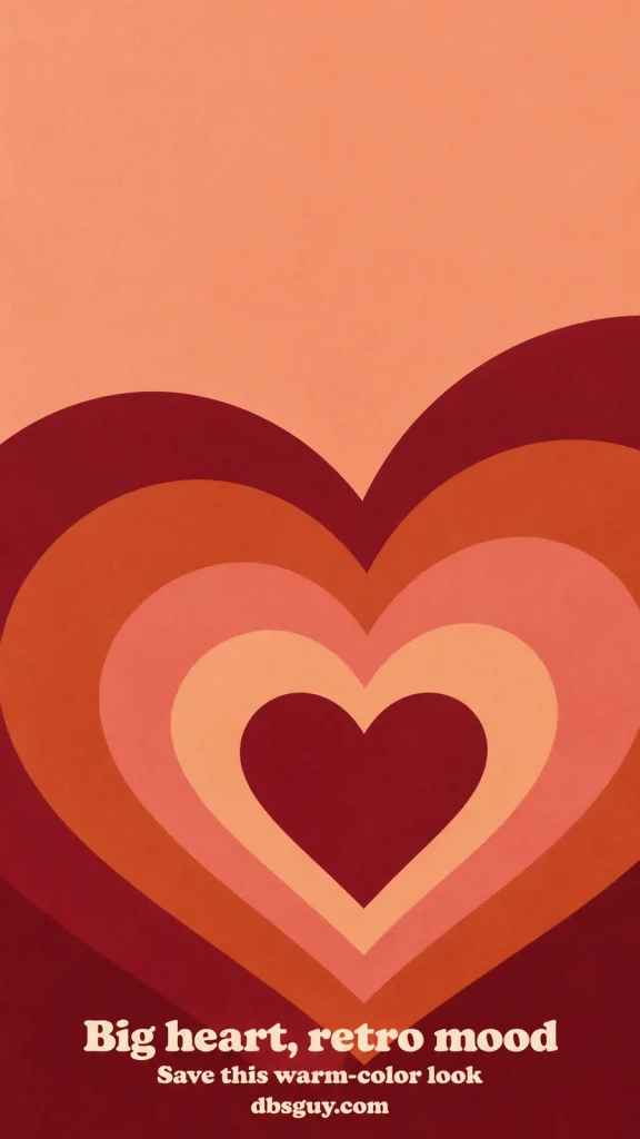
21. Retro Nested Hearts
Broad bands of peach, dusty rose, terracotta, and burgundy give this wallpaper a warm retro feel. The oversized heart reaches beyond the sides, so it is meant to feel immersive rather than sit inside a neat border.
Keep the smallest central heart visible and let the outer bands crop naturally. Try cream clock text in the plain peach area first; if it lacks contrast on your screen, switch to burgundy. This is a strong Lock Screen choice when you want color to be the main event.
Set your Valentine wallpaper on your phone
On iPhone
- Save your chosen image to Photos.
- Open Settings → Wallpaper → Add New Wallpaper, then choose Photos.
- Select the saved image. Adjust the preview and choose a clock color that stays readable against the background.
- Tap Add. Choose Set as Wallpaper Pair for both screens, or Customize Home Screen to give your apps a different background.
Apple’s wallpaper setup guide explains the available options. The wording and customization controls can differ with your iOS version.
On Google Pixel and other Android phones
On a Pixel, touch and hold an empty area of the Home Screen, open Wallpaper & style, and choose Change wallpaper. Choose your saved photo, select the screen you want to change, and preview it before applying. On other Android phones, look in Settings for Wallpaper, or open the image in your gallery and look for a “Set as wallpaper” option. The exact path depends on the manufacturer and software version.
Valentine wallpaper questions
Why does part of the image disappear on my phone?
The image and your display may have different proportions. A wallpaper picker can fill the screen by trimming part of the picture. Try reducing the zoom if the picker permits, then reposition the subject. Designs with a plain background, such as the blush aura, tolerate cropping more easily than the blue border or swan pair.
What if the wallpaper looks blurry?
First check that you saved the image rather than a small screenshot or thumbnail. Then reduce any extra zoom. These files are 900 × 1600 pixels, so enlarging them substantially can soften fine details. If your phone offers a wallpaper blur effect, check whether it is switched on. The artwork is static and does not include an animated or 3D effect.
Can I use one of these on a laptop?
You can try, but these are portrait phone designs. Filling a landscape desktop will crop much more of the artwork. If your computer offers a Fit option with a surrounding background color, that can preserve the full picture. This collection does not include separate landscape versions.
Which design should I choose if I have lots of widgets?
Start with the tiny cherry-red heart, blush aura, or midnight outline. Each has a large quiet area for the clock. Check your actual notification layout too: even an open wallpaper can lose its focal point behind a stack of messages.