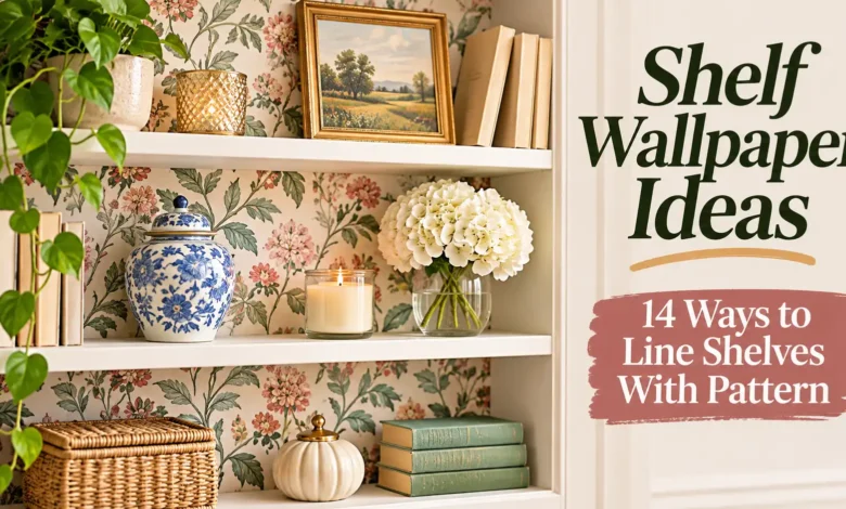
For the biggest change with the least pattern, line the back of a bookcase and leave its shelves plain. You’ll see the print between books and objects without wrapping every surface. If you want to line the shelf tops themselves, choose a covering specifically suited to that everyday wear.
These 14 shelf wallpaper ideas range from quiet botanical backdrops to patterned pantry liners and a removable-panel approach. Start with the area you actually see: the rear panel at eye level, the horizontal surface below eye level, or the front edge of a high shelf.
The images are AI-generated design concepts, created to illustrate pattern and placement—not photographs of installations we have completed or tested.
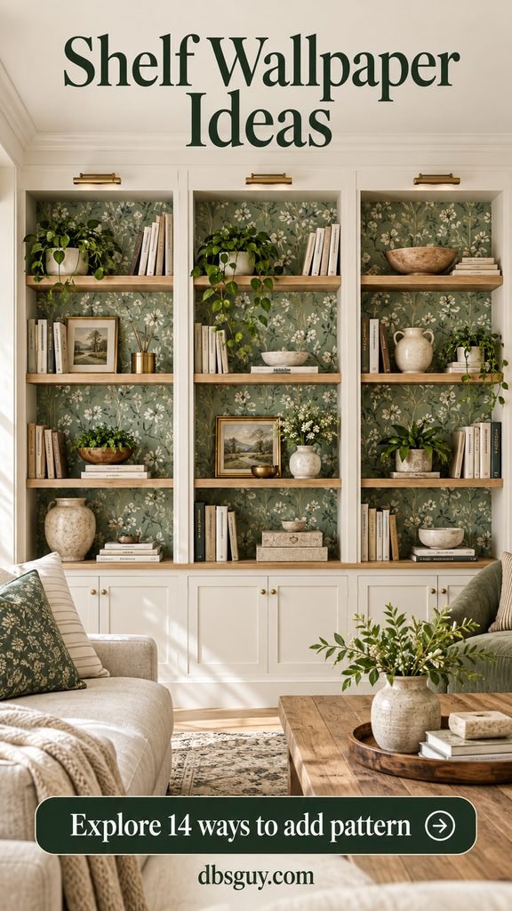
Choose the surface before you choose the print
Decorative backs: wallpaper works as a backdrop where books and dishes won’t repeatedly slide across it. Check that the particular paper is approved for your furniture’s finish. Peel-and-stick describes the adhesive, not a promise that every surface will be suitable.
Working shelf tops: look for a shelf liner or covering labeled for that use, with cleaning instructions that fit what you store. Ordinary decorative wallpaper may not tolerate scuffing or repeated wiping. Keep food in containers; a decorative liner is not automatically a food-contact surface.
Order a sample before a full roll. Hold it inside the shelf opening with a few of your actual objects in front. A print can look beautiful on a wall-sized product photo and disappear completely behind your books.
1. Use small botanical sprigs behind everyday books
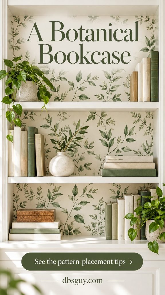
A small leaf print is a forgiving starting point when your book spines already bring several colors to the shelf. Try sage on ivory inside a white bookcase, keeping the shelf tops and side panels plain. The pale background connects the different objects; the leaves give the empty patches something to do.
Choose a repeat small enough that several complete sprigs fit above your books. Group books toward one end of a shelf and place a low bowl or rounded vase at the other. You don’t need to clear half your collection—just leave a few visible windows of pattern.
If the leaves disappear from your usual seat, try a slightly darker print before choosing a much larger motif. For a bookcase beside a chair, borrow the layout ideas in our cozy reading nook guide and keep the books you reach for most within easy reach.
2. Run vertical stripes through a narrow bookcase
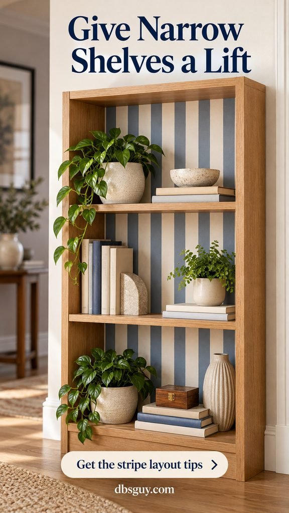
Muted blue-and-cream stripes give a slim bookcase a clear vertical rhythm. This works especially well when you want structure without adding another floral or leafy print to the room.
Keep each stripe in the same position from one shelf opening to the next. With removable shelves, papering the continuous rear panel makes that alignment easier. With fixed shelves, mark the stripe positions before cutting each separate piece; don’t start every bay with a different part of the repeat.
Check the side edges carefully. A narrow sliver of stripe down one side can look accidental. Shift the layout on paper first so the two outer edges feel balanced, and use a straight guide rather than assuming the cabinet is perfectly square.
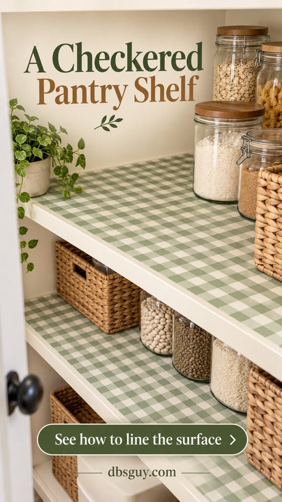
3. Line pantry shelf tops with small checks
For a pantry you look into from above, put the pattern on the horizontal shelf surface. Small sage-and-cream checks show between jars and baskets, while plain cabinet backs keep the storage area easy to read.
Use a wipeable shelf liner approved for horizontal use. Measure each shelf’s width and depth individually, then dry-fit the cut piece before exposing adhesive. A nonadhesive version is another option if you want to lift it out for cleaning; check that it stays flat when you move containers.
Align a row of checks with the front edge. Keep the liner within the shelf perimeter rather than leaving a loose flap. Store flour, snacks, and spices in closed containers, and lift heavy jars instead of dragging them over the print.
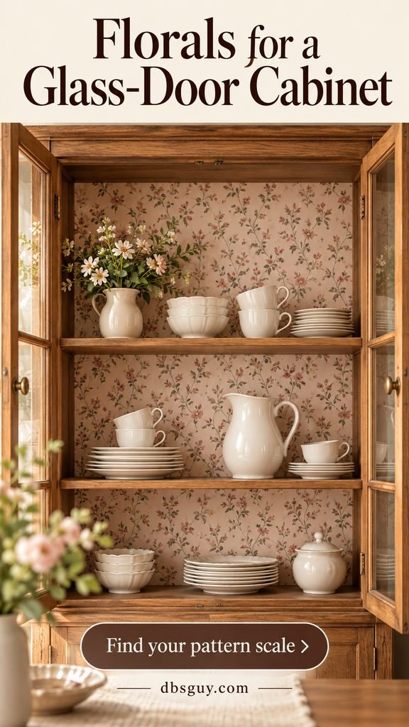
4. Tuck tiny florals inside a glass-door cabinet
A glass-door cabinet offers a contained place for a delicate floral you might not want across an entire room. Dusty pink flowers on cream soften an oak cabinet and provide a gentle backdrop for plain cups, bowls, and pitchers.
Before ordering, view the sample through the closed doors in both daylight and evening light. Glass reflections and door muntins can make a fine print harder to see. If your dishes are patterned too, choose a quieter wallpaper with fewer colors.
Cover the rear panel only. Leaving the wooden shelves exposed gives each level a clean outline and keeps the paper away from the surfaces where you slide dishes. Leave hinge fittings and shelf-pin holes accessible.
5. Choose a linen-look print for a quiet display
Pattern doesn’t have to mean recognizable flowers or bold shapes. A printed linen effect adds fine crosshatching behind pottery, baskets, and books without asking them to compete with a large motif.
Look at the sample beside your wood finish. An oatmeal print can warm pale oak; a very yellow beige may fight cooler wood or nearby gray upholstery. Here, the contrast comes from smooth ceramic shapes against the fine printed weave.
A linen-look print and real woven wallcovering are different materials. Check the label and care instructions rather than assuming a textured appearance means it can be scrubbed. Keep this treatment on the rear panel, with a few larger objects that leave its subtle detail visible.

Also Read: 30 Japandi Living Room Ideas for Effortless 2027 Calm
6. Put pale ceramics against a dark geometric backing
If your white pottery fades into white shelves, a charcoal backing creates separation. A restrained bronze geometric print adds detail close up while allowing the pale silhouettes to remain the main attraction.
Try the paper in the dimmest shelf opening first. A dark cabinet with deep shelves may swallow a low-contrast pattern, especially at night. You may prefer a midtone background if there is little nearby light.
Choose a small repeat and keep the shelf tops plain. Set a taller vase beside a low bowl rather than lining up equally sized objects. That difference in height exposes more of the background without making the display feel sparse.

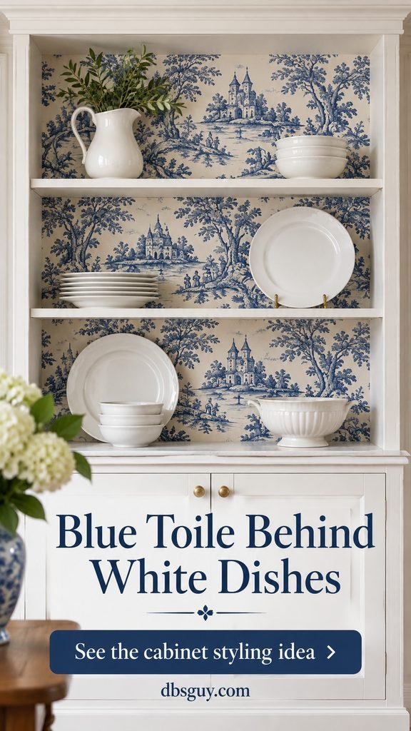
7. Frame white dishes with blue toile
Blue toile brings a little storytelling to a plain hutch: trees, buildings, or pastoral scenes appear in the spaces around your dishes. It works best when the dishes themselves have simple shapes and little surface decoration.
Check the actual motif size, not just the roll width. If a scene is taller than the opening between shelves, you may see only fragments. Position a recognizable part of the design in the largest exposed bay before deciding where to cut.
Keep plates securely supported and avoid filling every inch with stacks. One white pitcher against a blue scene can do more for this look than a crowded row of patterned cups. Plain white shelves act as breaks between the detailed panels.
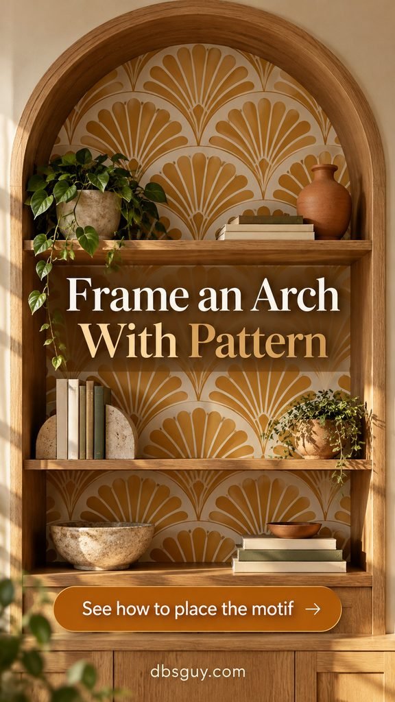
8. Fit a fan pattern to an arched bookcase
An arched bookcase already has a strong outline. A repeating fan or scallop motif can echo that curve, especially in warm ochre and cream. Keep the sides and shelves in their original wood finish so the arch remains easy to see.
Make a paper template of the curved top before cutting your wallpaper. Hold the template over the print to decide which motif belongs beneath the apex. Centering a fan there usually looks more deliberate than letting a seam or half-motif land at the top.
Use a cutting mat for the template work, and leave the trim allowance required by your paper’s installation method. If the rear panel is part of the bookcase’s structure, don’t remove it just to make wallpapering easier.
9. Coordinate two patterns across cube shelves
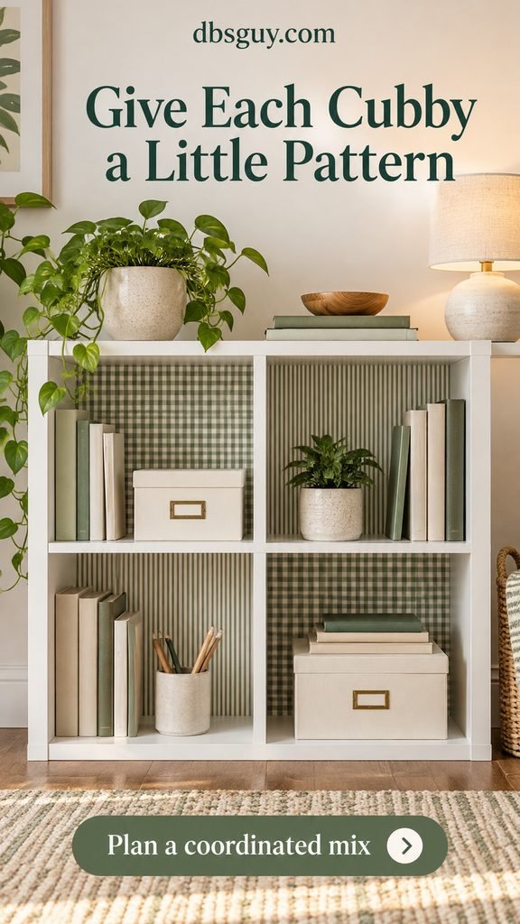
Cube storage gives you natural boundaries for mixing prints. Try miniature sage checks in two diagonal cubbies and fine sage stripes in the other two. Repeating the same background color makes the change in pattern feel planned.
Use just two designs to begin with. Cut a sample for each cubby and label its position on the reverse; similarly sized openings aren’t always identical. Keep the outer frame and horizontal surfaces plain.
This arrangement suits office supplies or a small book collection where each cube has a different job. Before covering every back, put your storage boxes in place. There’s little reason to wallpaper an opening that a full-size bin will completely hide.
10. Add pattern only to the front shelf edges
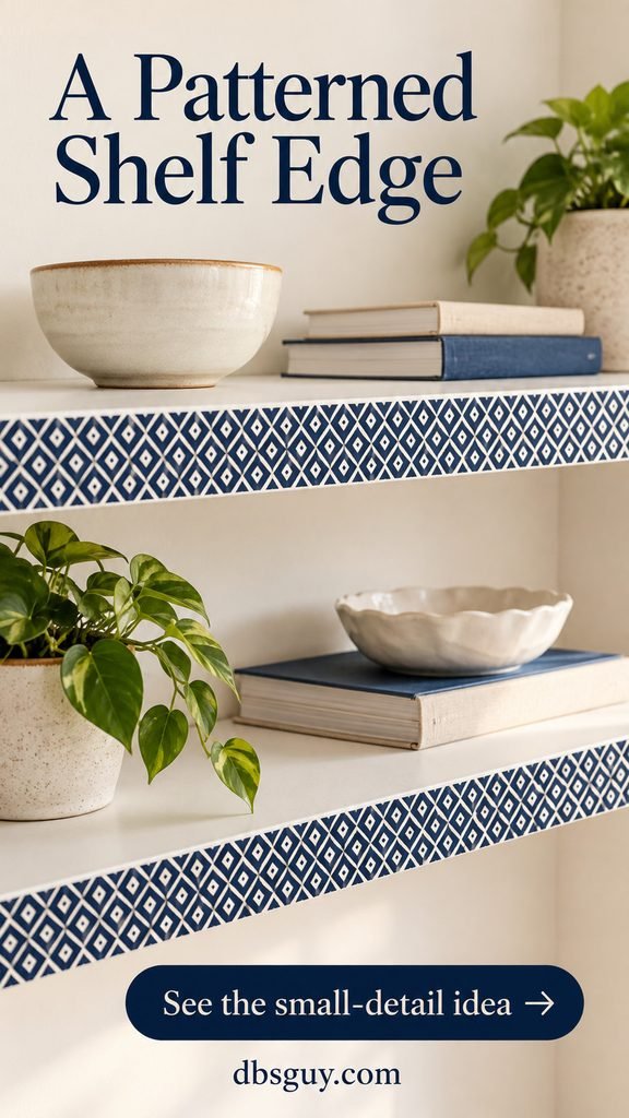
If your shelves are packed with books, most of a wallpapered back will disappear. A narrow patterned strip along the vertical front edge puts the detail where you can still see it.
Choose a tiny diamond, dash, or stripe repeat that fits within the height of the edge. Measure that height at several points, then cut the strip on a mat with a straightedge. Keep the paper within the flat fascia rather than leaving an overhang or wrapping it around a rounded lip.
Try this on a low-touch display shelf first. Frequently handled edges are more vulnerable to catching and peeling. If the edge is chipped, rough, or textured, wallpaper won’t repair it; prepare an approved surface or choose another placement.
11. Cover a removable insert instead of the furniture
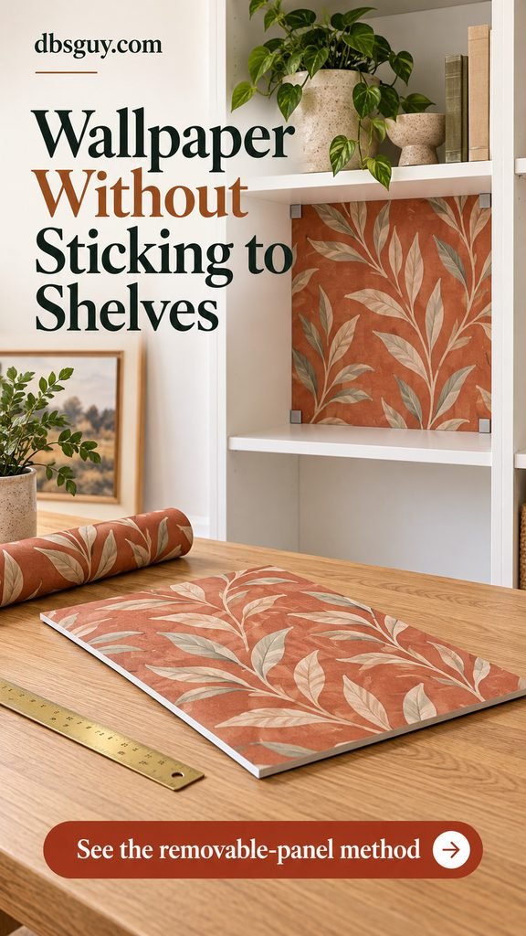
When you want to keep adhesive off a cabinet finish, put the wallpaper on a separate, thin rigid panel sized to fit the back of one shelf opening. The pattern still appears behind your objects, but the paper adheres to the insert.
Make a paper template first, then select a board that the wallpaper manufacturer allows as a substrate. Account for the paper’s thickness and any edge wrapping when sizing it. Test the plain insert in the opening before decorating it; you should be able to remove it without scraping the furniture.
The insert needs a secure retention method, such as suitable existing clips or a purpose-made frame. Don’t leave a heavy board leaning loose behind breakables. If clips require drilling, this is no longer a no-modification solution—get permission for borrowed or rented furniture. The panel is decorative, never a substitute for the original structural back.
12. Paper the recess behind floating shelves
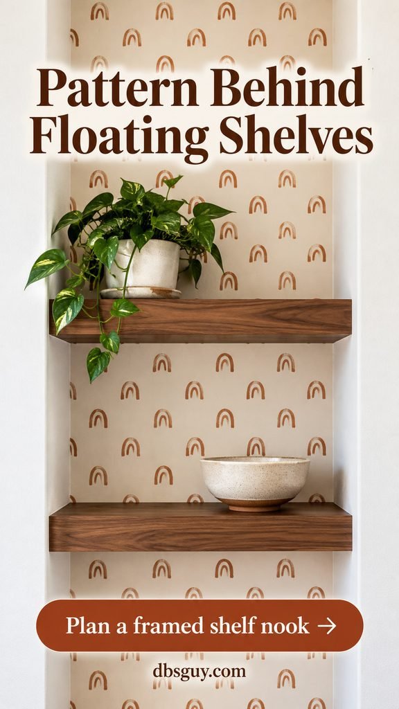
Open-backed shelves have no panel to line. In a recessed nook, use the wall behind them as the patterned surface and let the recess define the edges. A small rust-colored arch print pairs well with plain walnut shelves.
Keep the paper inside the recess rather than continuing it onto the surrounding wall. This gives the shelving area a clear boundary without needing to wallpaper the whole room. Check that the wall finish suits your chosen paper.
For a new installation, plan the wallpaper and bracket positions together. Keep the manufacturer’s mounting hardware and required wall fixings; paper is decoration, not a mounting surface. With existing shelves, don’t loosen concealed brackets unless you know how to reinstall them correctly. Keep plant pots on watertight saucers and wipe spills promptly.
Also Read: How to Create a Cozy Living Room with Floating Shelves & Plants
13. Use a wave print in a dry bathroom cabinet
Pale aqua waves make a simple background for folded white towels and amber bottles. Keep the paper on the cabinet’s vertical back, away from the shelf tops where toiletries may leak.
This is a dry-storage idea, not a shower-niche treatment. Use a product whose manufacturer permits your bathroom conditions, and avoid places exposed to direct water. WallPops, for example, distinguishes occasional humidity from direct water exposure and warns about excessive humidity without ventilation.
Put bottles in a washable tray and let damp items dry elsewhere before storing them. If the cabinet regularly develops condensation or stays damp, address that problem before adding paper. A wave motif can suggest water without the material being waterproof.

Also Read: Cozy Bathroom Wallpaper Ideas for a Warm, Inviting Space
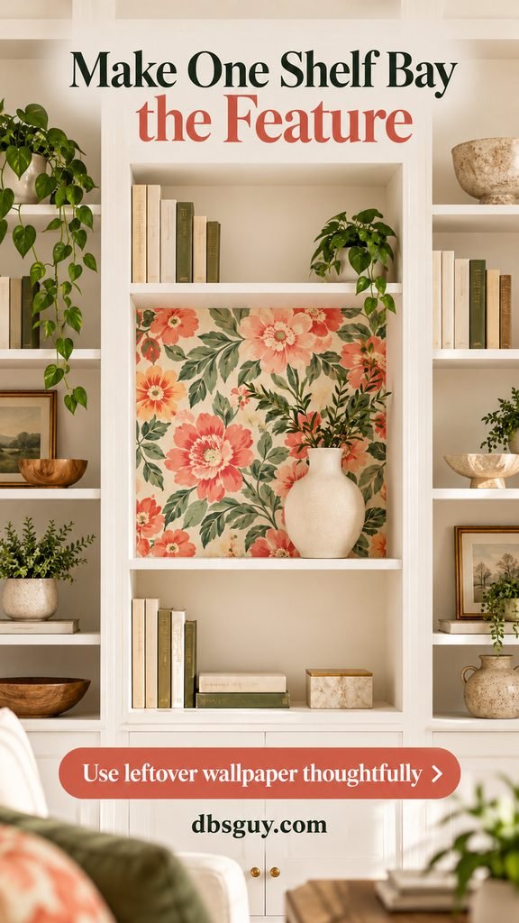
14. Turn one shelf bay into a patterned feature
You don’t need enough leftover wallpaper for the entire bookcase. Cover one eye-level bay and leave the other backs plain. A coral-and-sage floral makes that single opening feel like a framed accent.
Lay the offcut over a template before committing. The useful piece must accommodate the opening, trimming, and the part of the motif you want to show. If the offcut is too small, choose a smaller bay instead of piecing together unrelated fragments.
Place one simple object off-center in the patterned opening. Keep the busier book storage above and below. This is also a manageable way to find out whether you enjoy a bold pattern in the room before covering more surfaces.
Also Read: Best Fall Decorations Shelf Ideas to Brighten Your Space
Plan the cuts before you peel anything
Gather a tape measure, pencil, paper for templates, scissors, a straightedge, cutting mat, and the smoothing tool recommended for your covering. Use a sharp craft knife with care; cut loose pieces on the mat rather than on the furniture.
- Check compatibility. Read the product instructions for approved surfaces, cleaning, paint curing, and removal. Test a sample in an inconspicuous area for adhesion and removal. “Removable” does not guarantee that a weak finish will stay intact.
- Empty and measure. Remove adjustable shelves only as the furniture instructions allow. Measure the back, top, and bottom of each opening, and note any hardware or uneven corners. Keep structural parts and anchors in place.
- Map the pattern. Mark the top of every piece and decide where motifs and seams should fall. For fixed shelf bays, carry stripes or repeating motifs through the layout before cutting separate panels.
- Prepare and apply. Clean as directed and let the surface dry. For self-adhesive paper, expose a small section of backing, align it, and smooth gradually as you peel farther. Don’t stretch the material to force a pattern match. Follow the product’s instructions for seams and repositioning.
- Trim and check. Protect the furniture when trimming, check corners and edges, and reinstall shelves without covering adjustment holes. Follow any required waiting period before loading the shelves.
For an example of product-specific surface and moisture guidance, read the manufacturer’s NuWallpaper FAQs. Its requirements apply to that product; use your own paper’s instructions if you choose something else.
Don’t order by square footage alone
Roll width, pattern repeat, and usable panel length matter. For example, a 30-inch-wide by 60-inch-high back cannot be covered by one 20.5-inch-wide strip. You need two drops, each long enough for the height and trimming, plus whatever extra length the pattern match requires. A roll’s total area may look sufficient while its usable length falls short.
Draw each cut piece to scale before ordering. Include the manufacturer’s trim allowance, the printed repeat, and a spare piece for a mistake where practical. For several bookcases, check batch information so neighboring panels are as consistent as possible.
Questions to settle before starting
Can I use regular wallpaper instead of peel-and-stick?
Possibly, if the paper, paste, and furniture substrate are compatible. Don’t assume a paste suitable for a wall is suitable for a thin furniture back. Follow the manufacturer’s preparation requirements; for an uncertain finish, a compatible separate insert may be the better project.
Will peel-and-stick wallpaper damage my shelves?
It can. Surface condition, finish, adhesive, and removal technique all matter. A sample test is useful but not a lifetime guarantee. Avoid direct adhesive on furniture whose finish you cannot risk, and check permission before changing landlord-owned cabinetry.
What if bubbles or lifted edges appear?
If the product allows repositioning, gently lift the affected area and smooth it again as directed. Persistent lifting may indicate dust, texture, moisture, tension, or an incompatible surface. Don’t keep adding stronger glue without checking the cause and the manufacturer’s advice.
Should every shelf opening have wallpaper?
No. A single bay can be enough, particularly with a large print or a full bookcase. Start with the opening you notice most often. Put your objects back, stand at your normal viewing distance, and decide whether more pattern would add anything useful.