
The easiest places for holographic home accents are small, useful surfaces: an entry tray, a coffee-table bowl, a shelf vase, a desk organizer, a bathroom dispenser, drinking glasses, a window-side panel, or a lamp base. Pick the spot you use most and start with one piece. You do not need to turn the entire room into a rainbow.
The appeal is the shift: a pale pink edge from one seat, a blue-green reflection from another. In home decor, “holographic” often serves as a shopping label for iridescent, pearlescent, or dichroic finishes rather than a literal hologram. These eight placements focus on that color-changing look, with practical checks to help you choose something that works in your room.

1. The entryway: a catchall tray that earns its place
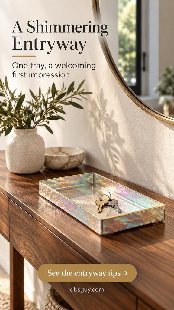
A narrow entry console is a good starting point because the accent has a real job. Choose one shallow iridescent tray for keys instead of spreading shiny objects across the entire surface. Walnut or dark-stained wood gives the pale rainbow finish a grounded backdrop; an ordinary mirror keeps the rest of the vignette calm.
Measure the tray against the usable console depth, including anything that already lives there. Leave enough room to set down a bag without knocking it. A raised rim helps contain keys, but delicate coatings may show scratches from metal: check the finish and care instructions before buying.
Keep mail elsewhere. This spot works when the tray is still visible, rather than buried under everything that came through the front door.
2. The coffee table: one low glass bowl
An empty iridescent glass bowl can be the color in an otherwise neutral seating area. A low, open shape lets you see the finish from the sofa without creating a tall barrier between people. Pair it with a plain book and leave the rest of the tabletop available for daily use.
Against matte oak, linen, and wool, the bowl reads as a deliberate change of texture. On a glossy table surrounded by chrome accessories, it can get lost in the reflections. If your room already has busy upholstery, try a softly pearlescent finish rather than a strongly saturated oil-slick effect.
Use a stable base and keep fragile glass away from the edge. In a household where that feels impractical, choose a durable decorative tray instead. For a quieter foundation around the accent, browse our Japandi living room ideas and borrow the restrained material palette.

3. An open shelf: a sculptural vase with breathing room
A shelf puts the accent close to eye level, where its outline matters as much as its sheen. Look for a vase with a simple sculptural shape—rounded, folded, or gently asymmetric—and let it stand apart from the books. The color shift supplies the detail; it does not need patterned objects on every side.
Start with the vase and two neutral books, then step back from the whole shelving unit. If the accent disappears, move it to a shelf with a lighter background or some side light. If it dominates, remove a nearby colorful object before adding more.
A dry display is useful here. If you want flowers, confirm that the vase is watertight and suitable for that use; a decorative vessel is not automatically a flower vase. Avoid placing a tall, top-heavy piece on an unstable floating shelf.

4. The desk: a translucent pencil cup
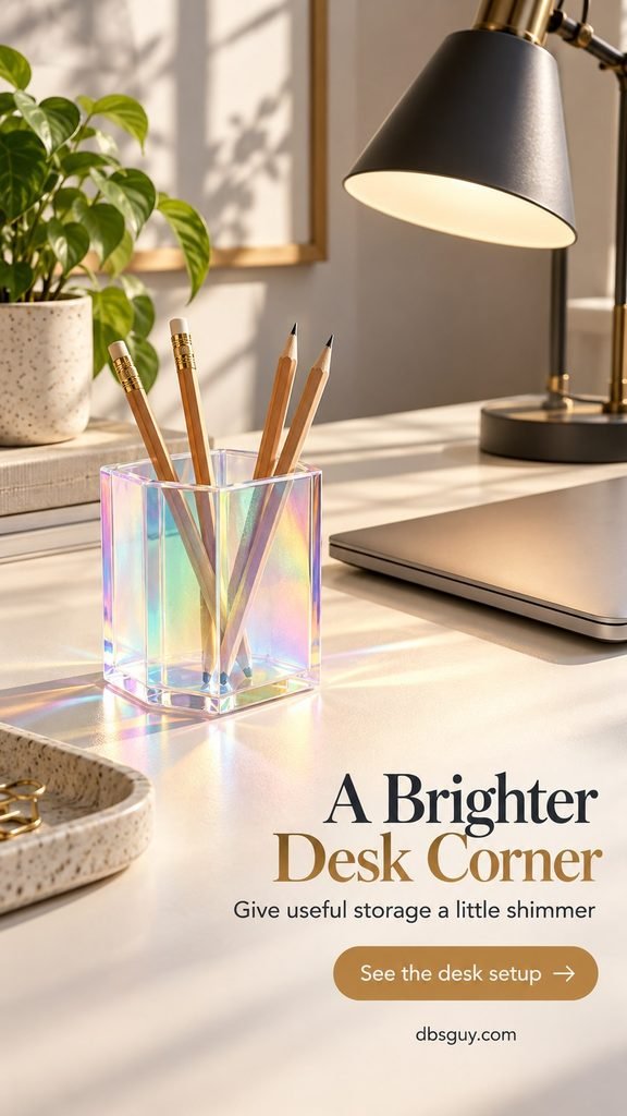
On a work surface, a small iridescent organizer is easier to live with than a reflective desk or rainbow-covered monitor area. A translucent pencil cup gives useful storage a little personality while keeping the shimmer off the main screen.
Choose a cup wide enough for your actual tools and a base that does not wobble. Keep it to one side of your writing area. In the concept shown, a charcoal task lamp and plain desk make the changing color feel crisp rather than sugary.
Check it under your normal working light. If it throws a distracting reflection toward your eyes, move it behind the screen line or onto a nearby shelf. Acrylic can scratch, so use the maker’s cleaning guidance instead of assuming a glass cleaner is suitable.
5. The bathroom vanity: a pearly soap dispenser
A soap dispenser gives a bathroom just enough shimmer without committing to iridescent tile. Choose a finished ceramic or glass accessory intended for bathroom use and place it on a small stone tray beside the sink. A clear tumbler, plain towels, and brushed nickel hardware let the pearly finish remain the focus.
Make function the first check: the pump should be comfortable to use, the base should sit flat, and the bottle should be easy to refill. Leave the faucet controls and sink edge clear. Wipe up standing water and follow the accessory’s care directions; a rainbow coating tells you nothing by itself about moisture resistance.
In a room without daylight, expect a different effect under the vanity lighting. Our bathroom ideas for rooms with no window can help you plan the brighter backdrop first.

6. The dinner table: a restrained pair of rainbow glasses
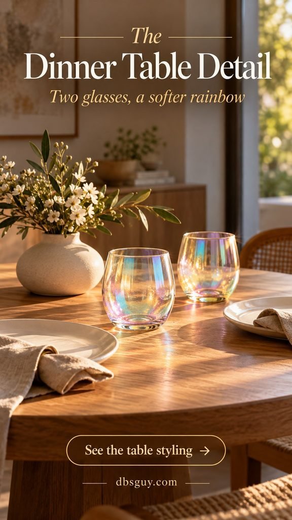
For a table set for two, start with two iridescent drinking glasses and keep the plates white. Flax napkins and an oak tabletop give the glass a warm setting. This is a more flexible way to explore the finish than buying an entire rainbow dinner service.
Buy drinkware explicitly intended for beverages, and check whether the finish is inside or outside, along with the manufacturer’s washing instructions. Do not coat ordinary glasses with craft film or decorative paint to recreate the concept. Dishwasher, microwave, and food-contact suitability are product-specific.
For fall gatherings, keep the seasonal color in the linens or flowers; for winter, silver or ivory details can sit comfortably beside the sheen. These are styling options, not a reason to replace what you already own. Leave the center of the table low so people can see each other.
7. A window-side ledge: a removable decorative panel
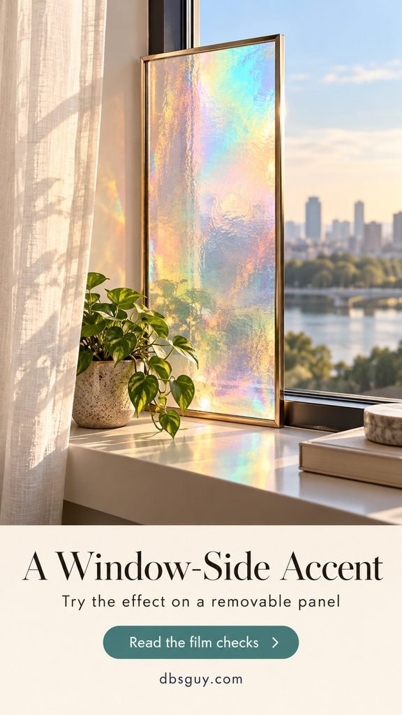
If the changing light is what attracts you, try a small framed decorative panel near a window before covering the window itself. The concept uses a transparent iridescent panel in a slim frame, with the actual window left clear. It gives the finish its own boundary and lets you move it if the color feels too strong.
Use a secure, stable installation rather than leaning loose glass on a narrow sill. Ask a supplier for an appropriate finished panel, or have a suitable film applied to a compatible separate panel according to its instructions. Check the material, exposed edges, mounting requirements, and suitability for your location.
3M’s description of its Chill dichroic film explains that the color changes with viewing angle and differs between transmitted and reflected light. That does not mean every rainbow film behaves the same way. Request a sample and view it in the actual room.
If you prefer direct window film, first confirm compatibility with your specific glazing and the window manufacturer’s requirements. Decorative film is not automatically a privacy, UV-protection, or heat-control product. Do not assume a translucent rainbow finish hides the room at night.
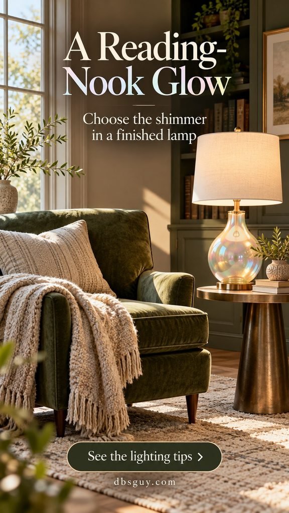
8. The reading nook: an iridescent lamp base
A finished lamp with an iridescent glass base brings the effect into an evening corner. Keep the shade plain so it supplies useful light while the base provides the decoration. An olive chair, cream shade, and textured throw make the rainbow feel comfortable rather than theatrical.
Look at the base with the lamp both on and off: the strongest color may come from daylight or the surrounding room rather than from the bulb. Choose the lamp for the light you need first, then its finish. Follow its stated bulb type and maximum rating, and keep the cord out of walking paths.
Buy a complete fixture suitable for its intended indoor location. Do not apply craft holographic film to bulbs, shades, or hot parts. If the corner still needs seating and layout decisions, our small-space reading nook ideas offer useful starting points.
How to choose a finish you will enjoy at home
My styling recommendation is to give the shimmer one quiet neighbor: wood, stone, linen, a plain wall, or an unpatterned shade. Begin with one focal accent per vignette, then live with it before adding another. This is a design starting point, not a fixed decorating rule.
Search both “holographic home accents” and “iridescent home decor.” Add the actual object you need—tray, vase, drinkware, or lamp—and read the material description. A rainbow gradient printed on an object will look different from a finish that changes as you move. Ask for an unfiltered video or a sample when the effect is central to the purchase.
Check dimensions, stability, intended use, and care instructions. A beautiful listing image cannot establish that a bowl is food-safe, a coating tolerates soap, or a film is compatible with your windows. For cleaning, follow the maker’s instructions and avoid experimenting with abrasives or solvents on an unknown finish.
Frequently asked questions
Are holographic and iridescent decor the same?
Retail labels overlap, but they are not precise synonyms. Iridescent describes a color-shifting appearance; “holographic” listings may refer to several rainbow effects. Dichroic products can show different colors in transmitted and reflected light. Choose by the documented material and the effect you can actually see, rather than the keyword alone.
Can this look work in a neutral home?
Yes. Try a pale iridescent object against ivory, oak, charcoal, or stone, with the existing furniture doing most of the visual work. If you prefer a quiet room, choose a small footprint and a soft finish rather than a large, mirror-bright surface.
Which spot is the easiest place to start?
An entry tray or shelf vase is easy to move and does not require installation. A desk cup is a good option if you want the accent to serve a daily purpose. Window treatments and lighting need more product-specific checks.
Will an iridescent accessory make rainbows on the wall?
Not necessarily. Some finishes mainly change color on their own surface; others affect transmitted light. The result depends on the product, viewing angle, and lighting. Do not buy from a dramatic concept image alone if projected rainbows are your main goal.
Choose one spot, keep its surroundings simple, and check the finish in your actual light. The most convincing accent is one that still makes sense when the rainbow is subtle.