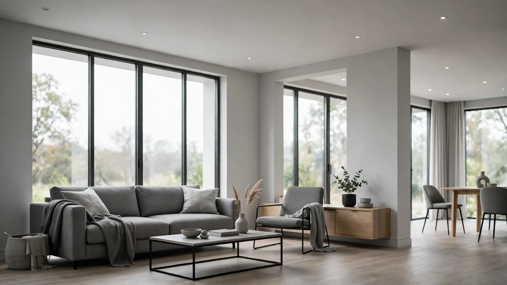
Home design moves fast. A finish or layout can be everywhere one year — all over new builds, renovations and photo feeds — and by the next, homeowners are quietly wondering why they ever wanted it. Some trends fade simply because tastes change, but others wear out their welcome for practical reasons: they are hard to clean, awkward to live with, or lovely only until the first real week of life in the house.
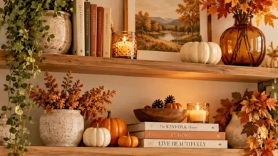
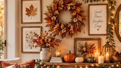
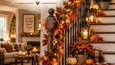
So here are the modern trends that come up again and again when homeowners talk about design regret. Some are huge decisions, like ceiling height and floor plans; others are small fixtures you touch ten times a day. A few of these will probably spark an argument — one person’s dated is another person’s dream — and that is half the fun. See how many you recognise from homes you have visited, or from your own. And if you are refreshing a room rather than renovating, ideas like these fall living room decoration ideas show how much warmth you can add without touching a single fixture.
1. Sliding Doors on Bathrooms
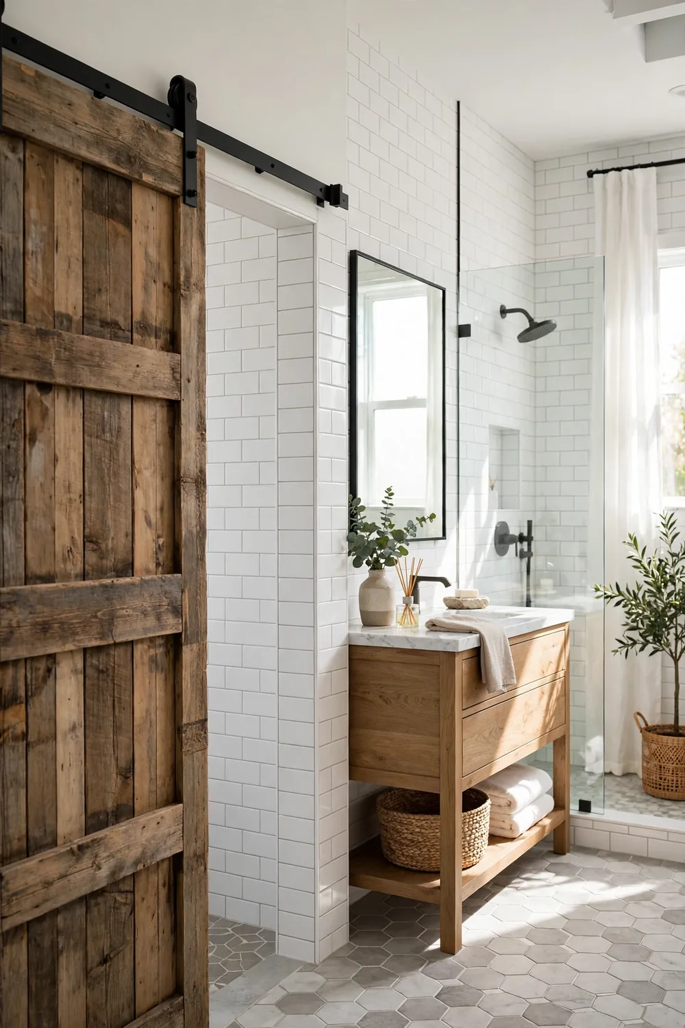
Sliding doors — especially barn-style doors on a visible rail — became the go-to fix for tight bathrooms and awkward door swings. They save floor space, they look charming in photographs, and they let builders squeeze an ensuite into floor plans where a swinging door simply would not fit.
The complaints are mostly about privacy. Critics point out that a sliding door rarely seals the way a hinged one does: there are gaps at the edges, the latch is often flimsy, and sound travels through far too easily. Plenty of homeowners say a bathroom is the one room where a solid, lockable door really earns its place — though fans answer that for a guest powder room, the trade-off is worth it.
2. Microwaves Mounted Above the Stove
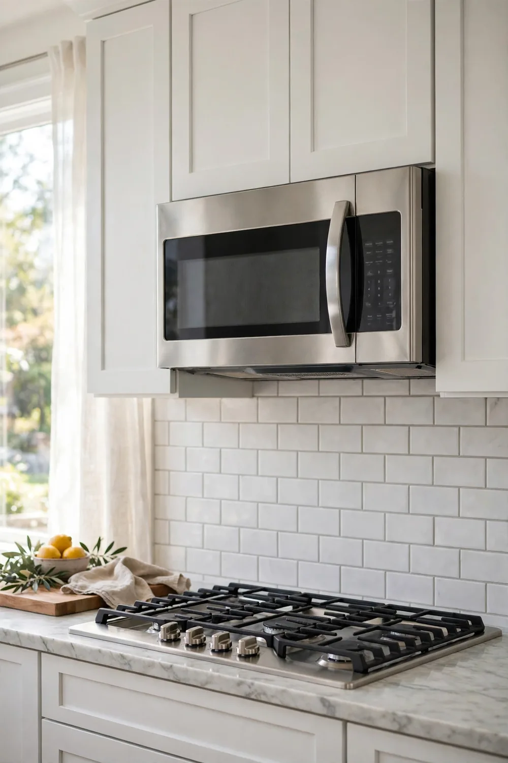
Mounting the microwave over the stove became standard in builder kitchens because it saves counter space and combines two appliances in one footprint, often with a built-in extractor fan underneath.
Homeowners who cook a lot tend to be the loudest critics. Reaching up over hot burners for a heavy dish feels risky, the built-in fan is often weaker than a proper range hood, and when the microwave fails, replacing it is a bigger job than swapping a countertop model. Many renovators now move it to a lower cabinet or a pantry wall instead.
3. Matte Black Faucets and Hardware
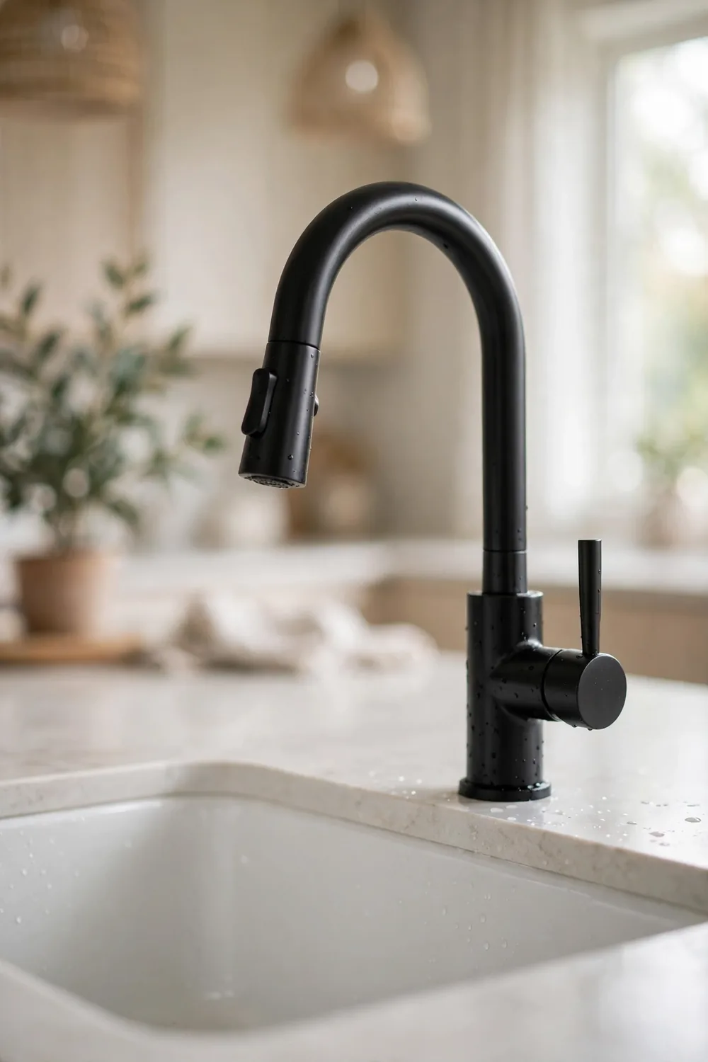
Matte black taps, shower fittings and cabinet handles swept through kitchens and bathrooms as the moody alternative to chrome. The finish photographs beautifully and pairs with almost any colour scheme, which is why it became the default modern upgrade.
Living with it is another story, owners say. Every water spot, fingerprint and trace of limescale shows up pale against the dark finish, so fittings can look dusty minutes after cleaning. In hard-water areas the effect is worse, and once the coating chips or wears at the edges, matching a replacement years later is not always easy.
4. Recessed Lighting Everywhere
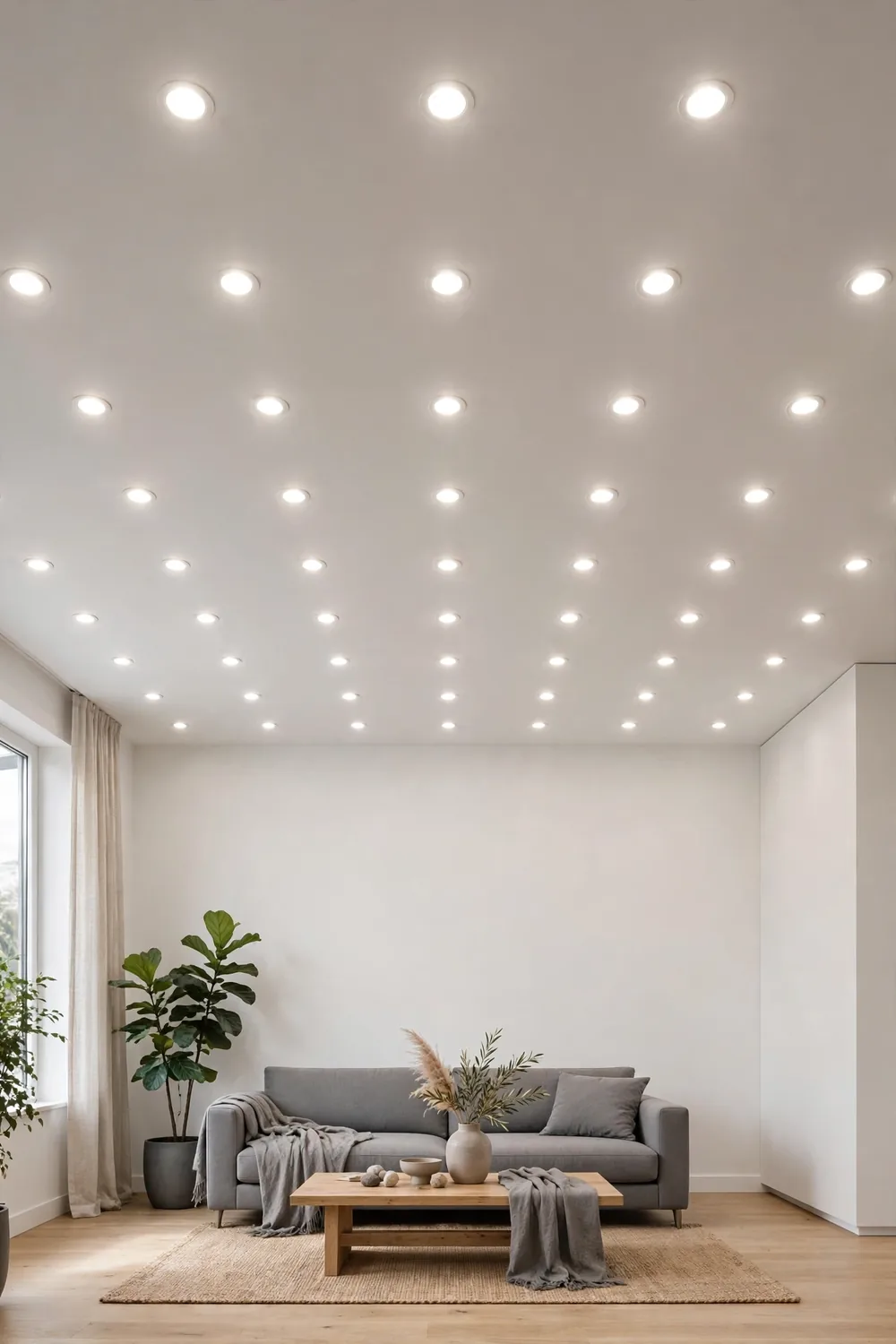
Rows of recessed ceiling lights — pot lights — promised a clean, uncluttered look with no hanging fixtures and even light in every corner. Builders love them because they suit any room and any style.
The backlash is about atmosphere. Critics argue that a ceiling dotted with bright downlights can feel flat and clinical, more like an office or a showroom than a home, and that the light does nobody any favours at face level. Designers increasingly suggest layering — fewer recessed lights, softened by lamps, pendants and dimmers — so a room can change mood instead of glowing at full blast all evening.
5. All-Neutral Beige and Brown Colour Schemes
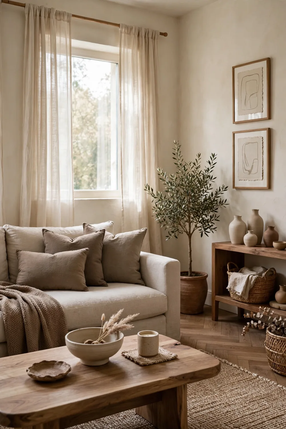
For years the safest palette in home design has been layers of beige, cream, taupe and warm brown. It is calm, it photographs softly, and it never clashes with anything, which made it the favourite of house-flippers and staging professionals.
Plenty of people now find that calm sliding into bland. Homeowners say room after room in the same warm neutrals can feel flat and forgettable, with no contrast and nothing for the eye to land on. The counterpoint is fair: neutrals are a forgiving backdrop, and colour can always move in through cushions, art and plants rather than paint.
6. Vaulted Ceilings
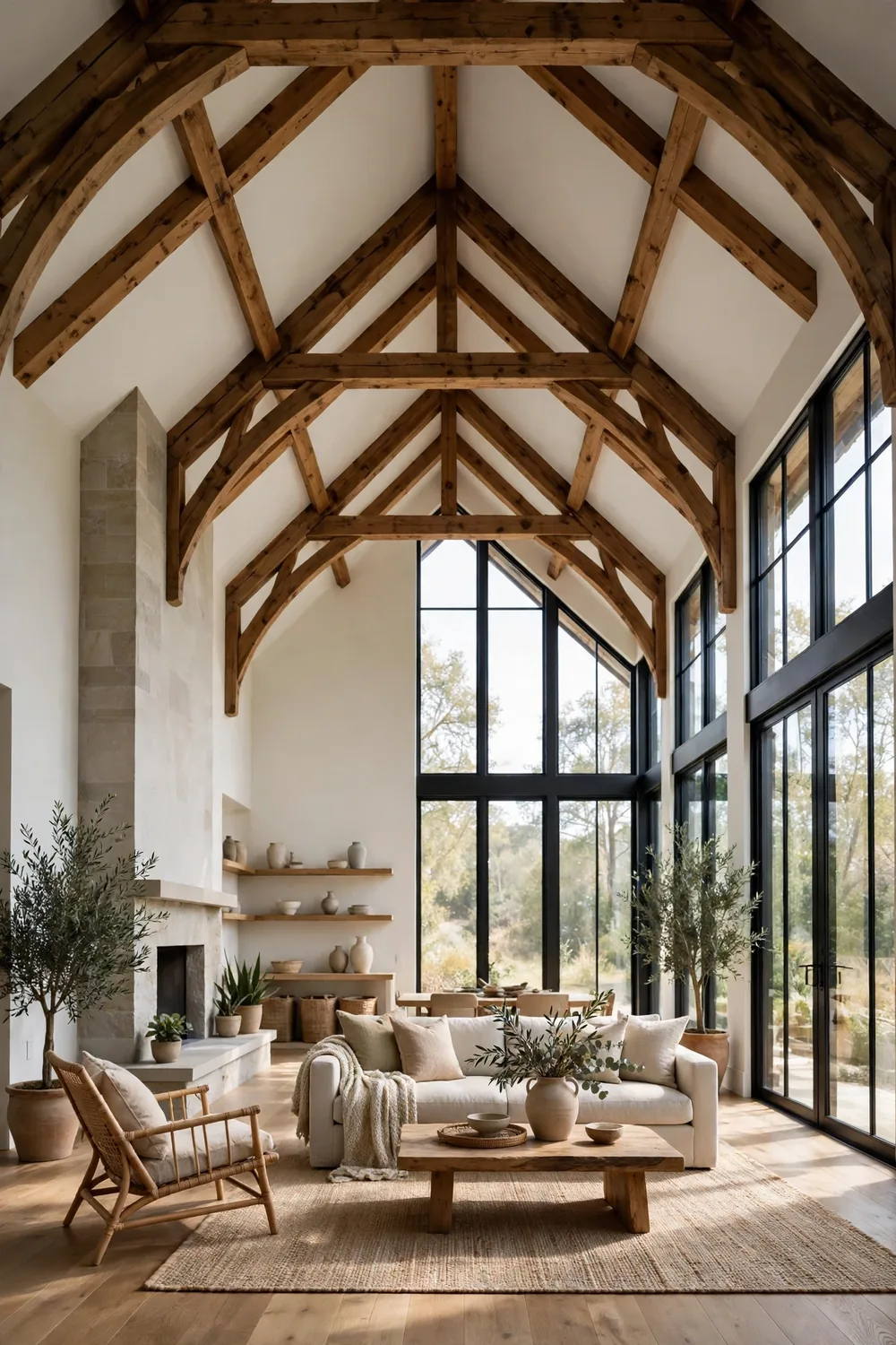
Vaulted and cathedral ceilings sell a feeling of space and grandeur. They flood rooms with light, make modest floor plans feel generous, and give a home that dramatic first impression estate agents love.
Owners tend to judge them by their heating bills and their ladders. Critics note that all that extra air volume costs more to heat and cool, that changing a bulb or cleaning a high window becomes a project, and that sound bounces around hard surfaces. Defenders say the sense of airiness is worth every penny — but few deny it is an expensive kind of beauty.
7. Jack-and-Jill Bathrooms
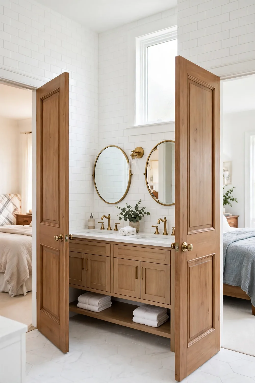
A Jack-and-Jill bathroom, shared between two bedrooms with a door from each side, has long been sold as the clever family layout: siblings get their own entrance, guests get privacy, and the house saves the cost of a second bathroom.
Families living with one often tell a different story. Someone always forgets to unlock the other door, or worse, forgets to lock it. Morning queues form at the single toilet, and teenagers are rarely thrilled about sharing. Fans say good locks and a split layout with separate sinks solve most of it, but plenty of homeowners say they would rather have had two small bathrooms.
8. Poor-Quality New Construction
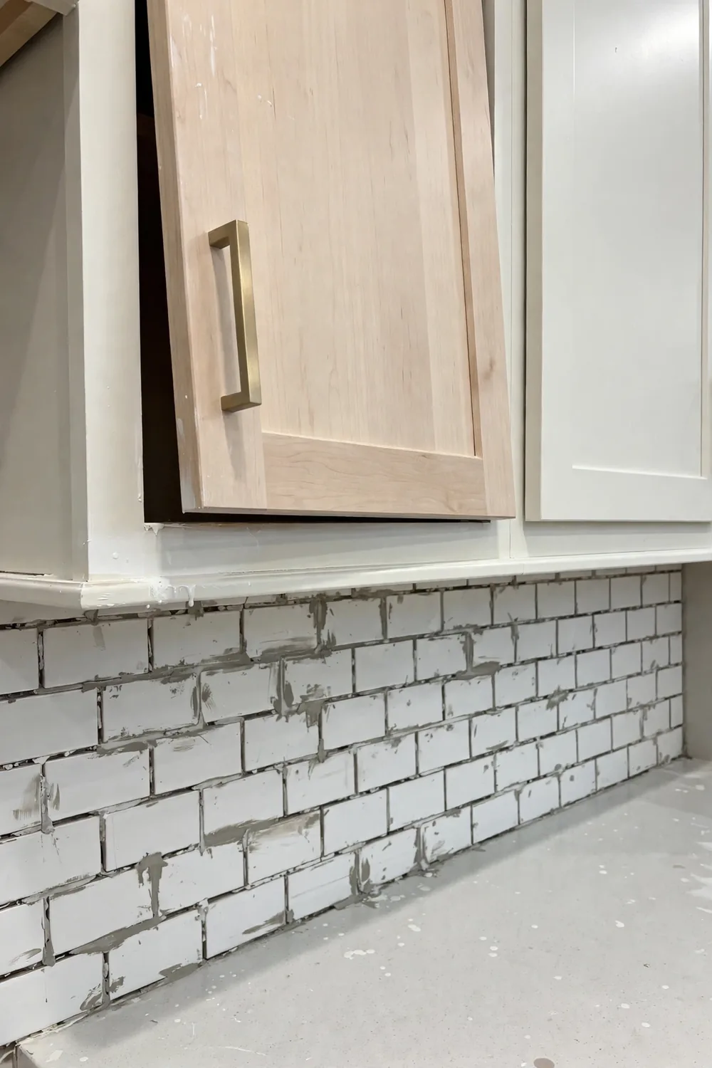
This one is less a style than a grievance. Brand-new homes are supposed to be the easy option — no repairs, no surprises — and glossy show homes promise crisp finishes, straight lines and everything working from day one.
Too many buyers say the reality is thinner walls, hollow doors, crooked trim, doors that do not quite close and finishes that scuff within months. Critics argue that speed and cost-cutting have replaced craftsmanship, leaving owners fixing defects in a house that still smells of fresh paint. Not every builder cuts corners, of course, but the complaint comes up so often that the old saying about homes not being built the way they used to be has become a refrain.
9. Farmhouse (Apron-Front) Sinks
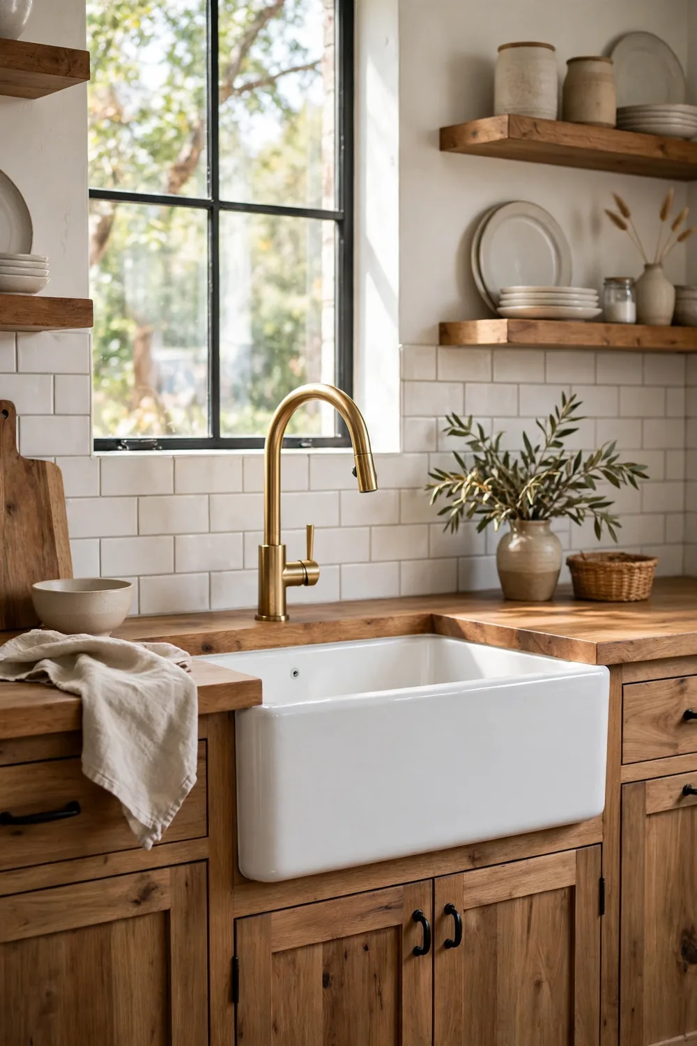
The apron-front farmhouse sink brought country-kitchen charm into modern homes: one deep, wide basin that swallows roasting trays and big pots, with a pretty front panel that becomes part of the cabinetry’s look.
Daily life tests it hard, owners report. A single basin means nowhere to set dirty dishes aside while you fill the sink for washing up, the front edge can leave your clothes damp as you lean in, and dropped items have a long way to fall. The installation also tends to cost more, since cabinets often need to be built or cut around it.
10. Generic, Matching, Designer-Chosen Wall Art
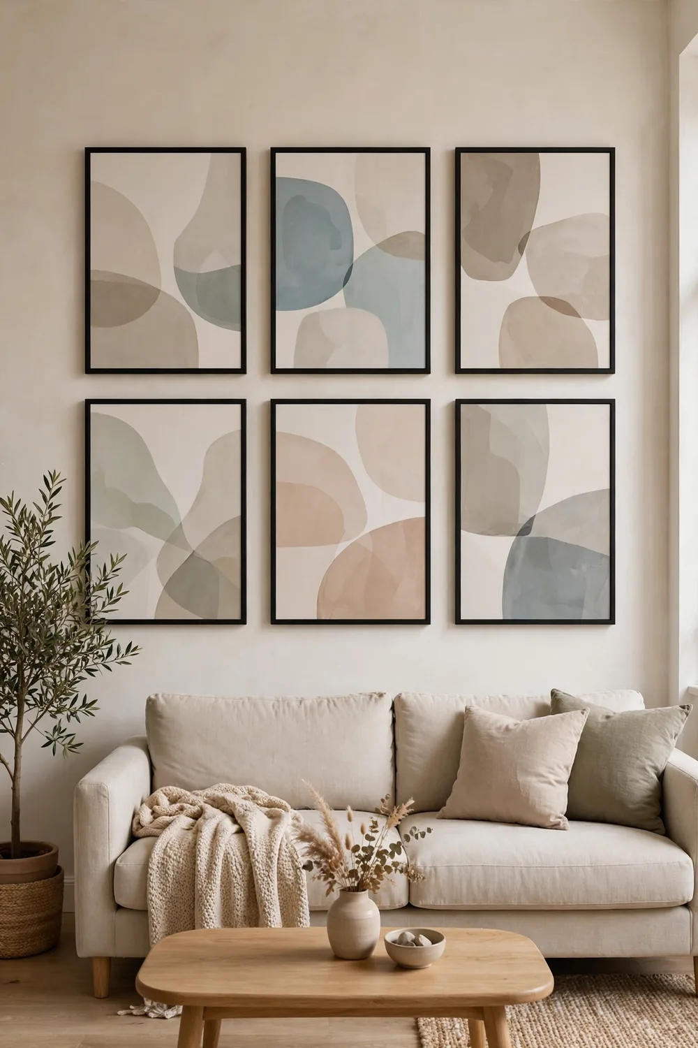
Builder show homes and furniture packages popularised the matched set: identical abstract prints in identical frames, hung in a neat row or grid. It is an instant, coordinated look that asks nothing of the buyer.
That is exactly the problem, critics say. Art chosen to match a sofa rather than mean anything can make a room feel like a hotel lobby or a catalogue photo — pleasant, but nobody’s home in particular. Many homeowners now prefer fewer pieces gathered slowly: photographs, prints by local artists, even framed fabric or children’s drawings, which carry a story even when they do not match.
11. Doorless Showers
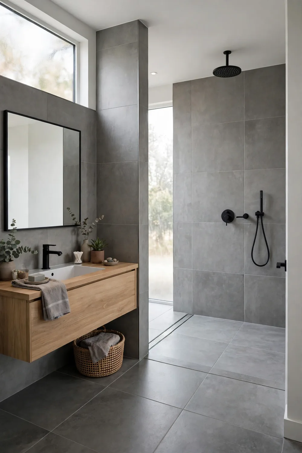
The walk-in shower with no door or curtain promises a spa-like, open feel and no glass to scrub. Wet-room styling makes small bathrooms look bigger and removes the step that makes access harder for some people.
The trade-offs show up in winter. Without a door, warm air escapes and showers can feel draughty, water finds its way further across the floor than the brochures suggest, and there is nowhere for steam to be contained. Fans counter that good drainage, a sensible layout and underfloor heating fix most of it — but plenty of people quietly add a glass panel later.
12. Freestanding Tubs in the Middle of the Bathroom
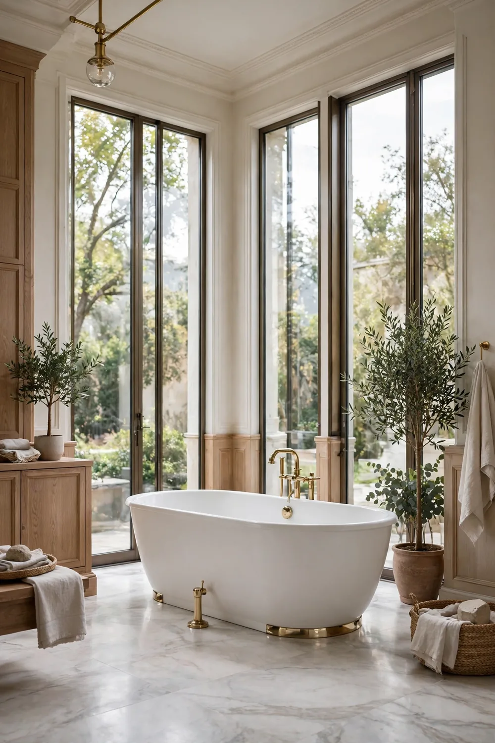
A sculptural freestanding bath placed in the centre of the bathroom is pure magazine drama. It signals luxury, gives the room a focal point and frees the tub from the walls entirely.
Critics ask a simple question: how do you clean behind it? Homeowners say the gap between tub and wall collects dust and splashes that are awkward to reach, floor-standing plumbing in the middle of the room can complicate installation, and a filled tub plus a bather is a lot of weight to plan for. Many people also admit the grand bath gets used far less than the shower — a beautiful centrepiece that mostly ends up holding laundry.
13. Gray Vinyl (Luxury Vinyl) Flooring
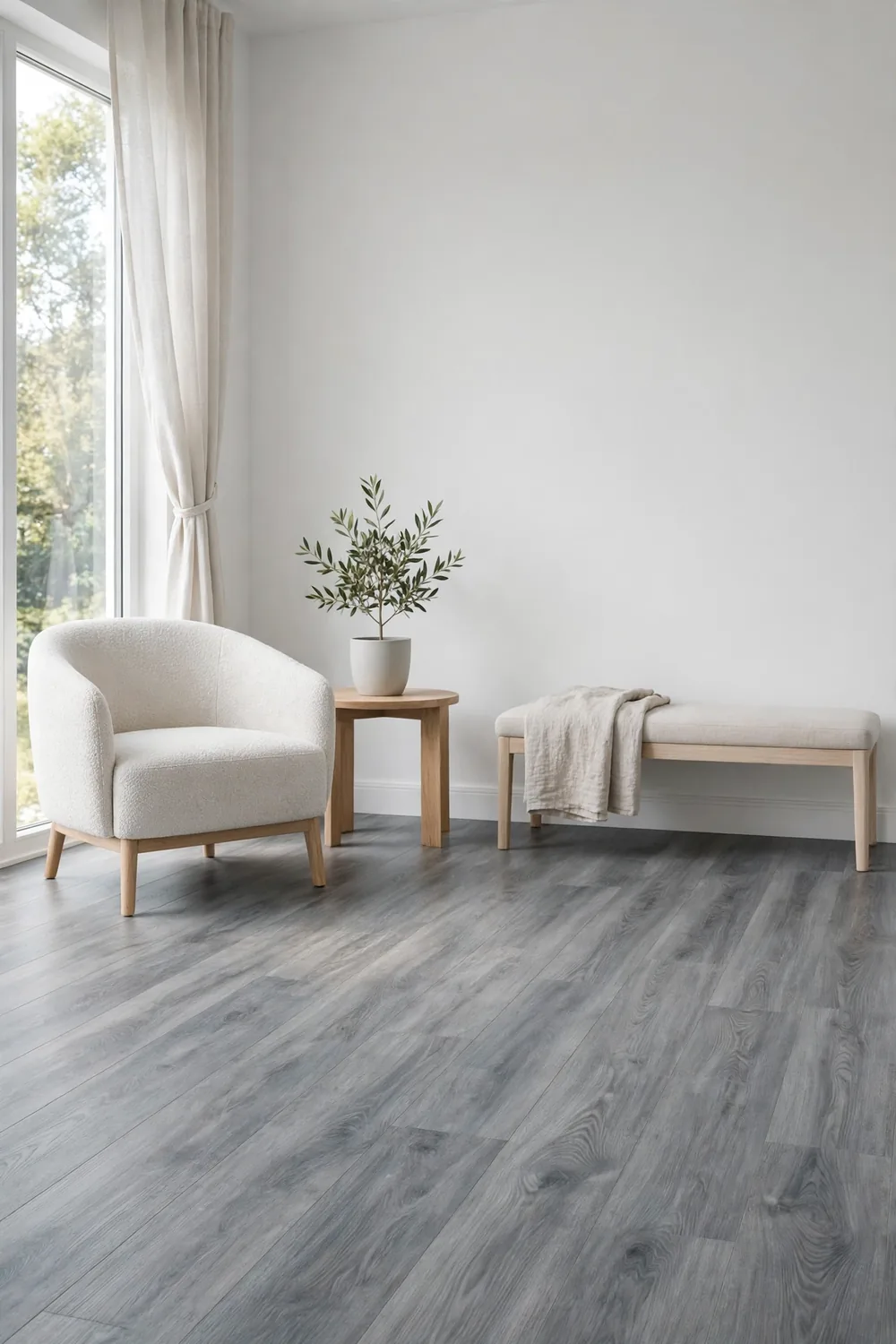
Gray wood-look vinyl plank flooring spread through renovations and rentals because it is waterproof, hard-wearing, affordable and quick to lay. The cool gray tone also matched the gray-everything era perfectly.
Now the tone itself is the complaint. Homeowners say gray floors can make rooms feel cold and flat, the printed grain repeats in a way real wood never does, and the look is so tied to its decade that it can date a listing photograph instantly. In fairness, vinyl itself is not the issue for most people — it is practical stuff — it is the gray wash that has fallen from favour.
14. Handle-Free Microwaves (Push-Button Doors)
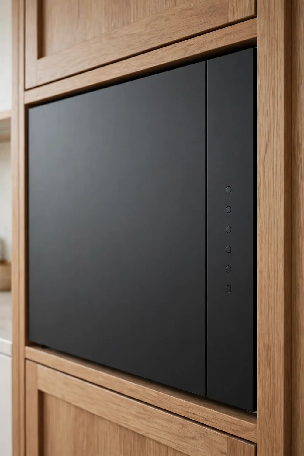
Appliance design has been smoothing itself out for years, and the microwave followed: flat doors that open with a push button or a hidden release, no handle in sight, for a seamless wall of cabinetry.
Users say the sleekness comes at a cost. A push-release door can feel flimsy, the button is not always where your fingers expect it, and opening the door with full hands — the exact moment a handle helps — becomes a juggling act. There is also a simple complaint: a handle tells everyone, including guests and grandparents, how the thing opens, with no instructions required.
15. Oversized Open-Plan Rooms
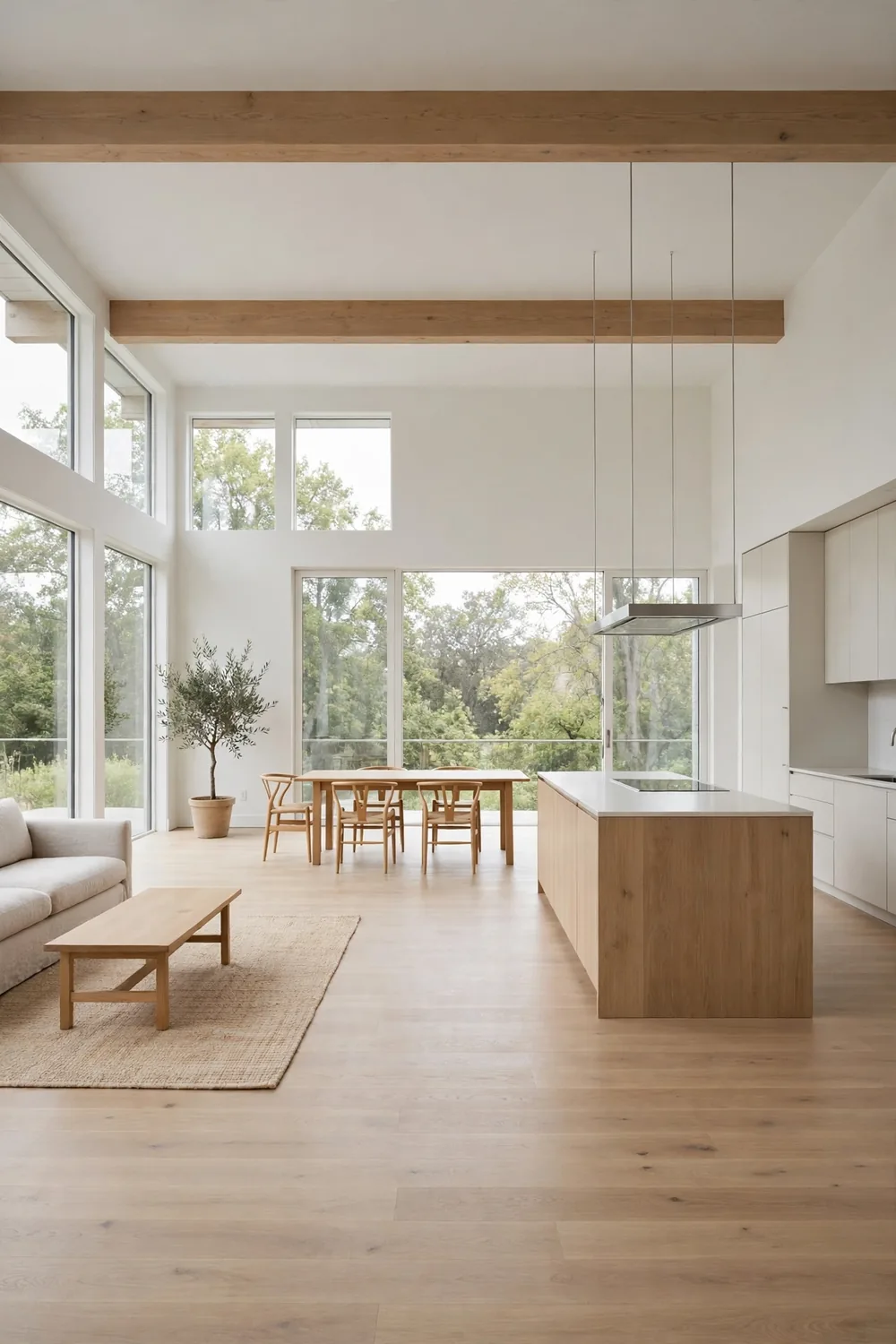
Open-plan living kept growing until, in some new homes, the kitchen, dining area and living room became one enormous space with no walls at all. The promise was togetherness, light and room to entertain.
Plenty of families found mega-rooms hard to live in. Cooking smells and dishwasher noise reach the sofa, the television competes with conversation at the table, heating a vast space costs more, and there is nowhere to take a quiet phone call. Designers talk increasingly about broken-plan layouts — partial walls, bookcases and level changes that keep the openness but give each activity its own corner.
16. Vertical Kitchen Faucets With No Hot/Cold Indicators
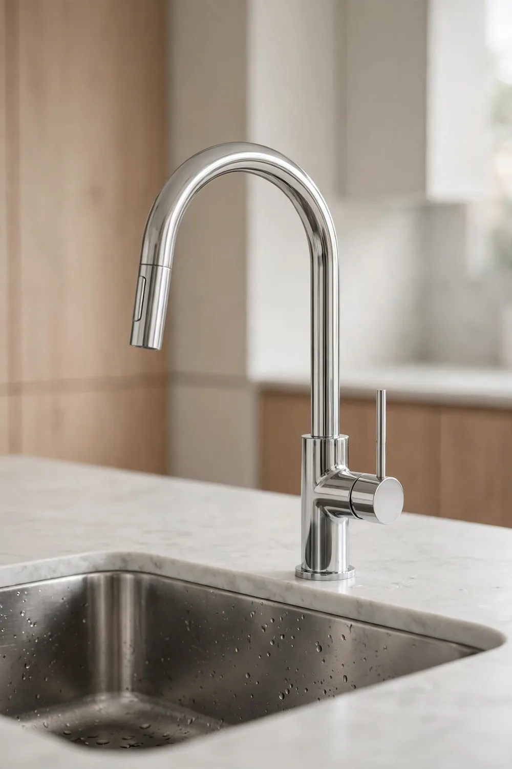
The minimalist kitchen faucet — a single slim vertical lever with no markings — is a favourite of high-end design. With no visible hot or cold indicator, the fixture stays a clean piece of sculpture by the sink.
Guests and children pay the price, users say. With no clue which way is hot, the first turn is a gamble, and more than a few people have been caught out by water far hotter than expected. Homeowners argue this is minimalism defeating its own purpose: a tap is a tool you use half-asleep and one-handed, and a tiny dot of red costs the design almost nothing.
17. Front Doors That Open Straight Into the Living Room
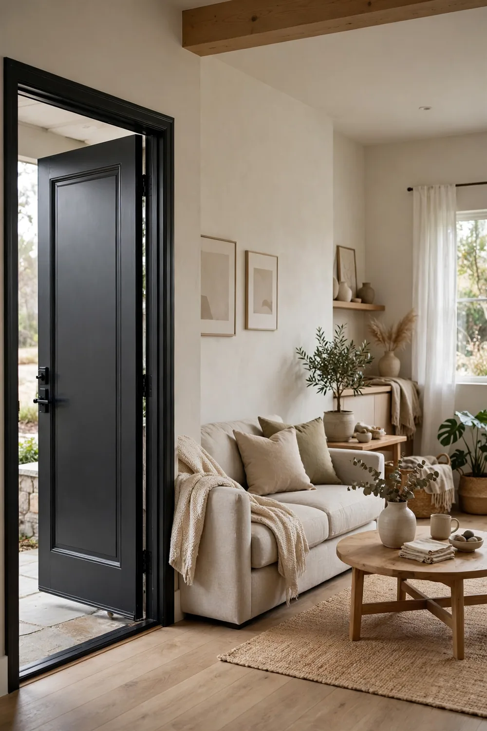
Many modern floor plans skip the hallway entirely, so the front door opens straight into the living room. Builders gain usable square footage, and the space can feel open and welcoming from the very first step.
Residents list the downsides quickly: every arrival is on display to the whole room, muddy shoes and the post land beside the sofa, cold air rushes in each time the door opens, and there is nowhere for coats to live. It is no surprise that entryway ideas for a warm welcome are so popular — even a small landing zone with hooks and a bench can give a home the breathing space the floor plan left out.
18. Gray-Everything Interiors
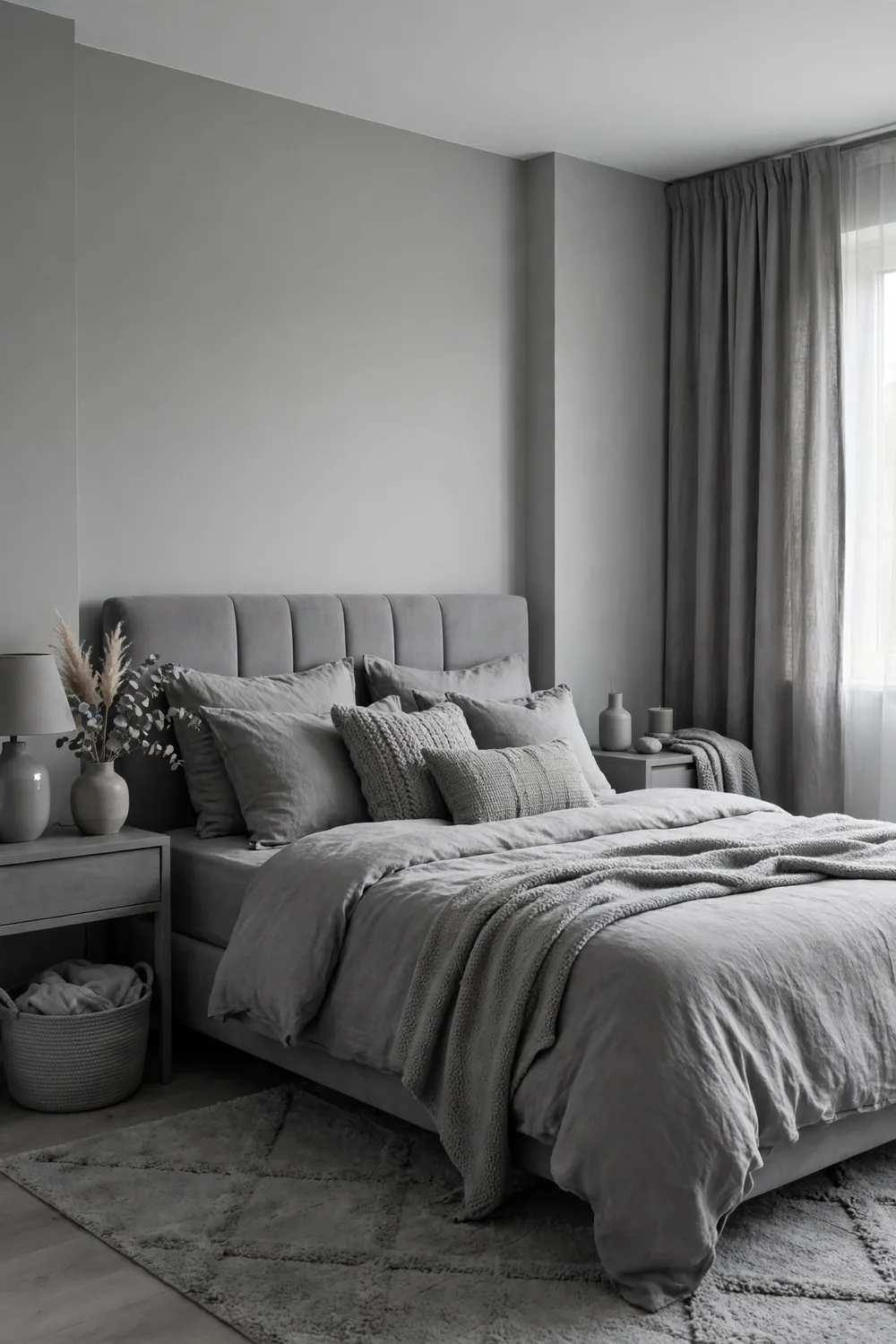
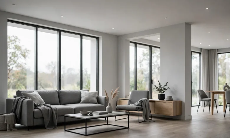
For the better part of a decade, gray was the colour of modern: gray walls, gray sofas, gray carpets, gray kitchens. It felt sophisticated, went with everything and was considered the safe, sellable choice.
Now critics say a home done entirely in gray can feel chilly and drained of life, especially in northern light, and that the look became so universal it stopped feeling like a choice at all. Even estate agents have started advising sellers to warm things up. Defenders note gray is a spectrum — a deep charcoal or a warm greige behaves very differently from flat silver gray — but the all-gray package has definitely lost its shine.
19. White Trim and White Doors
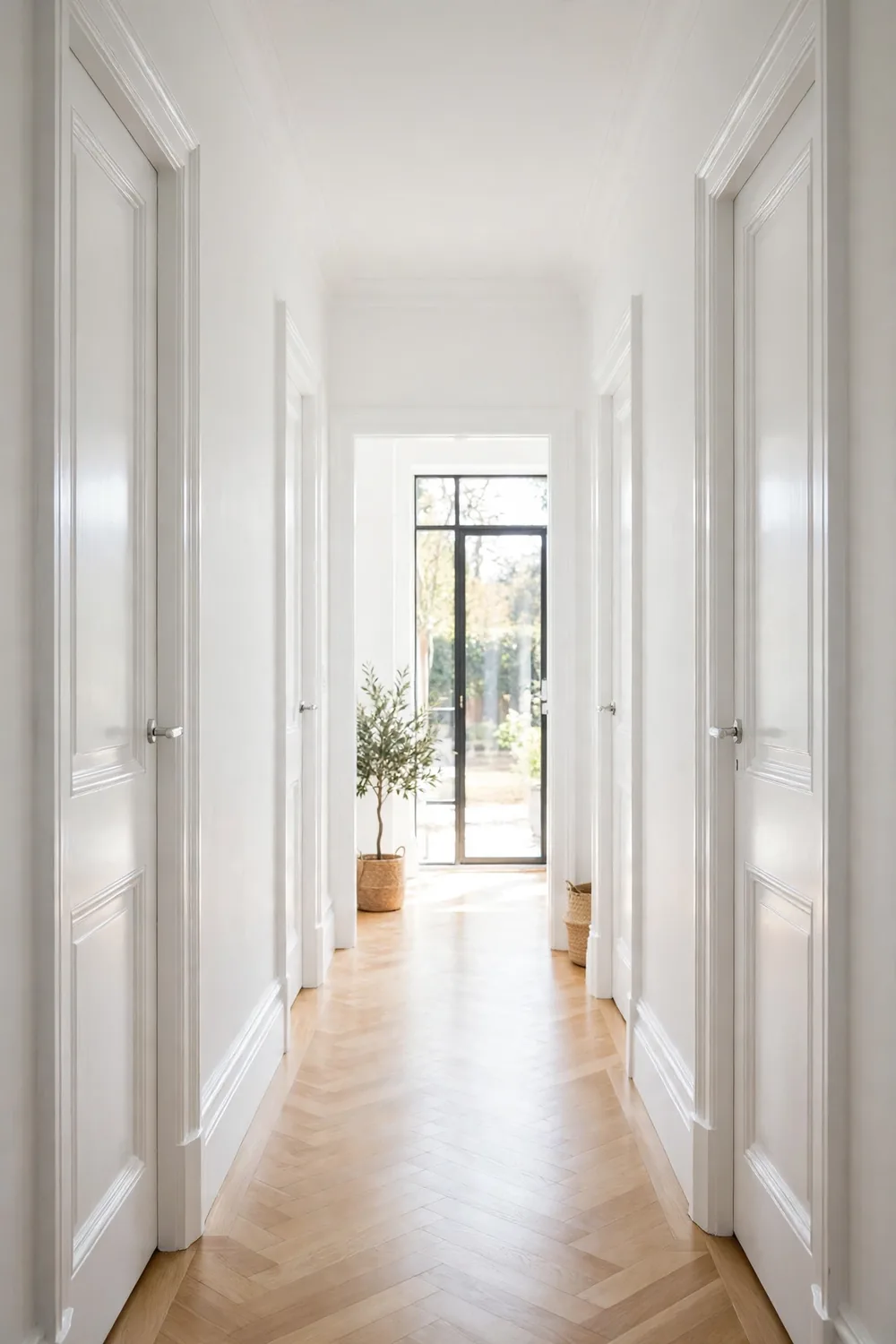
Crisp white skirting boards, architraves and doors are the classic finishing touch: they brighten a room, outline its shapes and go with every wall colour ever mixed.
So why the grumbling? Mostly upkeep. Homeowners point out that white woodwork shows every scuff, shoe mark and dusty fingerprint, and that keeping it gleaming means regular repainting, especially in hallways and family homes. Others simply find it predictable and prefer painted trim in a colour — deep greens, soft blacks and warm neutrals are having a moment — arguing that coloured woodwork gives a room more character for the same effort.
20. Panel-Ready Fridges That Blend Into the Cabinets
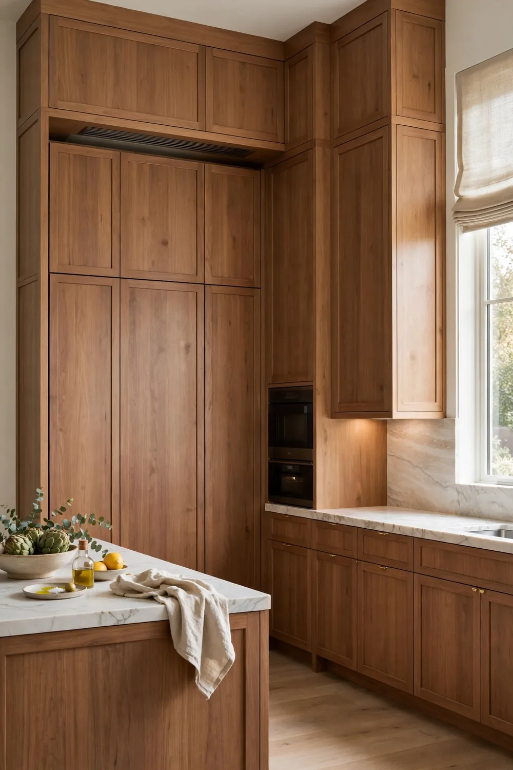
The integrated look hides the fridge behind panels that match the kitchen cabinets, so the biggest appliance in the room disappears. Designers love the seamless run of cabinetry it creates.
Owners raise practical points. Panel-ready models often cost more and hold less than their freestanding equivalents, guests open two wrong cupboards before finding the milk, and when the fridge eventually needs replacing, the new one has to fit the panels — or the panels need remaking. Some homeowners also miss the humble fridge magnet and the family notes that used to live on the door.
21. Ceramic Tile Bathroom Floors
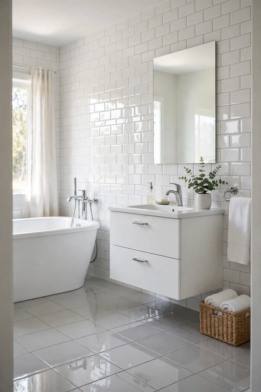
Ceramic tile has been a bathroom standard for generations: water-resistant, available in every pattern imaginable and easy to match with wall tiles for a clean, continuous look.
Under bare feet is where it loses fans. Critics call tiled floors cold in the morning, hard when you drop a glass bottle, and slippery when wet unless the finish is chosen carefully. Grout lines add their own chore, slowly darkening however often they are scrubbed. Heated floors answer the cold complaint — and many owners say that with heat underfoot, tile becomes one of the most practical choices again.
22. Electric (Smart) Toilets
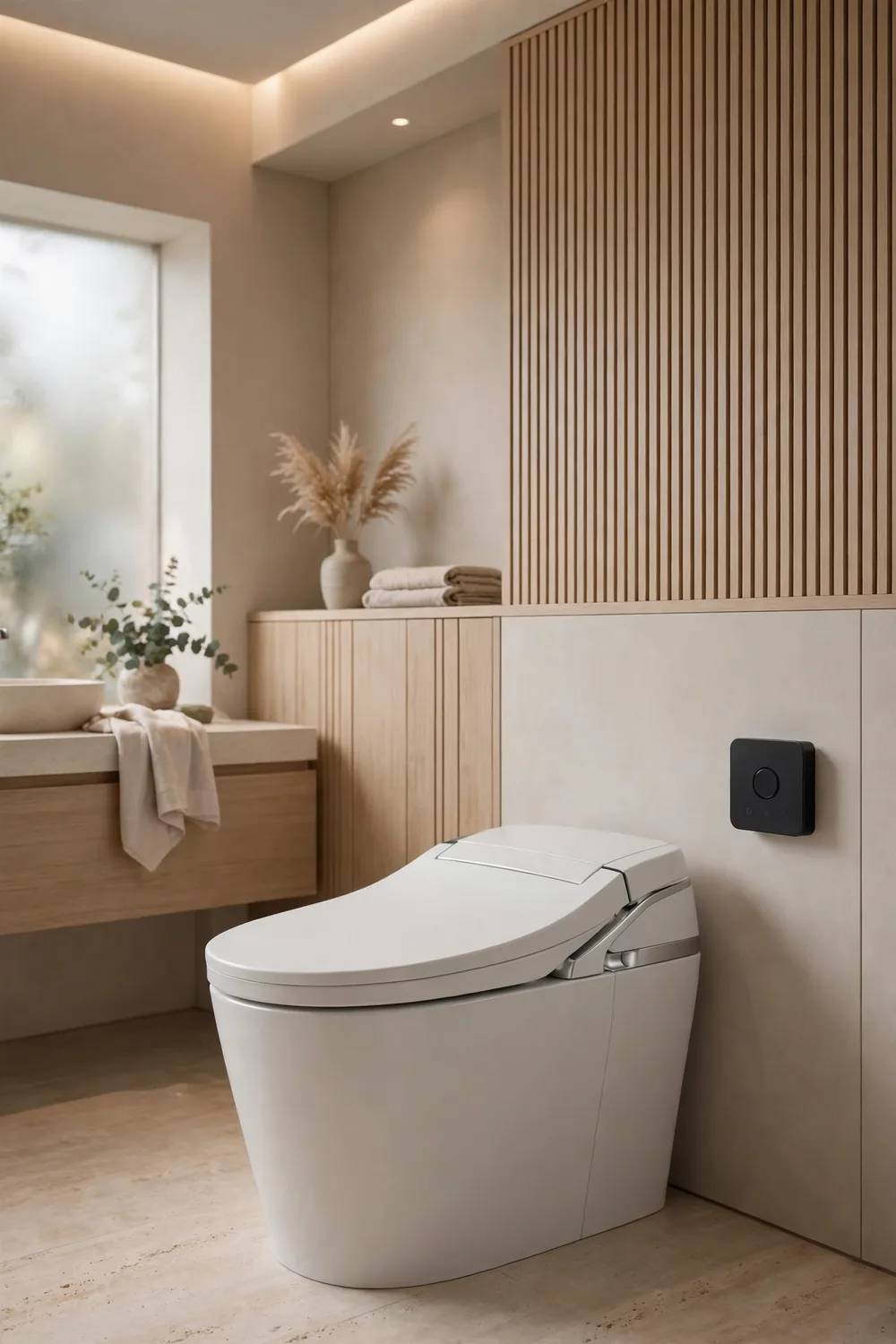
The high-tech toilet brings heated seats, bidet functions, soft-close lids that open as you approach and even self-cleaning cycles. Fans describe it as the most civilised upgrade in the house.
Sceptics ask what happens when it breaks. Critics point to higher purchase and repair costs, remotes and sensors that can fail, and the simple oddity of a toilet that needs electricity to do its one essential job. There is also a learning curve that guests did not ask for. Owners who love theirs tend to love them completely — but nobody denies it is a lot of technology for a porcelain throne.
23. Rainfall Shower Heads
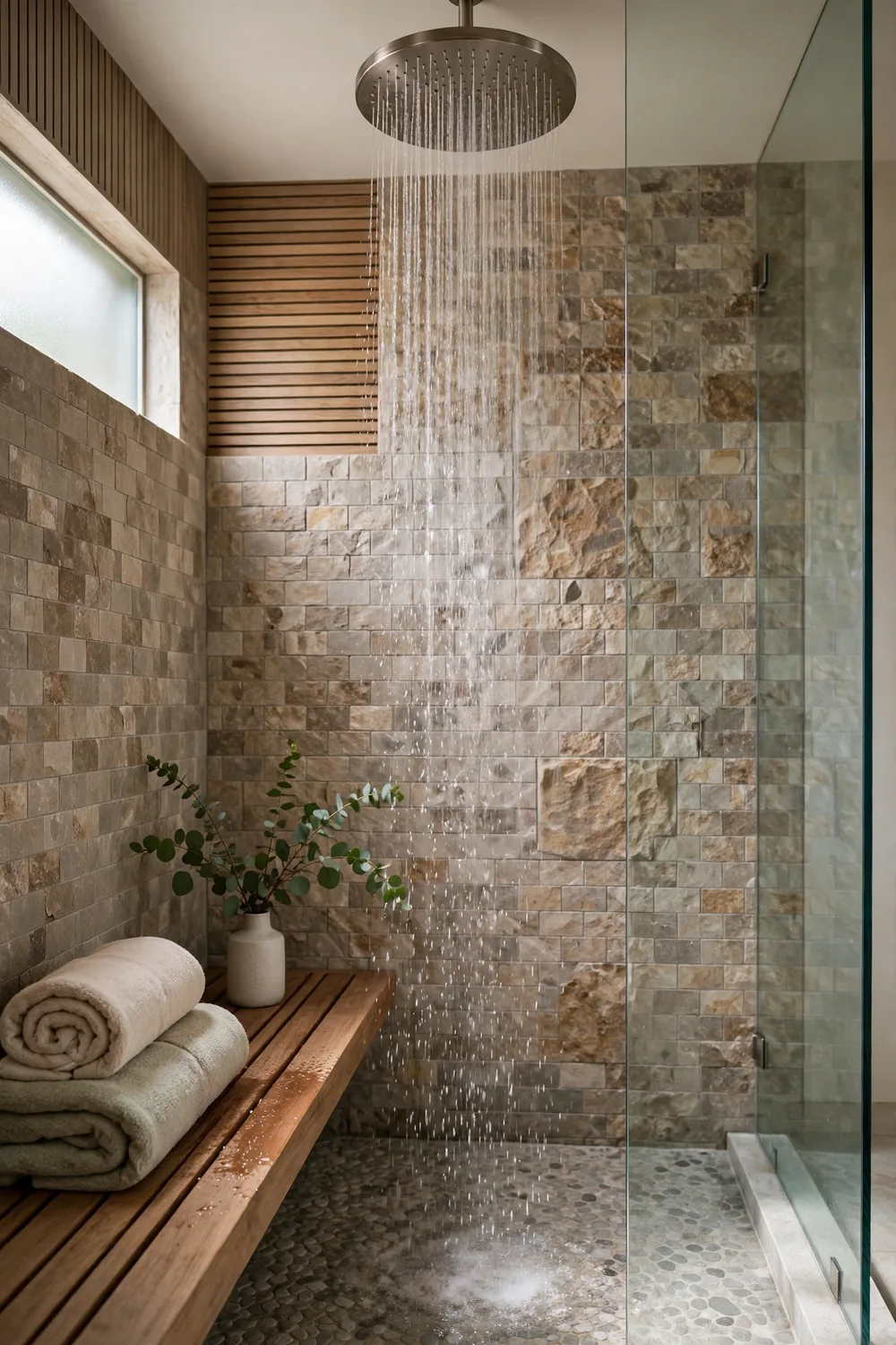
The rainfall shower head — a wide disc mounted overhead that pours water straight down like warm rain — is the finishing touch of the spa-style bathroom, promising a gentle, immersive shower.
Daily users are divided. Critics say the soft, downward flow can feel weak compared with a focused shower head, rinsing shampoo takes longer, and stepping out from under it means leaving the warm water entirely. Fixed overhead fittings can also be awkward for anyone much shorter or taller than average. Plenty of bathrooms now compromise with both: a rainfall head for the soak and a handheld for the actual washing.
Trends will keep cycling, and honestly, that is part of the fun of owning a home. The pattern in almost every complaint above is not really about taste — it is about what happens after the photographs, when a finish has to be cleaned, a door has to lock, or a room has to keep a family warm. Choose the looks you love, but let daily life have the final vote.
More Home Ideas You’ll Love
Still in a decorating mood? Take a look at these fall bathroom decoration ideas for seasonal touches that ask nothing of your plumbing, wiring or floor plan at all.