What we love about the fall palette is how much room it gives you. Moody florals for one bride, a rustic pocketfold for another, a gold-bordered card for the one who wants elegant over earthy. They all still read as autumn.
We’ve sorted these by wedding month, September through November, so you can see how the season deepens as it goes. First up: fall invitations spotted on real L&L weddings. Click any link to see the full day.
September Wedding Invitations
September weddings sit right on the seam between summer and fall, so the invitations do too. Expect deep floral palettes and the first real warmth in the paper, before the leaves fully turn.
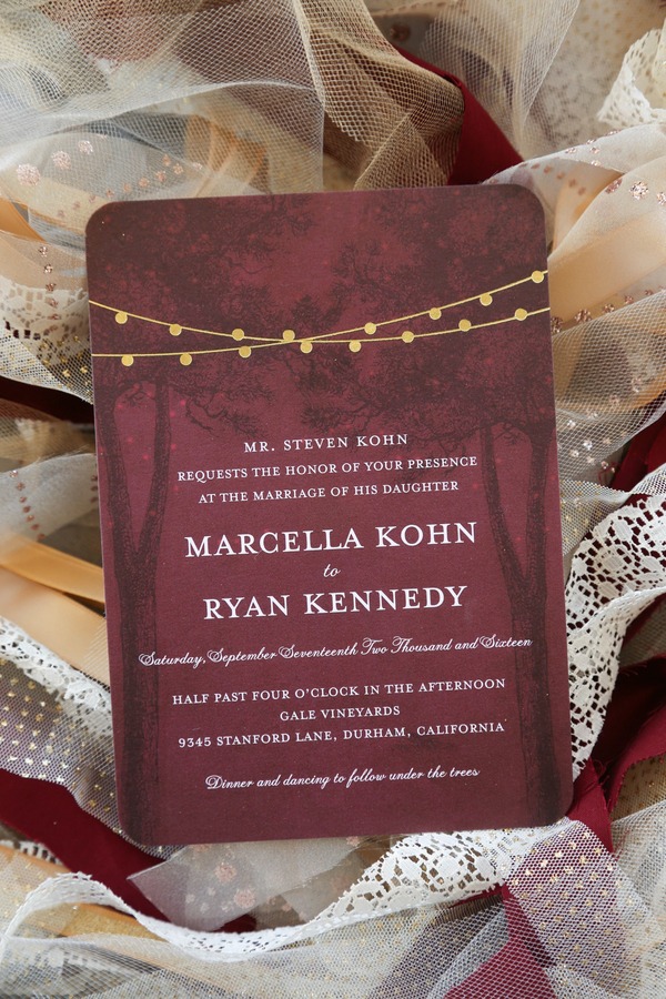
Burgundy Invitation with Gold String Lights
Deep wine paper, a string of gold lights printed across the top, and a stand of bare trees underneath. The whole thing looks like a reception happening after dark, in the woods, which is pretty much what Marcie and Ryan had at Gale Vineyards.
The fine print mentions dinner and dancing under the trees, in case the picture left any doubt.
See Marcie and Ryan’s burgundy and gold winery wedding at Gale Vineyards →
Plum Watercolor Florals with a Painted Venue Portrait
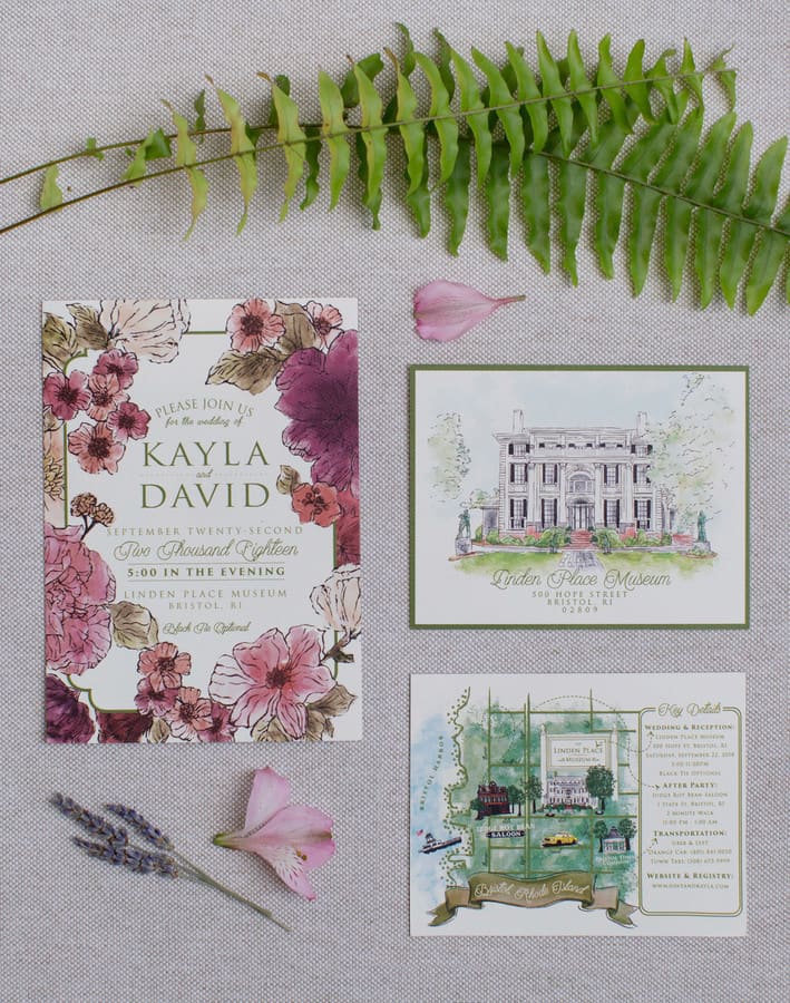
The flowers here aren’t pastel. They’re plum, burgundy, and a bruised mauve, the kind of palette that only really lands in September.
The suite came with a hand-painted portrait of Linden Place and a little illustrated map of Bristol, Rhode Island. A nice touch for guests who’d never been.
See Kayla and Dave’s romantic wedding at Linden Place in Rhode Island →
Copper Leaf Sprigs on Ivory Cardstock
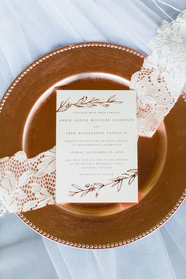
Simple ivory card, a few copper leaf sprigs at the top and bottom, sitting on a rose gold charger that picks up the same warm metal.
It’s restrained. But copper foliage and a late-September date add up to autumn without a single pumpkin in sight.
See Annie and Fred’s Whitehall Manor wedding in Virginia →
Kraft Paper Invitation with a Hand-Lettered Laurel Wreath

Brown kraft paper, black hand-lettering, a little laurel wreath drawn around the names. This is the rustic ranch invitation in its natural habitat.
Whitney and Chris were married at Shadow Lake Ranch, and the warm paper stock reads more harvest than winter white.
See Whitney and Chris’s rustic wedding at Shadow Lake Ranch →
Rose Gold Foil Foliage on Blush

Cream cardstock, rose gold foil leaves climbing the edges, the whole suite laid out on blush silk.
It’s the softer end of fall, warm metal instead of warm color, for a late-September wedding at Bowling Green Country Club.
See Emily and Brian’s wedding at Bowling Green Country Club →
October Wedding Invitations
This is peak fall, and it shows in the paper. Burgundy, maple leaves, kraft paper, and the occasional gold border for the brides who want elegant over rustic.
Deep Burgundy Roses with Scattered Maple Leaves
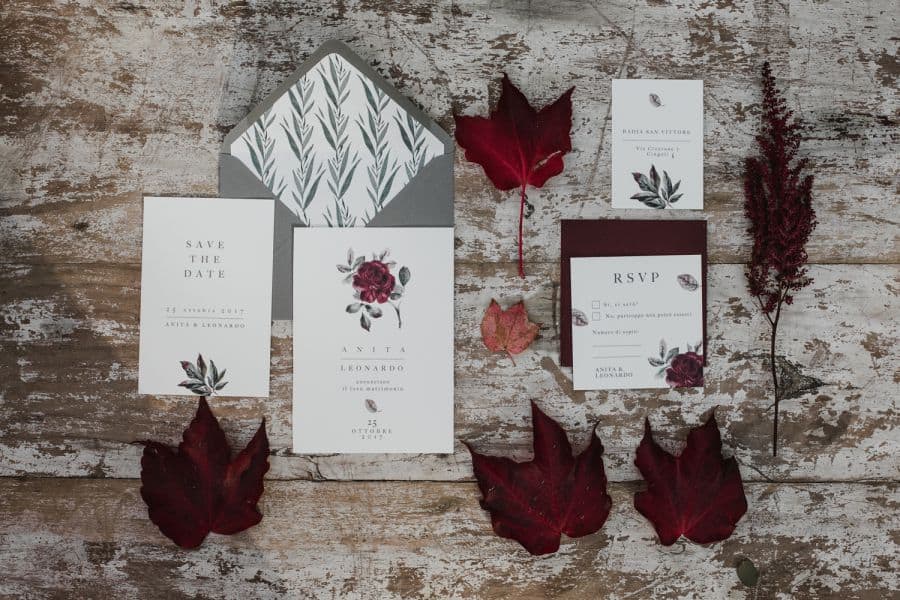
If you want to know what a fall invitation looks like, this is the reference photo. Burgundy roses, a soft gray envelope, real red maple leaves scattered across weathered wood.
It came out of the Fire of Autumn styled shoot in Italy’s Le Marche, which had the same cozy, glowing quality as the paper.
See the Fire of Autumn styled shoot in Italy’s Le Marche →
Eggplant and Kraft Suite with Dried Protea
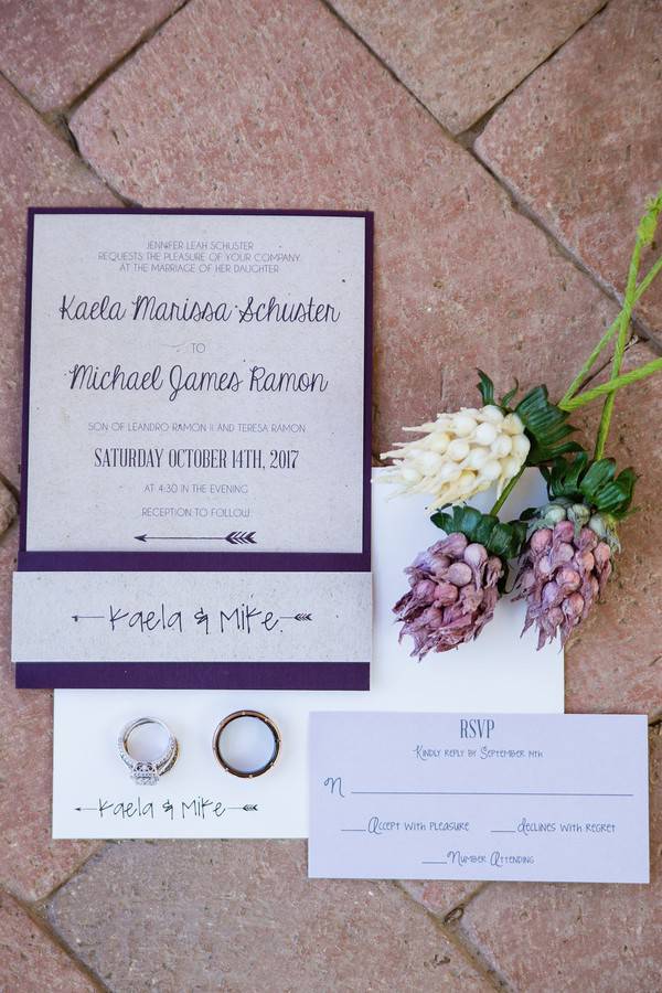
Kraft paper wrapped in an eggplant band, laid out on terracotta tile with dried purple protea beside it. Warm, rustic, a little moody.
Kaela and Mike leaned all the way into purple at Schnepf Farms, and guests got their first taste of it on the invitation.
See Kaela and Mike’s rustic wedding at Schnepf Farms →
Watercolor Foliage with Burgundy Blooms
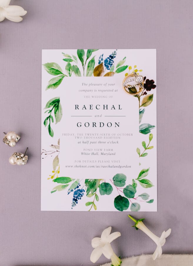
Mostly greenery, but look closer: burgundy blooms, little gold berries, a few brown leaves tucked into the border. That’s the tell.
Raechal and Gordon went cool for the ceremony and warm for the reception at Pond View Farm, and their late-October invitation lands right between the two.
See Raechal and Gordon’s rustic wedding at Pond View Farm →
Gold Botanical Border on Ivory
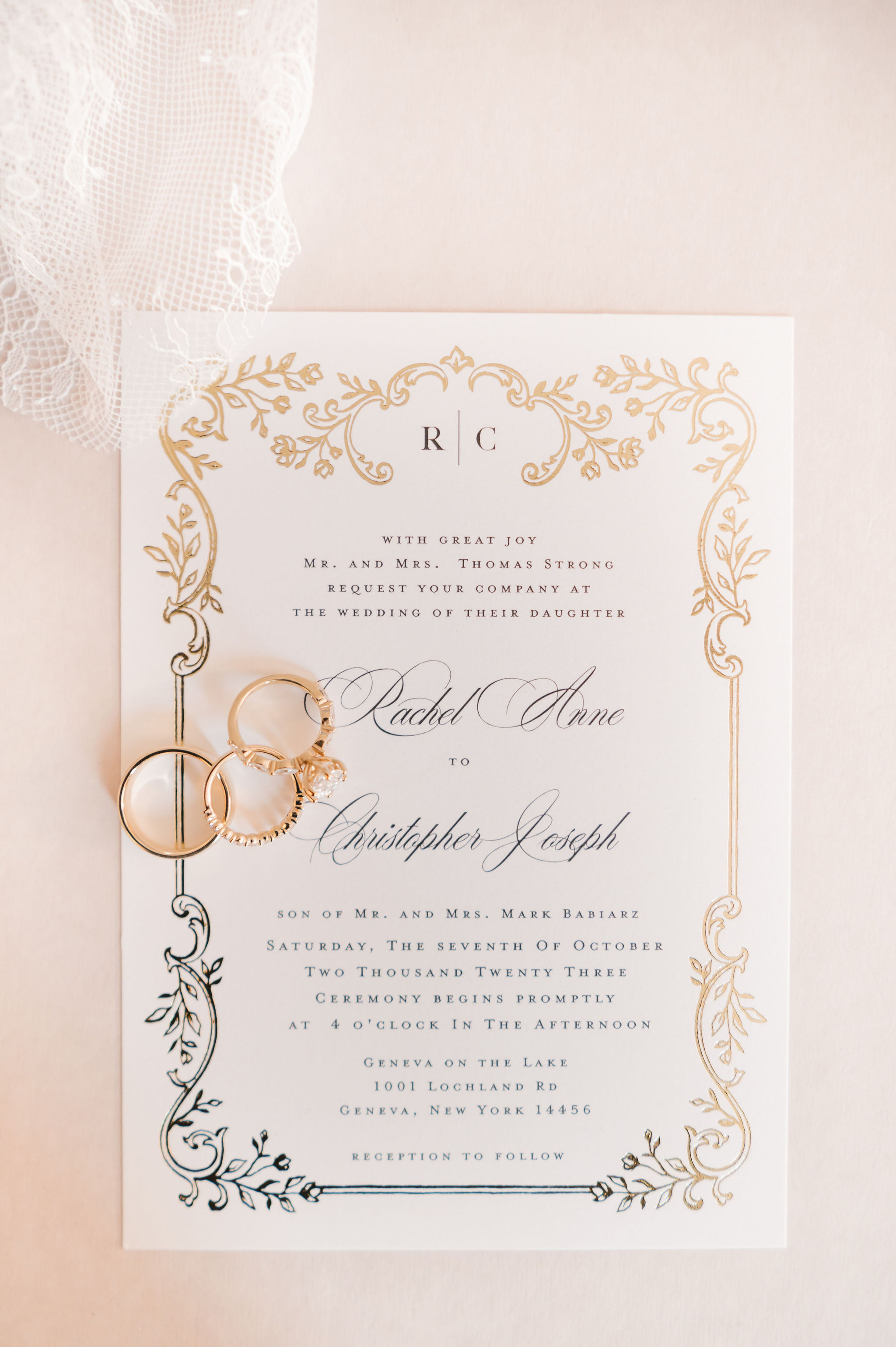
An ivory card wrapped in an ornate gold botanical border, the kind of gold-on-cream that leans black-tie more than bonfire.
This one’s here for the October brides who want the season in the date, not the design. Rachel and Christopher married at Geneva On The Lake in the Finger Lakes, gold accents throughout.
See Rachel and Christopher’s black-tie wedding at Geneva On The Lake →
November Wedding Invitations
By November the season’s all in, and the paper goes with it. Pocketfolds in chocolate and mulberry, string lights, sunflowers, and jewel tones for the couples who wanted the invitation to feel like the last warm night before winter.
Chocolate Pocketfold with Oak Leaves and Acorns

Chocolate brown pocketfold, cream insert, styled on a bed of real oak leaves and acorns with one red maple leaf thrown in for contrast.
Kelly and Anthony’s fall wedding leaned orange and red, and this is the November invitation that looks most like the season it landed in.
See Kelly and Anthony’s fall wedding at Nestldown →
Burgundy Blooms and Rose Gold on Ivory
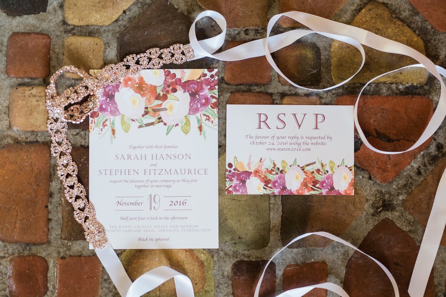
Burgundy and blush flowers up top, rose gold lettering, the whole card resting on terracotta brick that warms up the whole frame.
Sarah and Steven’s fall wedding at the Powel Crosley Estate ran on rich red and burgundy, and mid-November suited it.
See Sarah and Steven’s fall wedding at the Powel Crosley Estate →
Mulberry Pocketfold with a Die-Cut Insert
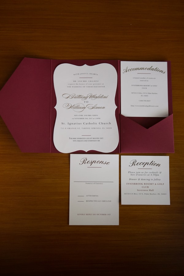
A deep mulberry pocketfold cradling a white die-cut card, with response and reception cards to match. Clean, formal, and unmistakably wine-toned.
Brittany and Will built their day around gold, burgundy, and pink. The invitation kept the burgundy front and center for a mid-November date.
See Brittany and Will’s burgundy, gold, and pink wedding →
Sepia String Lights and Mason Jars

Warm sepia paper, a bare tree, mason jars strung with fairy lights hanging off the branches. It’s the whole backyard-string-light mood in a single card.
Ashley and Eric were bringing the outside in at Blumen Gardens, and their early-November invitation looked the part.
See Ashley and Eric’s garden wedding at Blumen Gardens →
Wood-Grain Invitation with Sunflowers in a Mason Jar

Printed on a dark wood-grain pattern, with a mason jar of sunflowers illustrated at the bottom and One Fine Day up top. Sunflowers are the unofficial flower of fall, and here they’re front and center.
Chelsey and Taylor’s fall wedding ran bright and cheery, which the paper matches.
See Chelsey and Taylor’s sunflower-filled fall wedding →
Gold-Framed Be Our Guest Invitation on Red
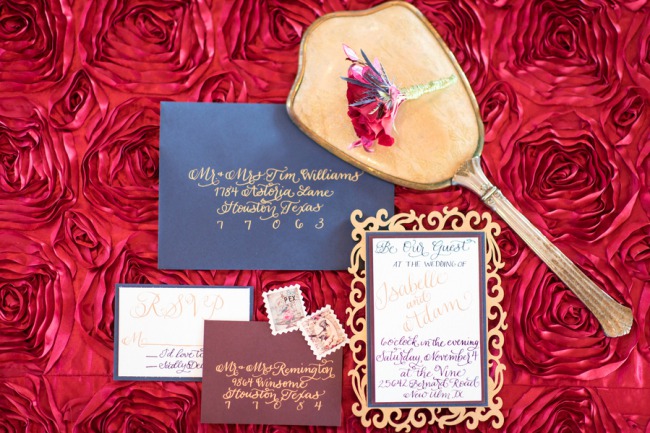
Navy and burgundy envelopes, gold calligraphy, and a gold-framed card that opens with Be Our Guest, all sitting on a blanket of red roses.
It’s from a Beauty and the Beast styled shoot leaning hard into French, jewel-toned romance. For a November wedding that wants drama over rustic, this is the direction.
See the Beauty and the Beast vineyard styled shoot in Texas →
FAQs
What makes a wedding invitation look like fall?
Usually one of two things: color or texture. The color route means burgundy, rust, mustard, copper, deep green, or plum. The texture route means kraft paper, deckled edges, or a warm wood-grain print. You don’t need both, and you definitely don’t need a cartoon pumpkin. One warm element is enough.
When should you send fall wedding invitations?
We recommend mailing invitations six to eight weeks before the wedding, and closer to three months out if a lot of guests are traveling. Save-the-dates go out earlier, usually six to eight months ahead. For a peak-season October date, err on the early side, since fall books up fast.
Do fall invitations have to have leaves on them?
Not at all. Leaves are the obvious move, but a mulberry pocketfold or a burgundy floral does the same job without a single leaf in sight. If anything, letting the palette carry the season keeps things from tipping into craft-store territory.
What colors work best for a fall wedding invitation?
Burgundy and terracotta are the workhorses, and they pair with almost anything. From there, add gold or copper for warmth, deep green for contrast, or blush and dusty rose if you want to keep a little softness. Kraft brown is the easy neutral that ties the whole thing together.